A Platforming Thread Through E3

POV: DESIGNER.  DIFFICULTY 2.  LEVEL 1 - 1 POV: DESIGNER.  DIFFICULTY 2.  LEVEL 1 – 1

Game Category1 Category2 Name Description Link
Yoshi’s Woolly World Level Elements Matter Splatter style Yoshi platforms that are only interactable when the “light” is shining on them. Video!
Yoshi’s Woolly World Mechanics Dynamic Use yarn egg shots to create platforms from outlined areas. Video!
Yoshi’s Woolly World Mechanics Dynamic Use yarn to tie Piranha enemy’s mouths shut to make it vulnerable to jumping. Video!
Yoshi’s Woolly World Mechanics Ricochet Egg Toss Tossed eggs bounce off of walls. Video!
Yoshi’s Woolly World Power-Up / Upgrade / Economy Power Badge Spend gems to buy powerups that help you in various ways. Reveal secrets, power up attacks, become invincible.
Yoshi’s Woolly World Feedback Bowtie Knot This visual element lets players know they can use their tongue to unravel the object.
Yoshi’s Woolly World Enemy Elements Health If you throw a Yoshi ball at this enemies, it dies in one hit rather than getting wrapped up. Video!
Yoshi’s Woolly World Mechanics Dynamic Large Yarn Ball This large ball is more powerful than the smaller ones. It can pass through multiple outline yarn platforms while applying yarn to them. The big yarn ball has a kind of stamina. Video!
Yoshi’s Woolly World Mechanics AIM Looks like there’s not other way to change the order of one’s yarn balls than to aim and hit down to put the ball away. Video!
Yoshi’s Woolly World Mechanics Dynamic Thrown yarn balls can collect gem pickups.
Yoshi’s Woolly World Mechanics Dynamic Thrown bird leave a trail that creates a dynamic cloud platform. Enemies also interact on this platform. Video!

Richard: Kirby’s Epic Yarn was one of the best-looking games on the Wii and now the team is giving that handcrafted touch to Yoshi with Yoshi’s Woolly World. The game looks like I can reach into the screen and grab a Yarn Yoshi. One of my biggest concerns: is that yarn style mostly aesthetic? Looking at the trailer, where are all the Yarn inspired mechanics?

Marcus: How many enemies have we seen Yoshi bing with his yarn egg?

Richard: I’m pretty sure I saw Yoshi hit some Shy Guys in a previous video (see here), but there aren’t any examples in the E3 2015 trailer. The best example may be when Yoshi nails a Piranha Plant enemy, which wrapped its mouth in yarn. That’s a pretty good example of a yarn- inspired mechanic. I’m looking for verbs like unravel, wrap, tangle, and I’m looking for the mechanics inspired by these verbs to be dynamic rather than a visual effect. For example, if you unravel a yarn boss halfway versus 3/4th of the way, does it move slower because it has more yarn mass?

Marcus: That sounds like one of those Miyamoto questions when he asked “what raw materials the propeller was made of ?”. I might ask you if something light as a feather gets lighter can it move faster? To me yarn and wool are materials that no matter how much I hold it’s always light as a feather. And so putting on my Miyamoto hat, I’d say that mass/weight wouldn’t be a factor in the mechanics of Woolly World.

Richard: But what about the Woolly World level from Super Smash Brothers for Nintendo Wii U? It has platforms suspended by wires that move under the weight of the fighters. Where do you think Sakurai and the team got that idea from?
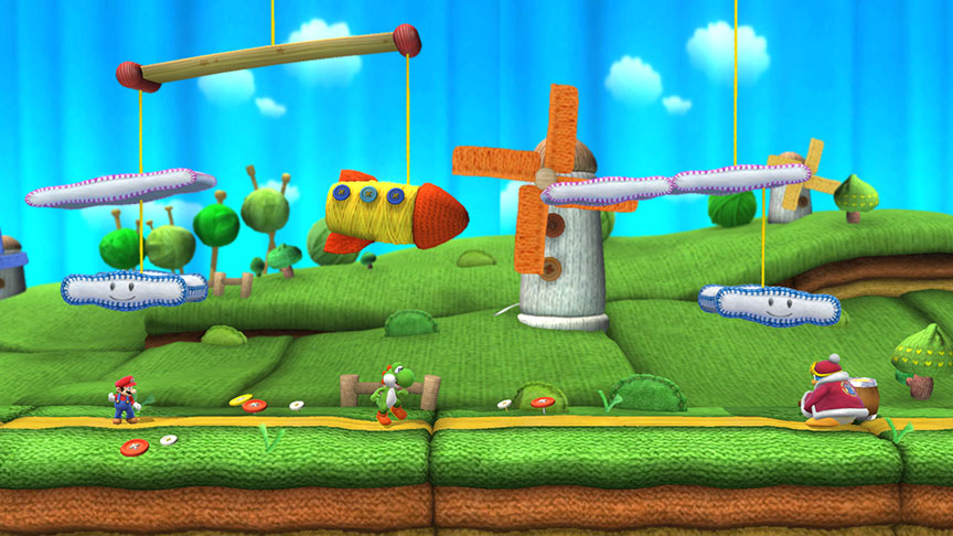
Marcus: Sakurai’s level in Smash Brothers almost feels like an extension of the original “Smash Brothers motif”: a child’s toy come to life. Woolly World in Smash is a Yoshi level come to life in a more literal sense. It’s a diorama version of Woolly World. And when things are suspended by strings it’s only natural that weight and physics apply.  

Richard: I had to go back to this video from E3 2014 to find examples of Yoshi actually throwing yarn balls around. Turns out, throwing a Yoshi ball is more powerful than a small yarn ball. And throwing a large yarn ball can do multiple jobs like stringing up platforms as it ricochets around. Stamina in this case is like yarn HP or strength. The more stamina a ball has, the more powerful the impact when thrown or the more tasks it can do.

Marcus: That’s an interesting way to convey weight. A larger ball having more stamina sounds like a layman’s definition of inertia. The larger ball takes more energy to bring it to a stop.

Dual Progression Part 1: Character Levels in Final Fantasy Tactics

POV: PLAYER.  DIFFICULTY 4.  LEVEL 3 - 1 POV: PLAYER.  DIFFICULTY 4.  LEVEL 3 – 1

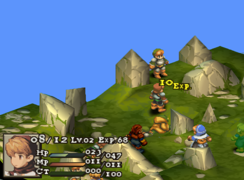
Final Fantasy Tactics has two progression schemes: One that causes core character stats to increase according to parameters defined by the Job the character has when they level up, and one that is used to buy skills within the Jobs that the character has access to.

The article is about that first progression scheme: character levels.

A character levels up when they reach 100 XP, then the character’s XP resets to 0. XP is gained when a character uses an ability or attack successfully, either doing damage to HP or MP, adding or removing a status effect, or modifying some stat of a friend or foe.

The basic formula for XP gained from a successful action is 10 + (Target’s Level – Actor’s Level). Killing the target for the first time grants a bonus 10 XP. If a character is resurrected and then killed again, the second time the character is killed there is no kill bonus. Subsequent deaths incur penalties to XP granted to the killer for that action.

Target’s __ Death XP Modifier
1st +10
2nd 0
3rd -4
4th -5
5th -6
6th -7
More than 6 -8

Example: The player’s level 5 Archer hits the opponent’s level 5 Knight with an attack. The Archer gains 10 + (5 – 5) +0 = 10 XP. If that archer were level 3, and killed the level 5 Knight for the first time with that attack, the archer would gain 10 + (5 – 3) + 10 = 22 XP. Now if that Knight were resurrected, and a level 7 Ninja came by and finished him off for a second time, that’d give the Ninja 10 + (5 – 7) + 0 = 8 XP.

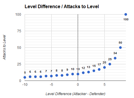
Thus it takes at most ten successful actions against same-level targets to level up.


The player is seldom in a position where their characters will earn extra XP from fighting higher-level opponents, especially considering that the player can fight in some random encounters between story battles to overlevel for upcoming missions. In order for it to take one less attack to level up the attacking character must be two levels lower than the defender.

Typically there won’t be more than eight opponents and five player-controlled characters in a battle, and a character takes 3 to 5 successful attacks to kill (I’ll show the work behind this number in later articles). Half the friendly characters in a battle are likely to get 2 kills, so for those characters that’s a total of 8 attacks to level: 6 earn 10 XP and 2 earn 20 XP. Characters that mainly use status effect magic and are unlikely to deal sufficient damage to kill an enemy will take at least the full 10 successful actions to level. They’ll on average need several more actual attacks, because the success rates of status magic can be as low as 50-60% whereas physical and magical damaging attacks have much higher average success rates.

This scheme leads to a relatively swift pace of leveling up, and rewards the player with several level-ups per combat in typical battles.

So far we have the outline of a serviceable leveling system, consistent with other games in the genre, like Tactics Ogre and Fire Emblem. Stay tuned for more in-depth analysis on progression in Final Fantasy Tactics–next up is Job progression!

Morpheus at E3

Marcus says: When trying to sell a new hardware-specific product, getting the product into the hands of consumers is often the best way to convince them of its merits. From the comfort of my home, miles away from the E3  show, Morpheus is as far away from my hands as Dallas is from LA (yes, a literal distance. no need for metaphor here).

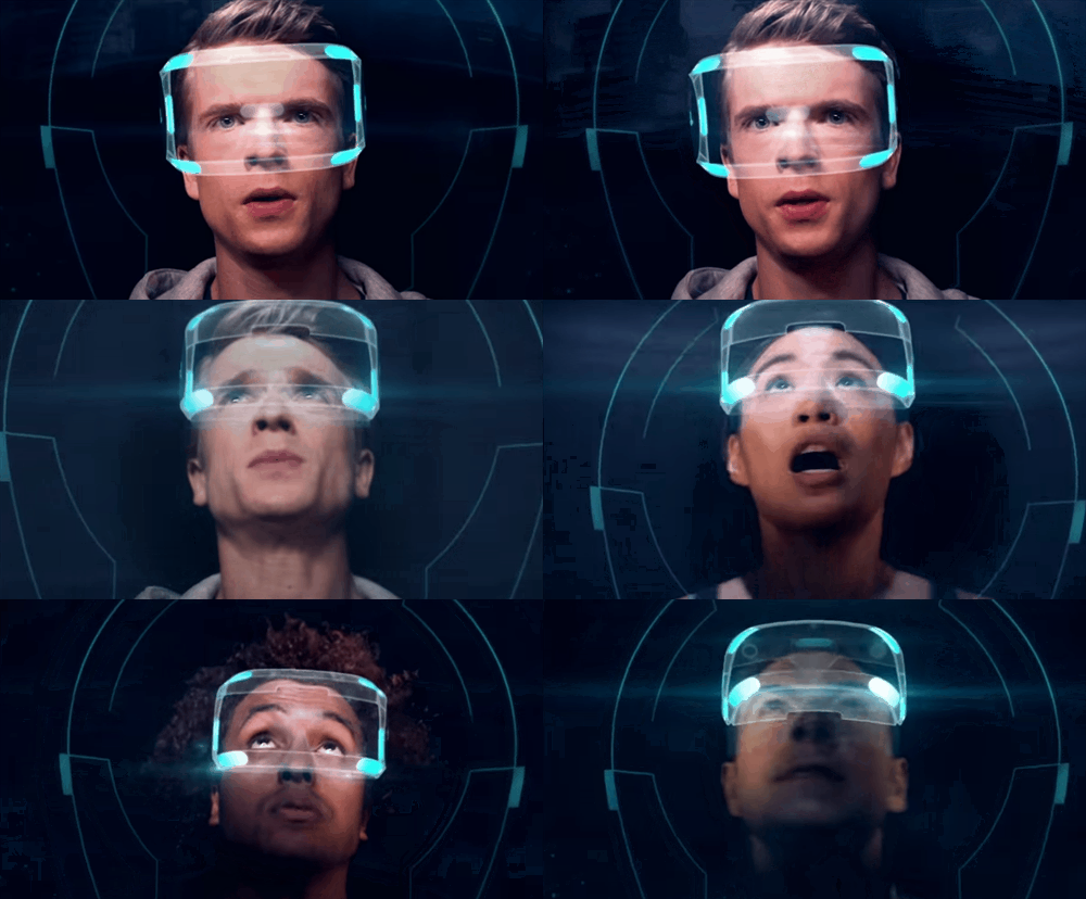
Without getting hands-on with Morpheus, I have to rely on the testimony from show goers and Sony PR. To my surprise, Sony didn’t attempt to sell the spectacle of the coming VR revolution. Instead, in trailer after trailer, I saw typical footage of typical games in typical gameplay scenarios. The only difference in the trailer for the VR games is that they feature first-person surveying; a not so subtle indication that, yes, a virtual head moving could be controlled by your literal head moving once you step into the realm of VR. The Kinect-like hovering prompts might also tip you off to the fact that these are indeed trailers for VR games.

Richard says: Nintendo is known for game presentations that focus on charm, creativity, and most of all gameplay. They typically don’t present footage without images of gameplay or content that is representative of the final product. Nintendo usually encourages their audience at E3 to go to the show floor and gets hands-on impressions. They even used the phrase “playing is believing” when they launched the Wii controller at E3 2006. I know the gaming industry has rapidly changed over the last 15 years, but I’d like to think actually playing games is the best and only way to understand what they are. Is it any different with Sony and Morpheus?

Reblog: Statistically Speaking Part 1

POV: DESIGNER.  DIFFICULTY 1.  LEVEL 1 - 1 POV: DESIGNER.  DIFFICULTY 1.  LEVEL 1 – 1

In Statistically Speaking, It’s Probably a Good Game Tyler Sigman gives a primer on probability from a game design perspective. He covers some basic mathematical facts of probability, but also talks about common misunderstandings.

Mike says: Randomized elements are so common in games that this article is more than worth a read, even if you think you know all it might have to say. I learned a bit more by digging through wikipedia after being inspired by some of this piece, particularly the fleeting mention of Binomial Distributions.

Richard says: The “quiz time” questions are thought provoking and even got me to laugh a bit. And no, the math isn’t the funny part. The last two paragraphs on page 1 describes the role and challenge of a game designer well.

“It’s pretty common to hear designers debating or waxing poetic on the finer points of linear or non-linear storytelling, human psychology, control ergonomics, or the integration of non-interactive sequences; less often do you catch them mulling over the bare bones details of the hard sciences like calculus, physics, or statistics. ” ~ Tyler Sigman

I don’t know how common it is for designers to talk about “control ergonomics,” but I like the point Tyler makes. The math part of game design is one of the hardest aspects to discuss among players and designers.

Reblog: How the Survivor Bias Distorts Reality

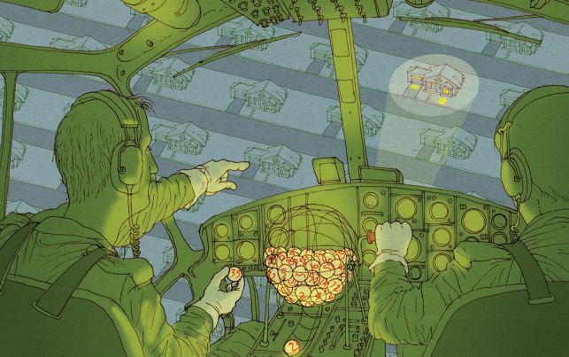
In How the Survivor Bias Distorts Reality Michael Shermer says for complex subjects many sources offer their advice based on analyzing success. He says that this is dangerous because if one only analyzes the successful one will not investigate the unsuccessful for its successful traits and qualities. This “survivor bias” leads to advice of severely limited value.

Credit: Izhar Cohen Credit: Izhar Cohen
Mike Says: I see this all the time in the analysis of game design. Analysts take a game that they love and tell us how great it is, but speak in terms that don’t actually differentiate the game from other much less successful games in any way. It’s important when coming up with principles of good design to examine unsuccessful games with a clear eye and see if they exhibit the design principle–if they do, more analysis and attention is needed.

Chris Says: I wonder how much more successful a converse approach to analysis of game design might be: start with a design failure and attempt to analyze why that design failed or why a particular design feature isn’t working. This approach seems to be used when working out the kinks of a game’s design during playtesting, and for good reason: often it’s easier to tell what’s not working that what is. Though a comparative analysis would obviously be the best, this approach is an easier one for beginners doing any sort of design analysis to take, and avoids some of the pitfalls of survivor bias.

Richard says: Hey, Mike. Didn’t you have a blog called “that’s a terrible idea” that specialized in understanding the many flaws of MMO game design? Sounds like you did the method Chris described. 

Uncharted 4: Chase Set Pieces

It’s E3 week! Here at Design Oriented we’re skipping the speculation and the hype. We’re focused on bringing you the details from E3 that are design-oriented. Keep an eye on our twitter feed and keep coming back here for features that zoom in on games from the show.

POV: DESIGNER.  DIFFICULTY 2.  LEVEL 1 - 1 POV: DESIGNER.  DIFFICULTY 2.  LEVEL 1 – 1

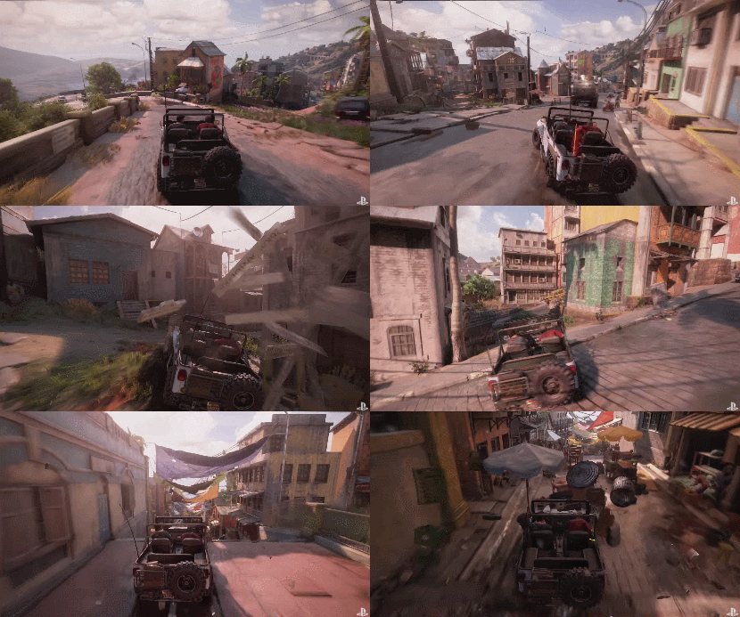
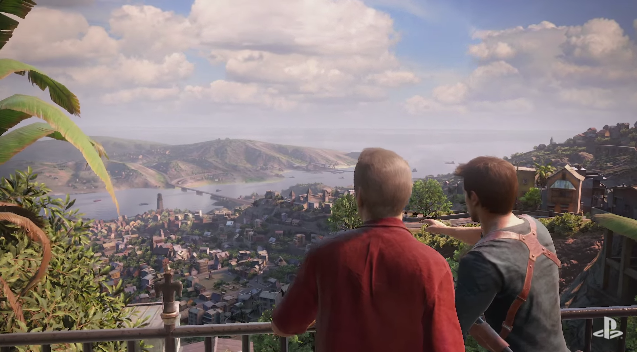
Making an E3 trailer or demo is a complicated. A few short minutes is all companies have to thrill, intrigue, and possibly make good on their promises. Naughty Dog promised there would be more ways to move through the levels of Uncharted 4 and this live stage demo chase scene makes good on that promise.

It starts with a sweeping vista and the destination far off in the distance.

How do Drake and Sully get to the tower below? Sully chimes in “We just keep heading down hill”. While a cinematic ride down roads and back alleys seems like a linear experience, the E3 demo hinted at something more. At every turn when Drake was cut off by the pursuing van, there were always at least two other paths the he could take to evade his foe.

The whole experience is subtly a dynamic set piece. As NeoGaf’s mrklaw notes, the whole scene is a clever use of winding roads that fork and then meet up again later. The interwoven paths funnel Drake and the pursuit van towards each other and down the hill towards the destination no matter which of the many paths they take.

Richard says: I think the biggest difference between this Uncharted 4 chase scene and this one from Uncharted 3 is that there are few to no dead ends. When young Drake takes the wrong jump in Uncharted 3, it’s game over. I couldn’t see any areas where the player car in Uncharted 4 would get stuck at a dead end.

The Uncharted 4 set piece flows pretty nicely. The scene also keeps up the pace by eliminating loading screens. Gameplay-wise, the decisions look just as simple as other Uncharted chase set pieces: Steer left, steer right, and you’ll make it. Contrast Uncharted 4 with this scene from The Adventures of Tintin, and you’ll see what I mean. Tintin features driving, shooting, grabbing, jumping, and punching.

Non-Vlambeer Games Scored

POV: DESIGNER.  DIFFICULTY 3.  LEVEL 4 - 1 POV: DESIGNER.  DIFFICULTY 3.  LEVEL 4 – 1

Previously, we applied the Vlambeer Scale of Quality to Vlambeer’s games. It turns out Vlambeer has been slowly increasing the score for their character action games over time, and Nuclear Throne has earned the highest score of all the games we’ve scored! To get a better idea of how effective the Vlambeer Scale of Quality is for measuring game feel, we have to apply it to non-Vlambeer games.

Games series that date back to the NES era tend to have lower Vlambeer Scores.

Super Mario Bros. series

  • Super Mario Bros. : 13
  • Super Mario World : 14
  • New Super Mario Bros. U : 16
  • Super Mario 3D World : 14

From 1985 to 2013 the Vlambeer Score, and therefore the look and feel, of these Mario platformers has stayed relatively stable. In fact, the scores are more consistent than with Vlambeer’s games. This is likely the result of a very conscious effort from Mario’s developers.

“Of course, when we were making Super Mario Bros. 3, it was important to add in lots of new elements, but I also think Super Mario Bros. has stayed popular precisely because we have preserved the original foundation.”  ~ Tezuka Iwata Asks

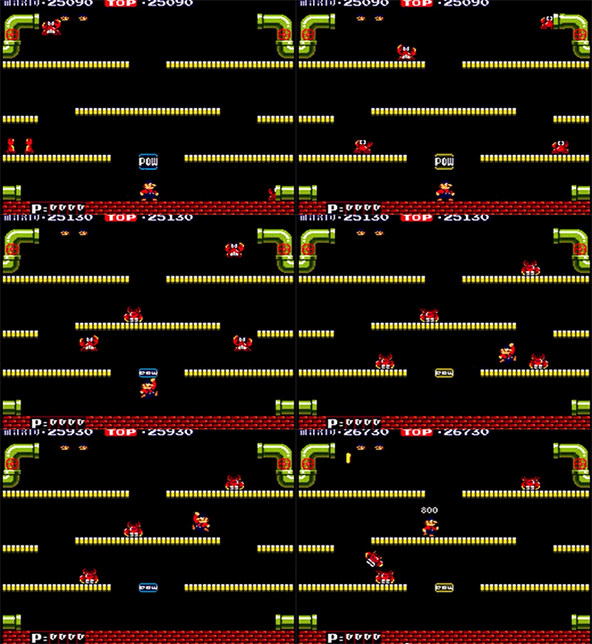
Screen Shake: The POW Block was first introduced in Mario Bros. (1983), which is the first example of screen shake in the series and, from what we can tell, in all video games. The POW Block was introduced into the side scrolling games with Super Mario Bros. 2, but was surprisingly absent from the 2D Mario platformers from then until the New Super Mario Bros. series 2006. Screen shake is often used when large enemies crash into the ground. (e.g. Super Mario Bros. 3 final Bowser battle)

Gif from Scroll Back by Itay Keren Gif from Scroll Back by Itay Keren
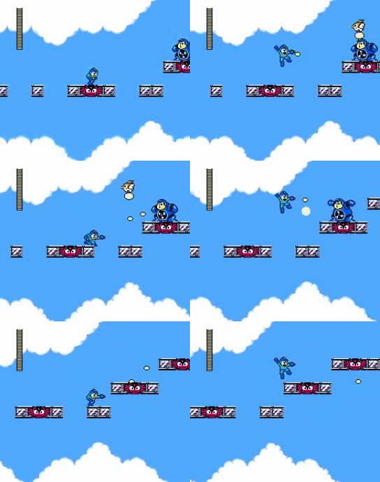
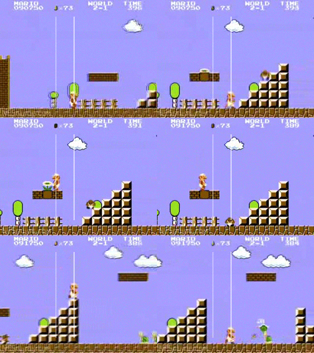
Camera Lerp: The 2D Mario platformers use the camera design that was established in Super Mario Bros. for the NES. The camera keeps Mario oriented slightly off center so players can see what’s up ahead. The camera will also accelerate to catch up to Mario when he speeds up. Camera lerp is used to smooth out the motion of the camera view. See Reblog: Scroll Back by Itay Keren for more details on camera design and terms.

Enemy Count: Since Super Mario Bros., 2D Mario platformers’ challenges are a balance of overcoming level elements and and enemy elements. Enemies are mostly used as a dynamic obstacle while not being the focus. In other words, Mario gameplay is primarily about moving and jumping not enemy combat. Mario games generally don’t ramp up the enemy count as the main way to increase the challenge for players. There are a few notable levels in each game that feature many more enemies than normal. Examples from New Super Mario Bros. Wii include 1-4, 4-1, 7-Tower, 7-6.

Faster Enemies: The fastest horizontally traveling enemy element in a Mario game is typically a kicked Koopa shell. Most Mario enemies move at a brisk walking pace. Mario enemies don’t amp up in speed as a means of increasing challenge. This is mostly because Mario’s challenge comes from the layered design combining level and enemy elements. Because enemies also interact with the level in dynamic ways (falling off platforms, destroying platforms, etc.) it works best to keep their movement relatively slow in order to give players time to react and plan their actions.

Mega Man series

  • Mega Man 2 : 9
  • Mega Man X : 14
  • Mega Man Zero: 17
  • Mega Man Powered Up : 12
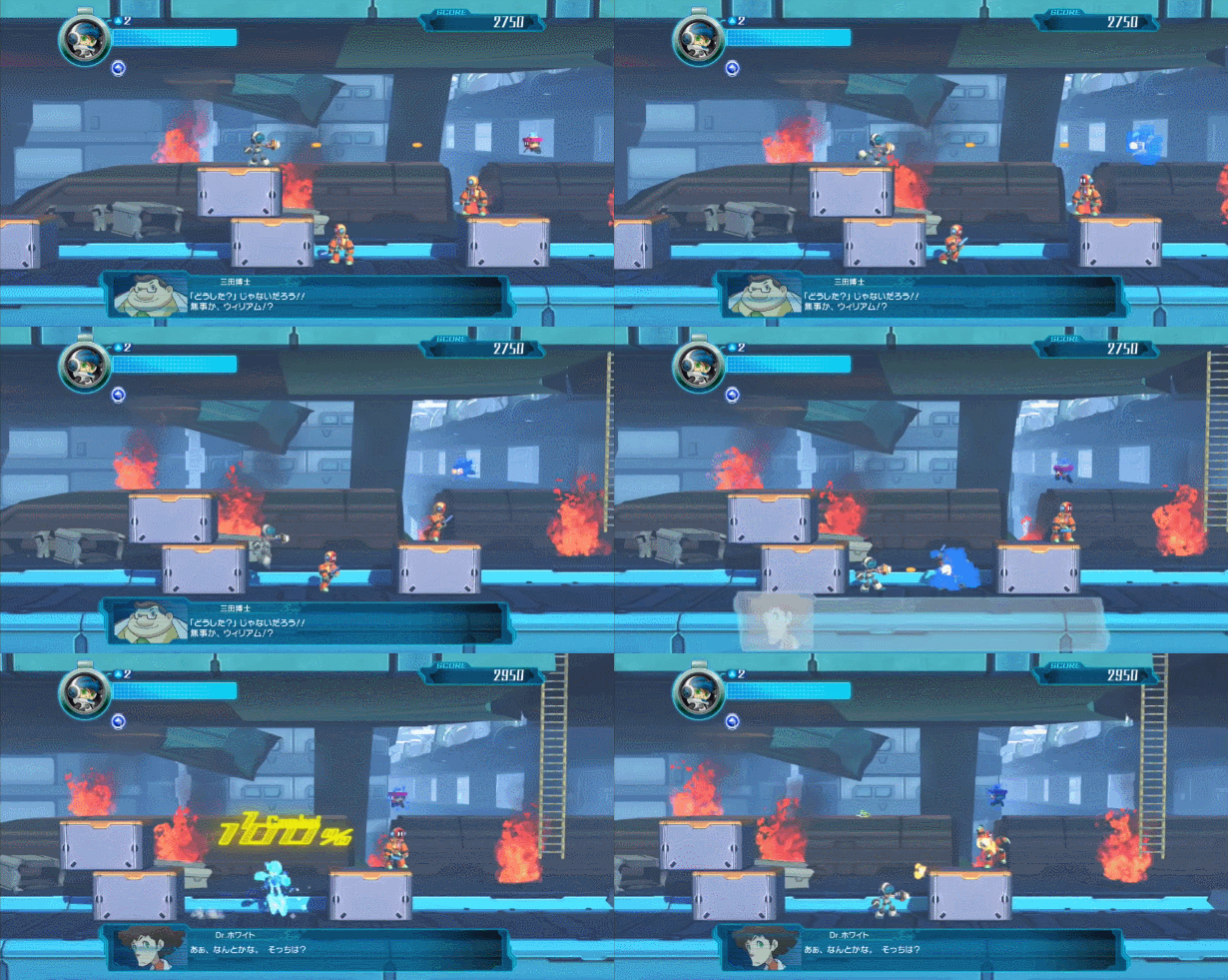
  • Mighty No. 9 : 10

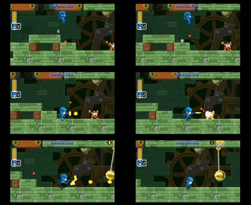
Mega Man, unlike Mario, has underwent various reboots and reinventions, tailoring the main character of the series to suit each generation of consoles and players. As his appearance changed from classic 1960’s classic anime, to radical 90’s humanoid, to Ghost In The Shell-like cyborg, Mega Man’s game design also adopted the trends of the times. While Mega Man classic can only power walk, Mega Man X and Zero can dash and wall jump, mechanics that turn a steady march through robot baddies into a kinetic romp. Mega Man can only shoot. When Zero entered the series he featured his Z-Saber melee attacks along with the Capcom game feel technique of hit pause [sleep]. Every new power and movement mechanic made these games faster and more diverse while increasing the visual flare.

As the Mega Man series grew its Vlambeer score increased. It is interesting to note that Mega Man Powered Up and Mighty No. 9 are throwbacks to classic Mega Man games and scored lower because of the homage. Mega Man Powered Up for PSP translates the 8-bit Mega Man style as cute “chibi” 3D models while keeping the gameplay as close to the 8-bit games as possible. Mighty No. 9 features a new character, new mechanics, and a new graphical style, however the gameplay looks like a mix between classic Mega Man and Mega Man X.

Various Games:

Richard says: A big take away from our examination of the Vlambeer Scale for game feel is that some points convey the Vlambeer style more than others. Lots of games have permanence, sleep, hit animations, and other effects from the Vlambeer Scale. But it’s the bigger bullets, more enemies, explosions, camera lerp, and screen shake that most effectively give a game that Vlambeer game feel.

Every game has its own style. 3D games in particular achieve their game feel differently from 2D games. Bloodborne and Splatoon both scored a 19 on the Vlambeer Scale. 3D games use many of the same game feel techniques but they don’t “feel” the same. Getting 3D cameras to work well for 3D games is incredibly difficult that often requires so much fine tuning that elements like screen shake and large (explosive) special effects are kept to a minimum.

Below are the points from the Vlambeer Scale of Quality that I feel are the most important to feature in a 2D action game in order of importance with a priority on creating good gameplay.

  1. Basic Sound and Animation. If your game doesn’t have these, then it’s probably not a 2D action video game.
  2. Impact Effects are important for communicating to the player what happens to projectiles and moving objects when they interact with other objects. This effect is usually a small pop, spark, mark that appears when bullets collide with enemies or walls.
  3. Lower Enemy HP works well in action games because the lower HP correlates with fewer actions needed to take the enemy out. The fewer the actions, the better players can mentally keep track of their damage over time because the value is well within our short term memory capacity. A common trope of boss design is the 3-hit-KO.
  4. Strafing comes in many different varieties. I love strafing in action games because it creates an asymmetric relationship between offense and movement. Being able to move and shoot at the same time at maximum effectiveness allows for simple solutions. Simply move well and shoot well. When offense comes at the expense of movement more interesting choices have to be made because there is a tradeoff between both types of actions.
  5. Sleep along with impact effects are very important for communicating to the player exactly when interactions take place. Impact effects alone are good for projectile interactions, but for certain collisions, like melee attacks, localized “hit pause” or global “sleep” is incredibly effective at communicating when collisions occur and seeing how the hitboxes overlap.
  6. Hit Animation are specific effects and animations played for when two game elements interact. The more complex the interacting elements, the more specific hit animations help communicate the game actions to the player. Look very carefully at a fighting game like Street Fighter, weak, medium, and strong hits cause characters to recoil with different animations. Also, fiery and electric attacks have a unique hit animation. The classic and perhaps most common type of hit animation is when elements flash a color (usually white).
  7. Bigger Bullets. Making informed decisions while playing an action game requires the game to communicate its actions well and also to have fewer actions on the screen to consider. Along with lower enemy HP, bigger bullets help players keep track of how many projectiles they launch. This design tip applies to melee attacks and other kinds of actions. It’s important to be able to count each individual action and potentially see the result of each.

Reblog: Combat Turn Design Decisions by Thorin

POV: DESIGNER.  DIFFICULTY 3.  LEVEL 1 - 1 POV: DESIGNER.  DIFFICULTY 3.  LEVEL 1 – 1

In the article Combat Turn Design Decisions Thorin makes the case that designing how a combat round works in a tabletop RPG has to balance keeping everyone involved and attentive, and actually letting players do substantial things on their turn. Quick turns mean less can get done, but players stay more engaged because they’re acting more often. Longer turns allow the players to have a lot of positive feelings of agency, but those who aren’t currently taking their turn tend to have their attention wander. Thorin suggests a simultaneous planning system in an effort to compromise.

Mike says: Thorin brings up a critical point in the design of tabletop RPGs, and his attention to player psychology is very well-placed. My concern with this article is an absence of detail in what actions actually mean and how much time they tend to take. When analyzing this topic, I would look closely at exactly what kinds of things players have to do to plan and resolve actions. I’d carefully take notes on where players got hung up, and on how engaged other players were during off-turn periods.

From my experience with tabletop RPGs, playing and running games, Thorin’s approach seems somewhat reductive and overly-simplistic. Much more work could be done here to make a convincing argument. As it stands, I’m not convinced his dichotomy is necessarily the case, nor am I remotely convinced that his suggested solution effectively addresses his concerns without opening up further cans of worms.

Richard says: I agree with you, Mike. I had a hard time wrapping my brain around Thorin’s ideas because they’re in an awkward space between abstract game design analysis and concrete examples. He doesn’t break things down into design parts like mechanics or difficulty design. And he doesn’t pick a specific tabletop game to illustrate his point. The result is a collection of thoughts that presents a vague issue and suggests a few game design knobs to twist in search of the solution. There are so many factors in a games design and outside its design that can create the negative effects Thorin outlined. 

Vlambeer Scale on Vlambeer Games

POV: DESIGNER.  DIFFICULTY 3.  LEVEL 3 - 1 POV: DESIGNER.  DIFFICULTY 3.  LEVEL 3 – 1

It’s time for the judge to be judged. We’ve nearly come to the end of our Vlambeer Scale article series. So far we’ve used the Vlambeer Scale of Quality to measure the Vlambeerian game feel of Ridiculous Fishing, Ninja Fishing, and an upcoming indie game called Downwell. Now the question is how do Vlambeer’s games measure up?

The following is a list of Vlambeer’s games in chronological order and some of the points from the Vlambeer Scale of Quality that each game does not have.

Super Crate Box

Muzzle Flash, Impact Effects, Enemy Knockback, No level of permanence, Lerp (no camera manipulation at all), Sleep (only for katana), Strafing Muzzle Flash, Impact Effects, Enemy Knockback, No level of permanence, Lerp (no camera manipulation at all), Sleep (only for katana), Strafing
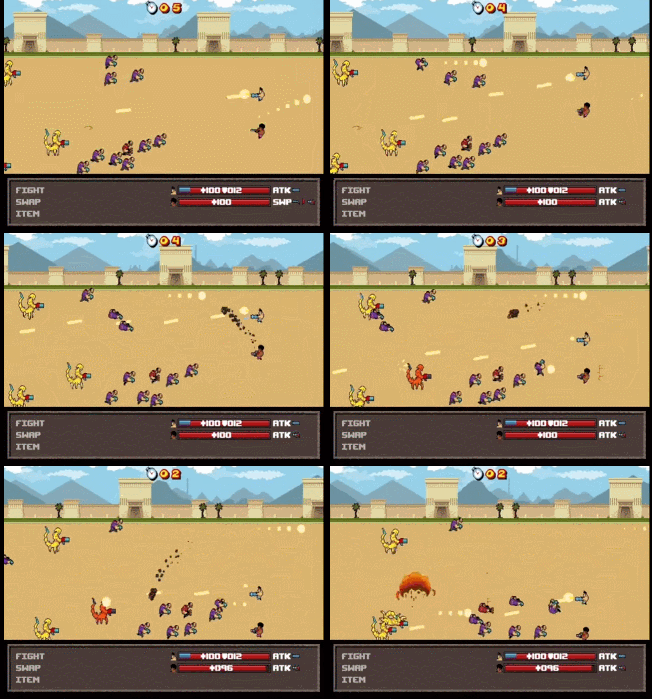
Serious Sam: The Random Encounter

Enemy Knockback, Level 2 and 3 permanence, Player knockback, Sleep, Gun delay, Camera kick, Meaning Enemy Knockback, Level 2 and 3 permanence, Player knockback, Sleep, Gun delay, Camera kick, Meaning
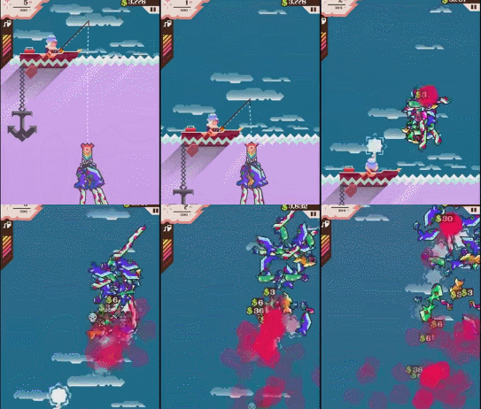
Ridiculous Fishing

Hit Animation, Player Knockback (guy is in a boat), Strafing Hit Animation, Player Knockback (guy is in a boat), Strafing
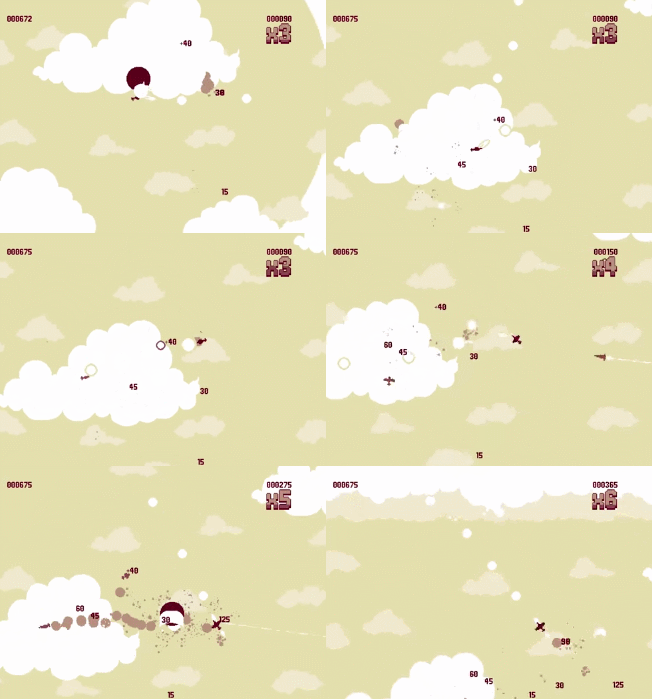
Luftrausers

Less Accuracy: No random spread with “Spread” weapon, Hit Animation,     Enemy Knockback, Player Knockback (you are a plane), More Bass Less Accuracy: No random spread with “Spread” weapon, Hit Animation,     Enemy Knockback, Player Knockback (you are a plane), More Bass
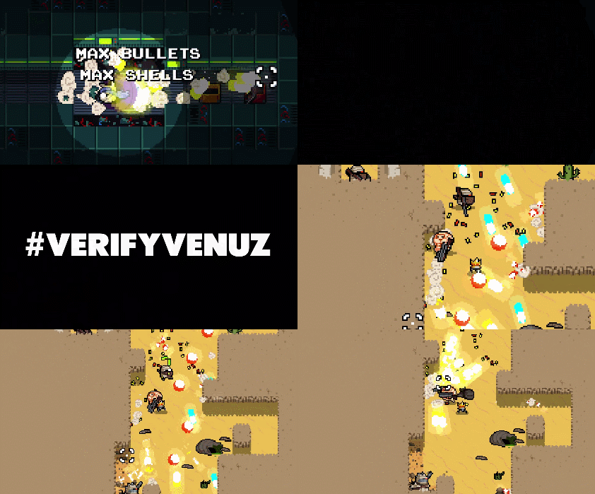
Nuclear Throne

    Random explosions, gun kickback, Player knockback     Random explosions, gun kickback, Player knockback

Marcus says:

  • Nuclear Throne The highest scored Vlambeer title with a 28 out of 31. It’s also the highest game of all the games we’ve scored!
  • Not every game has guns to fire to create camera kick or recoil. Some games seem to start off not even being able to to achieve a perfect Vlambeer Scale score. However, with a little creativity “gun based” elements of game feel can be applied to just about any action. Just look at what Death Note does to the action of writing down names on a piece of paper.
  • Player Knockback is only in Vlambeer’s first game Super Crate Box. In general, player knockback makes platforming gameplay more difficult. Most players want to push ahead when they get hurt like in Mario, rather than worry about how they will be pushed back like in Mega Man. Likewise, they want their gunshots to not affect their positioning.
  • Nuclear Throne is the only game with 3 distinct levels of permanence: bodies, bullet casings, and level destruction.
  • The element of “meaning” is in every Vlambeer game but the first two. Perhaps this is a lesson they picked up as they continued to create games. Whether from thematic setting or bits of story, a little meaning goes a long way.
  • Luftrausers embraces common tropes of flying combat games, which weakens its score.
    • With the most complex movement out of all the games, Luftrausers is about balancing moving with dodging and aiming.
    • To match the style of shmups, the bullets travel the slowest compared to the other Vlambeer games. Also, there is no random player bullet spread.
    • Luftrausers does not feature a heavy bass component. Keeping the soundscape in a higher register makes Luftrausers sound more like old arcade games.
  • The three avatar-based shooting games scored higher.
  • Serious Sam is the only game with “random” explosions. The random explosions come from firing into a large mob of enemies and hitting the “bomb” guy.
  • The three games with strafing achieve it in three different ways.
    • Strafing in the only MOVE mechanic in Serious Sam as the player characters are always running on their heels up and down the right side of the screen.
    • Strafing in Nuclear Throne is possible because the aiming is independent of a character’s movement.
    • Strafing in Luftrausers happens due to the inertial systems when the nose goes one way and the tail the other.

Richard says: back in 2010, I wrote a blog post on Super Crate Box on Critical-Gaming. Here are three points I made. Key words are bolded and Vlambeer terms are added in brackets where appropriate:

  • …because of the high game speed, it’s more difficult to judge the hitboxes and other interactions in the game. Sometimes I thought that I dodged an enemy, but I died. Other times I survived without being able to see how. And because the game doesn’t pause [sleep] (even slightly) when you die (like in Super Mario Bros or DKCR), sometimes the exact cause of your death is mysterious. Or my difficulty in understanding the interactions could be due to the way the hitboxes are designed. Either way, I feel that something should be tweaked.
  • [Super Crate Box has] excellently tuned weapons with an excellent coverage of the design space. Nice sound effects and unique feel created by screen shaking and other visual effects.
  • The 3 enemies and their speed upgrades [faster enemies] create just enough contrary motion that layers together nicely to create varied challenges.

Looks like the game feel of Super Crate Box is an important part of the experience and an important talking point. After all, I wrote this 5 years before we started the Vlambeer Scale of Quality here at Design Oriented.