I’m in Your Skin, Using Your Moves

POV: DESIGN.  DIFFICULTY 2.  LEVEL 1 - 1
POV: DESIGN.  DIFFICULTY 2.  LEVEL 1 – 1

Mike says: I’ve been playing Abyss Odyssey recently. It has a mechanic where when you have full mana you can use a special attack to capture the soul of an enemy once it dies. You can also gets monster souls by buying them from shops, but shop selection tends to be pretty limited compared to what you see in the dungeon. You can only have one soul equipped at a time, and you can press a button to transform into the monster whose soul you captured. Pressing the button again transforms you back into your actual character. You can’t gain mana while you’re in the soul-form, but it does give you another character worth of HP. Since Abyss Odyssey has permadeath-lite, having that extra health bar can significantly improve your chances of beating the game. When you lose all you HP as the monster, you lose its soul and have to somehow collect another one.
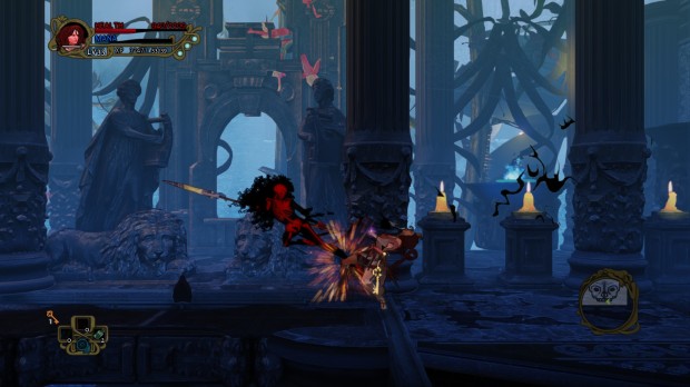
Once you’re transformed into an enemy you can use all of their moves–all of the enemies in the game have the same number of moves mapped to the same inputs as the player’s character, so it’s like having a whole new character to master. This adds a whole new dimension to gameplay and offers the player a lot of new movesets to master and experiment with.

I know another example of this kind of a mechanic will immediately pop into Richard’s head, since he’s the KirbyKid. What’s your thought on Kirby’s similar mechanics in the Smash Bros. series or in Kirby’s own games?


Richard says: I have no idea what you’re talking about, Mike. Just kidding. As you described the “what’s yours is mine” scenario has two parts: capturing the target and then transforming. If there’s one character that is all about these mechanics it’s Kirby. Each Kirby game does it a bit differently. In the earlier games, Kirby would only take a single mechanic or power from his enemies. But from Kirby Super Star, Kirby gains access to a wide range of moves to use that range from simple inputs like the press of a button to directional commands that mimic fighting games like Street Fighter (see example here). Some of these powers and transformations are so complex, that I feel that I could play the entire game with those powers only!

Smash does it a bit differently. Here Kirby only replaces his neutral B attack inhale with the neutral B attack of the player he captures. So while these Smash transformations only replace one out of roughly 30 moves that Kirby has, one move may be enough to allow Kirby to take on a new playstyle.
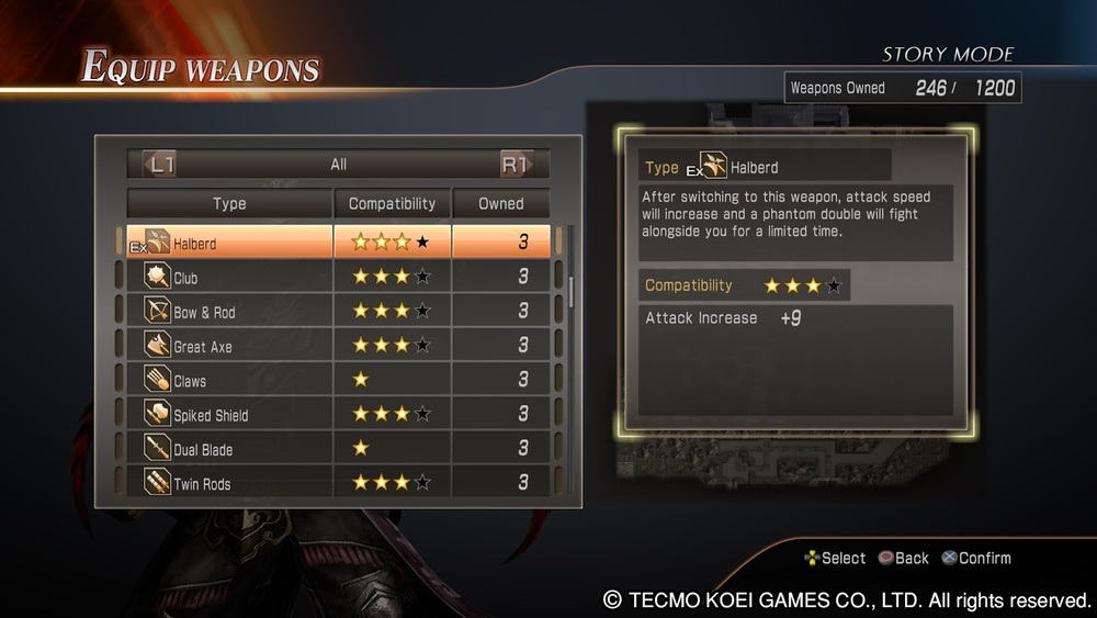
 

Mike says: Dynasty Warriors 8 also has multiple movesets that the player can choose between on the fly in battle. It’s done by weapon. You can equip two weapons at any one time, and press a button to switch between weapons. Weapons level up and are upgraded separately based on use. Enemy officers pull from the same overarching set of weapons that you do, so you can learn the movesets of various weapons and use your knowledge to your advantage against enemies by exploiting timing gaps in their attack patterns that you’ve learned from using the weapon yourself.

Richard says: I love it when enemies are designed with the same kind of rules and limitations as the player. The classic style 2D Mega Man games are pretty good at giving Mega Man the powers defeated bosses use.  

Reblog: Republican Dad Mechanics

In Republican Dad Mechanics, Austin C. Howe asserts that the bloodstain system in Dark Souls creates a perverse loop where the player will die to some combat encounter and then have to charge back into the same spot of danger to recover their souls, which is likely to just kill them again and cancel those souls forever. He claims this is bad design because it doesn’t reward the player from being diligent and careful, as the rest of the game’s mechanics suggest they should be.

Richard says: First of all, “bloodstain mechanic”  is not a mechanic; it belongs in the system / rules category. Normally, I wouldn’t point out such a thing as other critics don’t share the DO system of game element categorization. However, in this article Austin fails to build a coherent argument about Dark Souls, Bloodborne, Metal Gear Rising: Revengeance, and Bayonetta because he tries to compare a system to a mechanic.

“Thus, the game has given me something that should encourage me playing better, that is, the loss of my souls, but it’s also made those things the carrot on a stick that forces me into nonsensical loops of actions.”

The way Austin talks about the effects of dying and going back to collect the souls is vague and unhelpful. He casually argues that dying traditionally encourages players to play better. This is a rule-of-thumb game design phrase that has little substance. It’s more accurate to say that dying is the result of gameplay choices and their consequences. While it’s good to learn from one’s death, dying alone does not encourage players to play better.

Recovering lost souls by returning to the area you die is like a bonus second chance opportunity. Having this opportunity doesn’t force Austin to play a certain way. Repeatedly dying trying to recover lost souls is not nonsensical because the opportunity exists. Going after a bloodstain is only a foolish waste of time if players realize they cannot successfully retrieve what was lost and still attempt to do so. If players skip the opportunity, then their death and respawn is just like other games with traditional save point or checkpoint features. If the player attempts to recover lost souls, the player only stands to lose what he or she collects on the way back to the spot of death.

… for a game as ludically focused as the FromSoft games tend to be, I’m just gonna call it misguided design.

put in mechanics that encourages gamers to more consciously engage with the interactions at hand. But in these cases, we have system upon system built to encourage wild and often unrewarding risk-taking.

I find it odd that Austin shifts the blame of his failures from himself to the game. He described his experience with the bloodstain system as one that often ended in further death and frustration. Later he describes his game experience engaging with Bloodborne’s Rally (Regain health regenerating) system as being “wild” and “unrewarding.” The bottom line is that these games leave the door open for a wide range of applicable player skill and strategic approaches. There’s much more to playing than the simple decision of “do I return to where I died” and the result of “did I retrieve what was lost?” Because most of the outcome is determined by player skill, we cannot say that the game encourages the player to be wild and overly risky. The fact is, the bloodstain system and the Rally system are just rules; rules that should be factored into the players risk reward calculations. Though these systems may change the balance of player choices, the player is ultimately in control.

Talking about this bloodstain system is tricky because it’s a system that ties into level design, modes / features, and difficulty design. With all of that ground to cover, just talking about this one system alone caused Austin to overscope. Unfortunately, Austin seems a bit on tilt with the tone of this article, and he seems too wrapped up in making clever analogies to build an argument.

It would’ve been easy for them to look at player inputting those parries too early and say “git gud scrub” and walk away, but Platinum actually wants people to enjoy their videogames so they don’t do that. Instead, they offer a version of the parry that can be activated much earlier

Here Austin talks about the parry mechanics in Metal Gear Rising: Revengeance and Bayonetta. These are mechanics, not systems. To make an apt comparison, Austin should have compared the parry in Dark Souls or Bloodborne with these games. Focusing on just mechanics would have probably resulted in a much tighter argument.


In the one opportunity Austin has to bring the conversation full circle after overreaching and over-scoping, he blames the fanbase in a particularly crude remark.

How would you implement those kinds of risk-mitigation mechanics in Dark Souls? Well . . . you don’t. Because the fanbase would never shut the f*** up about it.

One Night Wereworlf Chang Edition

POV: PLAYER.  DIFFICULTY 3.  LEVEL 1 - 1 POV: PLAYER.  DIFFICULTY 3.  LEVEL 1 – 1

Everywhere I go, I always seem to find a design-oriented conversation. This time, I was hanging out with friends in a hotel room at an anime convention. Every year for the last 10+ years, we meet up to play some video games and some board games. This year we played One Night Ultimate Werewolf.

Going into that session, Marcus and I knew next to nothing about this style of game. As is common with board games, the person who brings the game to the group takes up the role of explaining the rules. Meet the guy who brought Werewolf, Chang, the shirtless guy with the green hair. Without much introduction, Chang sucked us into a detailed discussion of his customized deck for the game.

The point of this article is to highlight some of the design-oriented points made in this real-life conversation. Before we hear from Chang, I’ll summarize how One Night Ultimate Werewolf works:

  • The game is played with 3-10 people all sitting around in a circle.
  • There’s a deck of roles (character cards) selected for the game.
  • Each player draws a character card and looks at their role while keeping it a secret from everyone else. Roles are different types of villagers and werewolves defined by their special abilities.
  • NIGHT PHASE: Everyone closes their eyes and the moderator gives a set of instructions for everyone to follow in turn. Instructions involve having a player open their eyes, do an action, and then close their eyes again. Our moderator was a customisable cell phone narrator. (Very fancy!).
  • DAY PHASE: Everyone opens their eyes. It’s up to everyone to then figure out the roles of the other players. Keep in mind that no one can look at their role card at this time and that the roles have probably been switched around or manipulated in some way.
  • VOTE PHASE: It’s villagers vs werewolves. At the end of a set discussion time, each player votes trying to “kill” a member of the other team (villagers / werewolves). Majority vote decides who “dies.” If that player is a villager, werewolves win and visa versa.

One Night Were Wolf Chang Edition

For One Night Ultimate Wereworlf, Chang is both a player and a game designer. He is very clear about why he dislikes playing with certain cards and articulates his idea of a well-balanced deck. Most often we discuss balance in terms of preventing game elements from being too powerful or too weak. In Chang’s case, he considers the difficulty of his deck for new players and the balance of skill, which he expresses as warding against too many “chaotic” elements. Notice in the video how others in the room like character cards that Chang dislikes. Often Chang chose not to include a card into his deck because of the deck’s overall balance not because he’s against the particular card.

The following are comments and notes extracted from our conversation with Chang.

“My goal for smaller games and [when playing with ] people who are new, [is to remove] cards that have too much chaos or cards that don’t introduce fun into the game (sit out roles or taking people out of the game. E.G. villager, revealer).“ ~Chang

  • In One Night Ultimate Werewolf, you need to figure out what role you are and figure out what everyone else is. You can only do it based on what other people say and the werewolves don’t want you to know that they’re werewolves. This game is about lying. That’s the difficult part and the most fun part. It’s like a group puzzle.
  • When you play regular Mafia you already know your own role, but with One Night Ultimate Werewolf, you may think you’re one role in the night phase, but in the day phase you might not be that role anymore.
  • Removing players from the game is a problem with Mafia. You can take out a player very early and that person doesn’t get to play more until the whole game is over which can take anywhere from 10-30 minutes.  
  • Chang likes the Alpha Wolf card because it adds or removes a wolf card and this isn’t too chaotic.
  • According to Chang, One Night needs at least 5 people to be consistently fun. 10-player games are still fun but some people get left out of the discussion part because there are too many voices.


  • The Villager role doesn’t have a special ability Having this role in the game means Werewolves can claim that they’re a villager and thus don’t have to make up a dangerous lie about using a special ability they didn’t actually use.
  • Whoever the Bodyguard points to during the VOTE PHASE is protected from being killed. Chang thinks it would be more interesting if the Bodyguard role could only protect Werewolves as a Werewolf-Bodyguard. Villagers by default have more power than Werewolves because the more people discuss the easier it is for werewolves to expose themselves. If the Werewolf-Bodyguard existed, that player can listen in on the discussion,  and then upset the Villager’s voting efforts by protecting a werewolf caught in a lie.
  • Chang introduces the Paranormal Investigator into his deck when playing with an experienced group of players because the role has more complicated rules than most roles.
  • In Chang’s idea of a well-balanced game there should never be a role that is a “0%” where there is no reasonable way to find out who has the role or what actions were taken during the Night phase. Likewise no role should be 100% where it’s too easy to find out who has the role and that role does the same action in the same way every time. This means Chang doesn’t play with the Revealer card, a role that reveals another player’s role for the DAY PHASE.
  • Village Idiot creates complete chaos by switching around all the role cards (excluding his own card) in a clockwise or counter-clockwise fashion at the end of the NIGHT PHASE. This role can nullify strategic choices made by other players by scrambling the order of things. The role always goes last and thus has a ton of (chaotic) power.
  • During the NIGHT PHASE the Drunk switches two players’ roles without looking at them. During the DAY PHASE it’s very hard for the group to gather enough information to follow the trail and figure out what the Drunk did. The Drunk doesn’t make informed decisions in the NIGHT PHASE and does not gather much information to share with the group in the DAY PHASE. The Drunk is essentially a dice role.
  • “The deck I created is more structured and balanced, creating uncertainty without making it too confusing.” ~Chang. I like how Chang doesn’t completely reject all elements of “chaos” from his games, but, like randomness (which essentially the function of the Drunk), a touch goes a long way.

A Platforming Thread Through E3 part 3

POV: DESIGN.  DIFFICULTY 2.  LEVEL 3 - 1 POV: DESIGN.  DIFFICULTY 2.  LEVEL 3 – 1

The woolly world of Yoshi reminded us of the yarn aesthetic of Unravel, and in part 1 and part 2 of this article series we examined the yarn-like mechanics and design of these two games based on their E3 trailers. Yarny, the player character in Unravel, has a diagonal grappling yarn shot that reminds us of Chibi-Robo! Zip Lash.

Game Category1 Category2 Name Description Link
Chibi-Robo! Zip Lash Mechanics Ricochet Zip Lash The Zip Lash can ricochet off of objects. Video!
Chibi-Robo! Zip Lash Mechanics Zip Lash Seems to be able to aim and throw the Zip Lash in 2 directions. Forward and diagonally up forward.
Chibi-Robo! Zip Lash Mechanics pull Zip Lash The Zip Lash can grabble object and pull Chibi Robo along ending in a short jump. Video!
Chibi-Robo! Zip Lash Feedback When aiming the Zip Lash, a red laser line shows the path the throw will take. After a certain distance or maybe after a bounce, the line fades forcing playres to use knowledge based aiming instead of visual based skill. Video!
Chibi-Robo! Zip Lash Mechanics Dynamic, hover Preparing to throw and throwing the Zip Lash makes Chibi Robo hover in mid air. Video!
Chibi-Robo! Zip Lash Level Elements Multi-Coin Block Just like Mario, there’s a block that must be hit repeatedly to earn multiple coins. Video!
Chibi-Robo! Zip Lash Power-Up / Upgrade / Economy Burning Robo Special red outlets allow Chibi-Robo to catch on fire. Video!
Chibi-Robo! Zip Lash Level Elements Fire Walls Walls that can only be progress through using Burning Robo Video!

Richard: Check out the diagonal ZIP LASH mechanic. It looks like players can only ZIP LASH straight forward and diagonally upwards. If this is the case, that’s really interesting asymmetry. Mega Man is great because he can only shoot straight with his default weapon the M.Buster. This means he has to jump to aim at things in the air or on raised platforms. Having to move in unique ways and coordinate that movement with shooting makes for more engaging gameplay challenges. It’s the same way with SHMUPs that only let players shoot vertically (e.g. Ikaruga) and games like Super Mario Bros. where Mario can only shoot fireballs forward and downward. Or perhaps the best analogy is Bionic Commando Rearmed.

Marcus: Bionic Commando is a great example. Not just because it contains a very similar mechanic but because it explores the design space of using a grappling hook in an action and puzzle oriented way. Comparing the asymmetric design of these two games is tricky. But the Challenge Mode (i.e. puzzle mode) in Bionic Commando is an isolated and focused challenge absent of enemies, weapons, bosses, etc. This mode focuses on problem solving and traversal through grappling. Looking at the Zip Lash trailer, there doesn’t seem to be much in the way of battling so the puzzle comparison seems apt.

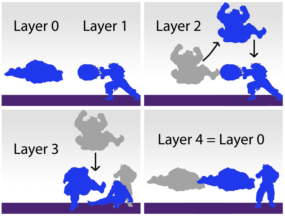
Mike: You can break this asymmetry down even further and look at the typical fighting game genre style of normal attacks. The player has to coordinate their movement along the stage, using forward and backward movement and jumping, with timing attacks that lock their character in place for varying numbers of frames. Some special attacks allow the player to move while attacking in specific ways, like Chun Li’s spinning kick and even Ryu’s fireball which he can walk behind as it slowly makes its way across the stage. This kind of trade-off and interconnection between movement and attack is so common in deep games it’s easy to miss it!

Richard: Good point, Mike. Even though the moves in fighting games are generally very quick, being forced to move or attack is the kind of asymmetry I love. I call this kind of asymmetric design “stop-and-pop” when we’re talking about shooters.

Richard: Looks like the ZIP LASH grappling spots are clearly marked as orange wall mounted level elements. Chibi-Robo! Zip Lash is doing it Zelda Hookshot style. Unravel’s anchors are, at least to my eyes, more organically integrated into the visual design. They’re easier to overlook, which is probably why the developers added that extra bit of glowing light to the anchor points.

Marcus: The anchors in Unravel function more like swinging in Bionic Commando rather than being pulled along the ZIP LASH. While I can see some of the Bionic Commando Challenge Room puzzles offering similar challenges to Unravel, the way the ZIP LASH ricochet along walls and blocks is more like the way an egg behaves in Yoshi’s Woolly World. Similar environmental puzzles could be used in both. 

Richard: Also, the ZIP LASH grabs coins and other pickups as it travels just like Yoshi’s thrown eggs and yarn balls!

Richard: The visual feedback design for the ZIP LASH is doing something pretty neat. In this game, the ZIP LASH extends in length as players progress through the level. This allows for the level design to create locks and keys pretty easily with space e.g. large gaps to cross. When preparing to ZIP LASH, Chibi-Robo swings the cord around. Notice how the red aimer turns into an ellipses near the end of its range. Also notice how a round red target mark appears when an object is in range. Looks like you’ll always know when you’ll hit an object in range, but after a bounce or two, the trajectory isn’t drawn out for you.

MIke: That’s an interesting learning aid. For most of the simple interactions in the game it lays out exactly what will happen, but for more advanced interactions involving ricochets and long distance ZIP LASHING it requires players to test their spatial judgment, experiment, and be able to forecast the ZIP LASH’s behavior.

Reblog: Swordy by Frogshark

Swordy is a local multiplayer physics based brawler. Harness momentum, physics and timing using analogue controls to send your opponents to their colorful deaths. Emergent combat offers nuance and mastery while being very accessible and easy to pick up. Twin stick genre reimagined with unconventional melee combat.

Richard Says: Swordy reminds me of Super Monkey Ball’s Monkey Fight, one of my favorite party games of all time. I use the term “party game” not to disparage Monkey Ball. That’s the official name for Super Monkey Ball’s super legit multiplayer games. Swordy features top down, multiplayer, melee based action. I love the colored, stylized blood. The dynamic size of the colored rectangles reflects the variable force of the attack according to the physics-based engine. The real time lighting and shadows coupled with how far the camera can pull back makes the action appear too small on the screen.

Mike Says: This reminds me of Hammerfight. Swing your big, inertia-rich weapon around and try to bash the other guy’s mushy bits while avoiding their weapon. The momentum of your weapon gives a kind of strategic commitment to your movement that other action games don’t have. Plan out where you’re gonna be in a second or two because all you can do is make minor adjustments once you start swinging. Those small adjustments can be the difference between your soft innards painting the arena or narrowly parrying a spiky ball of death. Cool mechanics and a nice aesthetic. I look forward to playing it.

Reblog: Balancing Multiplayer Competitive Games by David Sirlin

POV: DESIGNER.  DIFFICULTY 3.  LEVEL 1-1 POV: DESIGNER.  DIFFICULTY 3.  LEVEL 1-1

Sirlin’s classic primer on game design through the lens of multiplayer games (with a heavy focus on fighting games).

Marcus Says:  A great introductory piece to the world of game balance and a great example of how to deliver a message successfully without having to tease out, elaborate, source, and prove every detail. Which is something we note here at Design Oriented. Transitioning from Richard’s blog, Critical-Gaming, which featured a technical writing style to DO has been a learning process. Often times we feel as if we must tell the complete story on any topic least we sell the “truth” short. But as this article shows, there is a time for detail and there is a time for clarity. Some definitions in the article might seem a little inadequate to sticklers and some of the “tools for a better game” might seem a little too self-help-bookish for the people who have or are currently in the thick of game development. But who cares? That isn’t the point of the article. It’s meant to get your feet wet. There are links on the side where Sirlin goes into greater detail if that’s what you’re looking for.

Yomi is a great term for describing the Rock Paper Scissors competitive process. It’s punchy and able to be yelled in an energetic cry. It passes the cool-enough-to-be-an-anime-technique test. I can imagine a plucky young lad who hits a rough spot in his game of Rock-Paper-Scissors cry “YOMI!!! LEVEL 2!!” to power up and conquer his foe.

Mike Says: Balancing competitive games is one of the hardest things to do in game design. Sirlin’s take on the matter is informed by his own extensive practice and relative success in the field–he’s beyond qualified. But Sirlin’s definitions in the first and second page are unsatisfying to me because they often are delivered from a hindsight-rich perspective. I’m left with questions like: How does the fact that balanced games last years and years through competitive play inform my ability to judge and adjust balance now? Having a goal is great, but goals that can’t be judged for another five years are far less useful. Maybe they’re what we need, though, to keep our focus right, though I wonder who would design a hardcore competitive game and NOT want it to last a long time.

His advice to gauge your balancing efforts by categorizing asymmetrical factions/characters into tiers based on their current relative power, and encouraging the production of tier lists among playtesters, is great concrete advice. I’d like to see a lot more iteration on techniques for introducing the kinds of self-balancing systems he mentions into more genres of games, or identifying such properties of systems and getting a better grasp on them.

Sirlin’s reliance on intuition and deep understanding of the cognitive factors involved makes him highly qualified and effective as a designer, but the substance of the advice ends up being “playtest a lot and be careful, also get good at some game at some point” which is advice I’ve read just about everywhere in game design. The road to being a great game designer is incredibly long and arduous–the road to consciously understanding game design seems to extend into places far outside of where our feet have carried us.

Richard Says: Those diagrams do a pretty great job of showing the different outcomes of a double blind game scenario. You probably have to have Street Fighter knowledge to understand though. It’s still one of the best documents out there that talks about balance. Years ago, this pdf sparked a lot of content on my old blog Critical-Gaming.

Reblog: Flip by Ryan Juckett

POV: DESIGNER.  DIFFICULTY 2. LEVEL 1-1 POV: DESIGNER.  DIFFICULTY 2. LEVEL 1-1

From Ryan Juckett’s website:

Flip is a fast paced, competitive 1v1 action game that I’ve been making in my spare time. It is played on a grid of black and white tiles where each player is restricted to either side. Players flip tiles towards their color to gain control and close in on the enemy. With every action changing the play space, each round evolves into a unique battle field.

Marcus Says: Indie games are a great place to find new, innovative, or quirky ideas. While there are some out there who insist there is nothing (completely) new under the sun, that everything we create now is a different take of something done before, finding something “new” that hits your brain and reorganizes your perceptions, is still pretty cool. Upon first seeing Flip I said to myself “wow, there is nothing else like this”. But after thinking about it, this Traversable Territory system/rule, has shown up elsewhere. You could even say it’s in vogue right now with the upcoming Splatoon. Flip does present the mechanic in a unique way. So I guess it is better to say “wow there is nothing else QUITE like this”.

Richard Says: Reminds me of Polarium, an old puzzle game for the Nintendo DS. Those black and white squares, yo. I’m a fan of the clean look, the slow bullets, and the crisp audio feedback. The game also has bullet to bullet interplay (bullets can clash). Such mechanics are somewhat uncommon in top down, shmup style games. 

Mike Says: I actually want to play this one. Nice simple and clear aesthetic. Seems like it’ll be a deep competitive game that rewards equal parts good timing and reactions, and on-the-fly planning. The maps wrapping around the screen can be a bit of a mind-bender when you have to process the action quickly to dodge a shot or cancel it with one of your own bullets. The way that bullets convert space to impassable for your opponent adds another dimension of interplay to the 2D space + bullets concept that I haven’t experienced before.

Tweet us by clicking the bird below and tell us about games that also feature “traversable territory.”

Pac-Man Design: Arcade. Doodle. Map. Mechanics

POV: DESIGNER.  DIFFICULTY 2.  LEVEL 1 - 1 POV: DESIGNER.  DIFFICULTY 2.  LEVEL 1 – 1

On May 21st 2010 Google cost the world $120 million. I remember it as the day I visited google.com and found a playable version of Pac-Man in place of Google’s logo. The doodle wasn’t any larger than the normal logo, but the faithful recreation of the sights, sounds, and gameplay of Pac-Man took me from yet another Google search to a glimpse into my past. Now, about five years later, Google has outdone itself with another Pac-Man project.

On April 1st, 2015, I got to play Pac-Man through the streets around my apartment, the DFW airport, and exotic locations around the world via Google’s April Fools’ Day promotion that created Pac-Man levels out of map data.

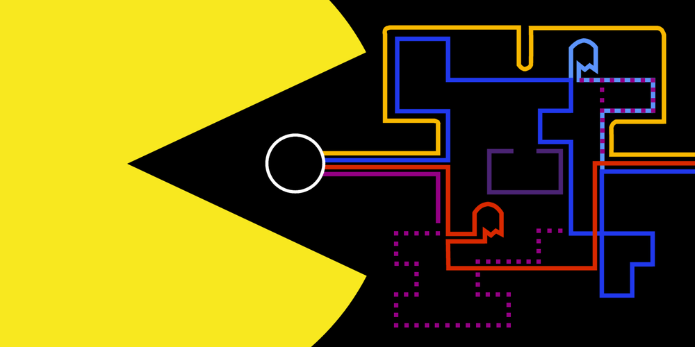
Between the original Arcade version of Pac-Man and the two Google Pac-Man projects, we have the perfect case study to examine the design of this classic. Because Pac-Man is a relatively simple game, we can dig deep into its entire design and highlight how the small differences between Google’s recreations and the original game make a big difference in the player experience. In this article, I’ll cover the basic mechanic of Pac-Man and build from there in future posts.

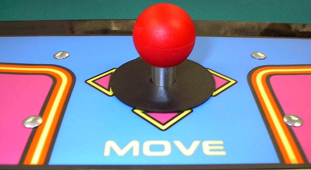
There is only one mechanic in Pac-Man; MOVE. No jumping, punching, or shooting. Just moving up, down, left, and right with no momentum or acceleration to worry about. In fact, You don’t even have to hold a particular direction since Pac-Man continues to move in the direction he’s going until stopped by a wall or a Ghost. What’s great about Pac-Man, and what creates gameplay of interesting choices, isn’t deciding how to move, but deciding where to move and when. Still, with controls so simple, there are a few subtle details in the tuning of Pac-Man’s MOVE mechanic we should cover.

In the original Pac-Man arcade, the entire game is designed to fit onto a grid. Pac-Man and the Ghosts are one square large. The walls and lanes are also mapped to this grid so that all movement through the maze is both clear in how it communicates travelable spaces, and clean in that there are no sprite edges to get hung up on as Pac-Man rounds corners.

To make movement even smoother, players can input the direction they want Pac-Man to move before Pac-Man reaches a turn. Doing so allows Pac-Man to turn the corner as quickly and efficiently as possible. This leaning into turns due to the buffered input helps reduce the skill needed to make efficient turns thus freeing up the player’s attention to focus on the strategy of surviving the maze.

The Google doodle nails the controls of Pac-Man. It’s free and you should play it right now to remind yourself how smooth controls lay the foundation for smooth gameplay. Treasure the finely tuned controls while you have them because the controls in the Google map Pac-Man are frustratingly bad.

The core creative conceit of Google Maps Pac-Man (GMPM) is obvious: play Pac-Man out on the roads of the world. The organic geometry of roads, with curves and many-way intersections at odd angles, significantly complicates the control design of Pac-Man.

There are two facets of controller design to focus on here: directness and intuitiveness. Controls are direct when mechanics (player actions) are designed in a way that matches the input method. For Pac-Man arcade version Pac-man can only ever move in a cardinal direction, and an arcade stick allows only cardinal directions, thus forming a perfect mapping. In other words, the player cannot manipulate the input in a way that can’t be reflected in the game. Pressing up moves Pac-Man up always. This design also makes the controls intuitive.

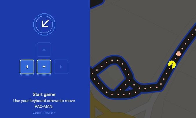
In GMPM, even the controls are not as direct or intuitive as the Pac-Man arcade version, and I blame the curves. When you press up on the Google Maps version, Pac-Man’s path can eventually curve so that Pac-Man moves left, right, down, or any angle in between. Pac-Man will keep traveling down even a curved path automatically. But it’s when I attempt to buy time by moving back and forth along a single curved road that the lack of directness becomes troublesome. On a curved road do I press left-right-left, up-right-up, or some combination of diagonals?

Diagonal road intersections are especially frustrating in GMPM. It’s hard to tell if you should press one or two directions to make a diagonal turn. Because the turns can branch off at any angle, even adding diagonals through 8-way movement controls won’t eliminate ambiguous turns. Since you often can’t tell where Pac-Man will go at an intersection if you hit a certain direction, playing Google Map Pac-Man becomes more about how to move instead of just when and where.  

D-pads are the best input device for instantaneous movement at constant speeds and quick, repeatable discrete movements along 4 axes. Curved movement in games necessitates the use of more complex rules to govern movement that tend to benefit from more complex control input devices like analog sticks. Fortunately, the Google map Pac-Man offers mouse control. With a small yellow arrow indicating the direction Pac-Man will move if possible, the mouse helps players navigate curved paths and angled turns with greater accuracy than the digital arrow controls. Unfortunately, because the mouse is a relative pointing device, Pac-Man will attempt to move toward the mouse cursor at all times. This means you can’t simply move down roads by tapping a direction and taking your hand off the controls. If you aren’t constantly adjusting where the mouse points, Pac-Man may take turns or even reverse direction when unintended. The worst case of this is happens when Pac-Man moves off the edge of the screen–where he ends up is often asymmetrical to where he came from and unpredictable. Keeping control over Pac-Man via mouse position tends to require quick and precise mouse movements. During these brief moments, I feel like I’m playing a first person shooter, not a maze runner.

For the Google Map Pac-Man I like the arrow keys for their simplicity, but I end up using the mouse controls for their accuracy.


Controls and mechanics are the first step to understanding a game. In part 2, we’ll look at what makes Pac-Man gameplay so interesting