Inversus Blind Play and Game Breakdown

The commentary audio didn’t record correctly. Fortunately our notes are down below. 

Game Category1 Category2 Name Description
Inversus Mechanics directional face buttons FIRE Tap the x button to fire left. Tap the B button to fire right. etc.If the player has a red bullet, it takes priority and is fired before white bullets.
Inversus Mechanics charge CHARGE Hold a fire button to charge your shot. Movement is slowed only when the carge is nearly complete. Normal movement is 1.67 faster than slow charge movement. Aprox 1 second to charge. A charge shot fire 3 bullets in 3 consecutive lanes. A charge shot only consumes 1 bullet.
Super Monkey Ball 2 Mechanics charge Hold B to charge. Charging slows down player movement and rotation speed. Players must pick a direction to charge because of the control scheme. This direction cannot be changed.
Inversus Systems / Rules screen wrap Screen Wrap Move to the edge of a screen and appear on the opposite side. Not univerisal feature on all levels.
Inversus Feedback CHARGE When charging, the ammo count inside the character spins, and then locks into place hilighting the bullet that will be shot next (red or white). The highlighted piece of ammo also shows which direction the player is commited to.
Inversus Power-Up / Upgrade / Economy Red Bullet Collect the red bullet and fire a fast shot. Fast shots have normal stamina and can be clashed with other bullets. Players can collect more than 1 red bullet. Collected red bullets override a white bullet if the player’s ammo is full. 2.25 times faster than white bullet.
Inversus bullets
Inversus Level Elements Grey block that can not be fired through, colors can not be changed
Asteroids Systems / Rules Screen Wrap
Inversus Level Elements clash Red Bullet spawn Respawn with a red bullet every 12 seconds. When there’s a red bullet up for grabs, shooting the square will the opposite color will clash and cancel the power-up and reset the timer.
Inversus Systems / Rules ammo, regenerating Bullet Respawn timing After shooting all of one’s bullets, they respawn at these second intervals. 2.65 – 1.91 – 0.63 – 0.48 – 0.31 . Also, shooting a bullet does not reset the first interval to 0 seconds. Epona style.
Inversus Mechanics clash Bullets collide with bullets and cancel each other out.
Inversus Level Elements Gray wall A solid object that cannot change polarity. Cancels bullets on contact.
Inversus Mechanics analog stick Move The movement is analog. Can “creep” very slowly or go full speed.

Reblog: How I’d Redesign Piano Sheet Music

POV: DESIGN.  DIFFICULTY 2.  LEVEL 1 - 1 POV: DESIGN.  DIFFICULTY 2.  LEVEL 1 – 1

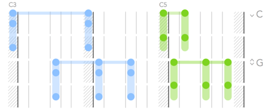
In his article How I’d Redesign Piano Sheet Music, Alex Couch suggests a new way to notate music which is oriented towards notating simpler popular pieces of music and getting newer players playing songs they know in as pain-free a way as possible.

Mike Says: I love that Alex consciously limits his audience as a way of freeing him up from what could be onerous constraints that would make the notation harder to read, like allowing the notation to accommodate precise timings. This is a critical design technique for user interfaces–focus on what the user is actually going to be doing and make that workflow as clear as possible instead of clouding the experience with all the knobs and buttons and text needed to manipulate and describe the much larger set of advanced features that only a power user would know how to use.

His choice to present the information in a downward-flowing format draws directly from the physical layout of the piano. It’s a great way of making the notation analogous to the real world, thus making it intuitive. I’m reminded that intuitive designs do not appeal to some foundational objective common-to-all-humans quality most of the time–intuitiveness in design is a matter of knowing the expectations and past experiences of your users and trying to maintain consistency with those experiences as much as you can.


Marcus says: I have long made my frustration with reading sheet music known to anyone within earshot of my piano practice. As any one of my piano teachers over the years would tell me: sit up straight while playing. It’s advice I’m forced to ignore. The only way I can read the tiny notes laid across their skinny bars is to lean forward and squint my eyes. I’m always dreaming of another way to read sheet music so I jumped at the chance to use Alex’s new notation. One short Sunday afternoon practice session later and………I’m still coming to grips with it. It should be no surprise, reading any type of language, no matter how simple, takes time. The notation does a number on my noodle but if anything I’m starting to see the strengths of the notation shine through. Giving a greater priority to the spacing of the notes creates a visual on the page that is more like how I have to visualize the space my hands must carve out when I’m playing a piece. I’m going to keep working at reading this new notation. Maybe it’s the solution to my sight reading woes.


Richard says: Marcus, you think you’re frustrated with piano sheet music, remember when I blogged about it on Critical-Gaming? Mike started making this comment, but I’ll finish it. Take note of the excellent structure of Alex’s article. He articulates what his project aims to do, what it doesn’t aim to do, and the various features of his Piano Tablature system. He even discusses the pros and cons of his system. Great stuff Alex. The only thing left to do now is actually sit down and work with Alex’s new system. Alex is in luck. All the writers at Design Oriented are musicians. Mike, Marcus, and I play piano as well. I’m inspired to not only try it out but to start a new article series linking music and game design. I’ve got Guitar Hero, Rhythm Heaven, and Sentris on the brain, and I want to talk about notation (UI/UX), level design, and mechanics. Stay tuned.

Chris says: I’ve never had much difficulty reading sheet music, so perhaps it’s no surprise that Alex’s redesign isn’t really something I can see myself experimenting with. It takes time to learn any system of representation, but I actually find it less distracting to use systems that are more abstract – like language and sheet music – than those that rely on a large dose of literal representation – like Alex’s system. The beauty of abstract designs is that you don’t have to think too much about how the representation and the represented object are the same in order to understand what’s going on; instead you just have to think about the represented object itself.


Reblog: Play What You Like’s Guide to SRPGs

POV: JOURNALIST.  DIFFICULTY 3.  LEVEL 1 - 1 POV: JOURNALIST.  DIFFICULTY 3.  LEVEL 1 – 1

Mike says: I’ve been digging around the internet for design analysis on SRPGs (TRPGs as they’re more widely known in the west) since I started my series on Final Fantasy Tactics. Play What You Like is one of the few particularly useful sources of opinions focused on the genre. The author, Gregory Faccone, catalogs and posts a relatively brief critique on each SRPG that he plays.

Though I think that many of his reviews include important information about the games in question, and I would definitely play the SRPGs he recommends strongly, his approach to analysis leaves me wanting. His judgment-heavy posts seldom back up their claims with solid evidence. He clearly has certain expectations and assumptions about the genre that are not specified anywhere, yet his expectations play a critical role in his opinion–and so many of his opinions are presented with no further analysis or explanation and in a disorganized fashion. I think he has the knowledge to do fantastic analysis, but from the five posts on the site that I’ve read he seems to be unwilling to provide the structure and detail necessary to properly articulate and substantiate a critique that would satisfy me.

Richard says: “Conquest did a fine job including a great many [Pokemon] in a deeper way than typical Pokémon games.” a bold claim indeed. I agree with you, Mike. The breadth of topics covered in the Pokemon Conquest analysis is pretty great. He mentions everything from mechanics, level elements, modes and features, to feedback issues like the 3D environments occluding the player’s view of Pokemon. The game design reasoning behind his claims is often missing. I learned enough about this game from the analysis to push me over the fence. Now to look for a copy to purchase.

A Platforming Thread Through E3

POV: DESIGNER.  DIFFICULTY 2.  LEVEL 1 - 1 POV: DESIGNER.  DIFFICULTY 2.  LEVEL 1 – 1
Game Category1 Category2 Name Description Link
Yoshi’s Woolly World Level Elements Matter Splatter style Yoshi platforms that are only interactable when the “light” is shining on them. Video!
Yoshi’s Woolly World Mechanics Dynamic Use yarn egg shots to create platforms from outlined areas. Video!
Yoshi’s Woolly World Mechanics Dynamic Use yarn to tie Piranha enemy’s mouths shut to make it vulnerable to jumping. Video!
Yoshi’s Woolly World Mechanics Ricochet Egg Toss Tossed eggs bounce off of walls. Video!
Yoshi’s Woolly World Power-Up / Upgrade / Economy Power Badge Spend gems to buy powerups that help you in various ways. Reveal secrets, power up attacks, become invincible.
Yoshi’s Woolly World Feedback Bowtie Knot This visual element lets players know they can use their tongue to unravel the object.
Yoshi’s Woolly World Enemy Elements Health If you throw a Yoshi ball at this enemies, it dies in one hit rather than getting wrapped up. Video!
Yoshi’s Woolly World Mechanics Dynamic Large Yarn Ball This large ball is more powerful than the smaller ones. It can pass through multiple outline yarn platforms while applying yarn to them. The big yarn ball has a kind of stamina. Video!
Yoshi’s Woolly World Mechanics AIM Looks like there’s not other way to change the order of one’s yarn balls than to aim and hit down to put the ball away. Video!
Yoshi’s Woolly World Mechanics Dynamic Thrown yarn balls can collect gem pickups.
Yoshi’s Woolly World Mechanics Dynamic Thrown bird leave a trail that creates a dynamic cloud platform. Enemies also interact on this platform. Video!

Richard: Kirby’s Epic Yarn was one of the best-looking games on the Wii and now the team is giving that handcrafted touch to Yoshi with Yoshi’s Woolly World. The game looks like I can reach into the screen and grab a Yarn Yoshi. One of my biggest concerns: is that yarn style mostly aesthetic? Looking at the trailer, where are all the Yarn inspired mechanics?

Marcus: How many enemies have we seen Yoshi bing with his yarn egg?

Richard: I’m pretty sure I saw Yoshi hit some Shy Guys in a previous video (see here), but there aren’t any examples in the E3 2015 trailer. The best example may be when Yoshi nails a Piranha Plant enemy, which wrapped its mouth in yarn. That’s a pretty good example of a yarn- inspired mechanic. I’m looking for verbs like unravel, wrap, tangle, and I’m looking for the mechanics inspired by these verbs to be dynamic rather than a visual effect. For example, if you unravel a yarn boss halfway versus 3/4th of the way, does it move slower because it has more yarn mass?

Marcus: That sounds like one of those Miyamoto questions when he asked “what raw materials the propeller was made of ?”. I might ask you if something light as a feather gets lighter can it move faster? To me yarn and wool are materials that no matter how much I hold it’s always light as a feather. And so putting on my Miyamoto hat, I’d say that mass/weight wouldn’t be a factor in the mechanics of Woolly World.

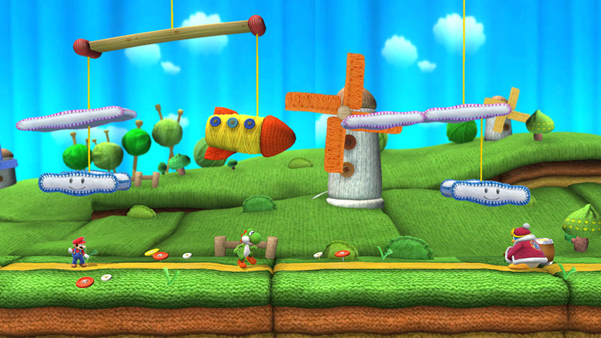
Richard: But what about the Woolly World level from Super Smash Brothers for Nintendo Wii U? It has platforms suspended by wires that move under the weight of the fighters. Where do you think Sakurai and the team got that idea from?

Marcus: Sakurai’s level in Smash Brothers almost feels like an extension of the original “Smash Brothers motif”: a child’s toy come to life. Woolly World in Smash is a Yoshi level come to life in a more literal sense. It’s a diorama version of Woolly World. And when things are suspended by strings it’s only natural that weight and physics apply.  

Richard: I had to go back to this video from E3 2014 to find examples of Yoshi actually throwing yarn balls around. Turns out, throwing a Yoshi ball is more powerful than a small yarn ball. And throwing a large yarn ball can do multiple jobs like stringing up platforms as it ricochets around. Stamina in this case is like yarn HP or strength. The more stamina a ball has, the more powerful the impact when thrown or the more tasks it can do.

Marcus: That’s an interesting way to convey weight. A larger ball having more stamina sounds like a layman’s definition of inertia. The larger ball takes more energy to bring it to a stop.

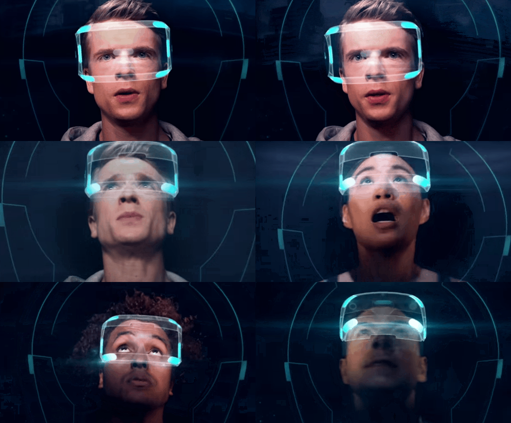
Morpheus at E3

Marcus says: When trying to sell a new hardware-specific product, getting the product into the hands of consumers is often the best way to convince them of its merits. From the comfort of my home, miles away from the E3  show, Morpheus is as far away from my hands as Dallas is from LA (yes, a literal distance. no need for metaphor here).

Without getting hands-on with Morpheus, I have to rely on the testimony from show goers and Sony PR. To my surprise, Sony didn’t attempt to sell the spectacle of the coming VR revolution. Instead, in trailer after trailer, I saw typical footage of typical games in typical gameplay scenarios. The only difference in the trailer for the VR games is that they feature first-person surveying; a not so subtle indication that, yes, a virtual head moving could be controlled by your literal head moving once you step into the realm of VR. The Kinect-like hovering prompts might also tip you off to the fact that these are indeed trailers for VR games.

Richard says: Nintendo is known for game presentations that focus on charm, creativity, and most of all gameplay. They typically don’t present footage without images of gameplay or content that is representative of the final product. Nintendo usually encourages their audience at E3 to go to the show floor and gets hands-on impressions. They even used the phrase “playing is believing” when they launched the Wii controller at E3 2006. I know the gaming industry has rapidly changed over the last 15 years, but I’d like to think actually playing games is the best and only way to understand what they are. Is it any different with Sony and Morpheus?

Reblog: Combat Turn Design Decisions by Thorin

POV: DESIGNER.  DIFFICULTY 3.  LEVEL 1 - 1 POV: DESIGNER.  DIFFICULTY 3.  LEVEL 1 – 1

In the article Combat Turn Design Decisions Thorin makes the case that designing how a combat round works in a tabletop RPG has to balance keeping everyone involved and attentive, and actually letting players do substantial things on their turn. Quick turns mean less can get done, but players stay more engaged because they’re acting more often. Longer turns allow the players to have a lot of positive feelings of agency, but those who aren’t currently taking their turn tend to have their attention wander. Thorin suggests a simultaneous planning system in an effort to compromise.

Mike says: Thorin brings up a critical point in the design of tabletop RPGs, and his attention to player psychology is very well-placed. My concern with this article is an absence of detail in what actions actually mean and how much time they tend to take. When analyzing this topic, I would look closely at exactly what kinds of things players have to do to plan and resolve actions. I’d carefully take notes on where players got hung up, and on how engaged other players were during off-turn periods.

From my experience with tabletop RPGs, playing and running games, Thorin’s approach seems somewhat reductive and overly-simplistic. Much more work could be done here to make a convincing argument. As it stands, I’m not convinced his dichotomy is necessarily the case, nor am I remotely convinced that his suggested solution effectively addresses his concerns without opening up further cans of worms.

Richard says: I agree with you, Mike. I had a hard time wrapping my brain around Thorin’s ideas because they’re in an awkward space between abstract game design analysis and concrete examples. He doesn’t break things down into design parts like mechanics or difficulty design. And he doesn’t pick a specific tabletop game to illustrate his point. The result is a collection of thoughts that presents a vague issue and suggests a few game design knobs to twist in search of the solution. There are so many factors in a games design and outside its design that can create the negative effects Thorin outlined. 

Three Pillars of Combat Design: Final Fantasy Tactics

POV: DESIGNER.  DIFFICULTY 2. LEVEL 1-1

Seems like RPG-style reward and unlock systems are working their way into just about every genre these days. 2007 felt like a turning point to me; it was then that Call of Duty 4: Modern Warfare hit the market and showed just how addictive a multiplayer shooter can be when it has experience point rewards for effective play and a range of unlocks to spend the experience points on. Now it’s hard to find a mainstream multiplayer shooter without a persistent character progression system.

Playing a character who grows in ability over time, from a bumbling novice to a demigod, has been a trope of RPGs since the progenitor, Dungeons & Dragons, appeared in the 1970s. D&D’s tactical, turn-based combat system for the tabletop laid a foundation for a genre close to my heart; a genre that arguably started a decade later when the Fire Emblem series began in 1990 and became the archetype for what is now an established genre: the Tactical RPG (TRPG) or, as it’s called in Japan, the Simulation RPG (SRPG).

TRPGs are turn-based strategy games leavened with characters that advance and persist between battles. Though superficially similar to JRPGs in storytelling techniques and advancement systems, the desultory combat systems typical of JRPGs are replaced with  significantly more weighty TBS-style battles, which can take a half-hour or longer to complete. For the purposes of making analysis easier, let’s take a look at the iconic TRPG, Final Fantasy Tactics to lay the groundwork for future analysis.

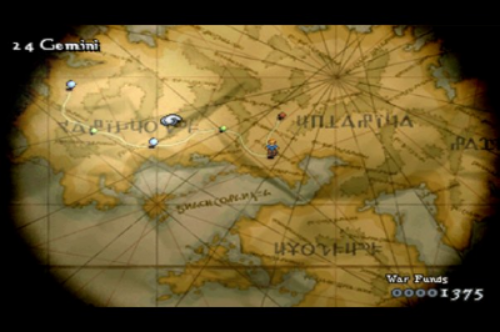
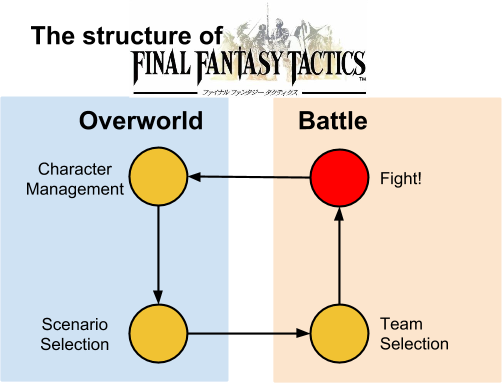
Final Fantasy Tactics, like most modern TRPGs, features an overworld which mainly displays a battle selection screen. The menus accessible on the overworld allow the player to manage many of the persistent aspects of their roster of characters: distributing rewards granted during battle by unlocking new abilities and giving characters equipment. The character advancement system is complex: there are over a hundred unlockable abilities that the player can equip to characters. Character progression in Final Fantasy Tactics, as is typical of TRPGs, is complex in the sense that there are many characters to manage and/or there’s a complex skill tree toclimb per character. There’s also equipment restricted to only certain classes that can grant significant statistical advantages and new abilities.

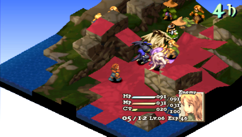
Once the player is done managing their character’s growth and equipment, they pick a battle from the overworld map. Then the player must choose a team of 1 to 8 characters, in addition to the main character, to bring to the fight. Once the player’s team is locked in, they fight in a turn-based battle against enemy characters and beasts in an attempt to fulfill some victory condition, which is often killing all enemies or a specific enemy. Victory grants equipment and monetary rewards as well as unlocking additional battles, defeat means game-over.

The gameplay of Final Fantasy Tactics, and TRPGs in general, thrives when it features:

  • [Design Space] A variety of characters that provide different strategic options, both solo and in combination.

  • [Level Design] A variety of mission scenarios which require the mastery of many techniques using different characters and abilities.

  • [Upgrade / Economy] An advancement system where players can tailor their characters to fill different roles and take advantage of various combinations of enemies and terrain.


Final Fantasy Tactics is a very complex game that shows many of the benefits and pitfalls of character advancement systems and reward systems. Feedback loops between battle and overworld, combined with class balance issues and some level design decisions almost caused me to stop playing. In the next articles in this series I’ll break down the genre conventions that lead to these kinds of issues, while also diving into specifics about Final Fantasy Tactics dynamics that make the game so appealing.

Reblog: Tron Bonne, an Echo of Better Days

POV: Journalist.  DIFFICULTY 3. LEVEL 1-1

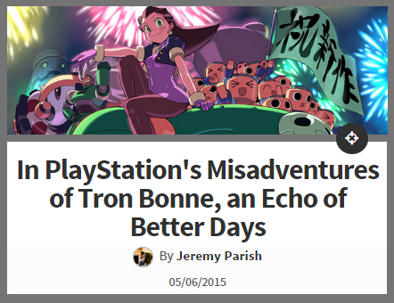
A retro “review” of The Misadventures of Tron Bonne by Jeremy Parish from USgamer.

Marcus Says: I really enjoy how Parish detailed the The Misadventures of Tron Bonne’s genre conventions. Parish did it in a way that didn’t rely on technical jargon. Instead of focusing on rules, systems and mechanics, he explained how the story and feel of the game is a spin off of a spin off, which reflects its oddball gameplay. Parish’s approach reframes expectations. Instead of describing how some mechanics fall short of genre standards, he focuses on how the mechanics enrich the aforementioned story and theme of this misadventure.

Richard Says: I need to take writing lessons from Parish. The writing flowed so nicely. I feel like I have a really good idea what kind of game and experience Tron Bonne is, and I don’t think watching a let’s play would give me a clearer picture. The article overall is more of a summary and review than a critique, but the few statements made clear: “The mission, puzzle, and adventure stages may have been fairly small, but they rewarded experimentation with all sorts of funny and surprising Easter eggs” Also, +1 point for Sokobon puzzles.

Deafness

When I show a game to people I don’t ask their opinion or give them a survey. I just watch their eyes and their face while they play. Do they smile? Do they look frustrated? So I guess I do test my games — but it isn’t very scientific. ~Shigeru Miyamoto

In a Shigeru Miyamoto-like move, I want you to look at the faces of the people who experience hearing for the first time. I’ve watched this video many times and it never gets old to me. The reactions are so genuine. I hope to move someone in the same way with my words, my games, or my actions.


My former Piano teacher Dr. George Deforest shared his understanding of the purpose of public musical performance. To him success is measured by whether the piano player had an effect on the audience; “did you move somebody.”

We may never be able to share our first-hand experiences like the sensation of seeing color. There may be an uncrossable gap between my feelings and yours. If so, perhaps having a powerful affect on others is the next best thing.

Notice in the video how the experience of hearing has a different effect on the young (ages 0-6). The kids smile, clap their hands, laugh, and ultimately delight in the new way to perceive the world. Contrast their reaction to the others, who are all overcome with emotion and tears.

How is it that the reactions of the young children are so different? My best guess is that it has to do with the children’s inability to perceive how they are different  from people who can hear.  According to Selman’s Theory of Role Taking Development, at a young age, kids do not understand that other people see from a different point of view than they do. Likewise, they cannot understand the feelings and values of others as being separate from their own. The younger the child, the less they understand that they can’t hear sounds, which makes them different from many others. They don’t have as many memories of failing to relate to the reactions and sensations of others. This results in kids who are delighted to hear sounds for the first time in much the same way that they are delighted by everything else that is still so new and captivating in their world.

The adults, on the other hand, have lived a life full of comparisons and questions. A life where the question of “why can’t I hear” has been overtaken by questions like “what is it like to hear” and “how does my deafness affect me?” A life full of memories watching most of the world respond to sound and not having a way to relate to the sensation. A life of being different and having no way to form a meaningful connection with the sounds of the world. A world filled with countless actions and objects that suddenly gains a whole new dimension the moment the inner ear hearing implant is turned on.

I have no doubt turning on a fundamental ability like hearing would be an amazing experience transforming the familiar world new again. But I believe the tears of the people moved most deeply by being able to hear for the first time is the result of living with other people and putting up the daily questions about the dimension of sound that almost everyone engages with so naturally; a whole world they have no access to. They may not have known what it’s like to hear, but they knew that they were missing out.

After the hearing aid is turned on, it’s amazing how “hi mom” or “purple” or even a quiet room cuts through years of questions, culture, and context. Perhaps this is what design is. More specifically, this is what good art that’s designed to move people is. A collection of details, tools, and best practices put together to create a work that will hopefully be deft enough to cut through the junk we put in between each other, the noise that prevents us from being moved.