Dolly Deer and Design

POV: JOURNALIST.  DIFFICULTY 2.  LEVEL 1 - 1 POV: JOURNALIST.  DIFFICULTY 2.  LEVEL 1 – 1

Marcus says: As described on its webpage, Dolly is an artistic minimalist platformer where you are tasked with exploring the mysteries of a strange world to ultimately discover its dark truth. It’s a short trek filled with visual metaphors, and it’s free (download it here). Deciphering the metaphors is key the to unraveling these mysteries.

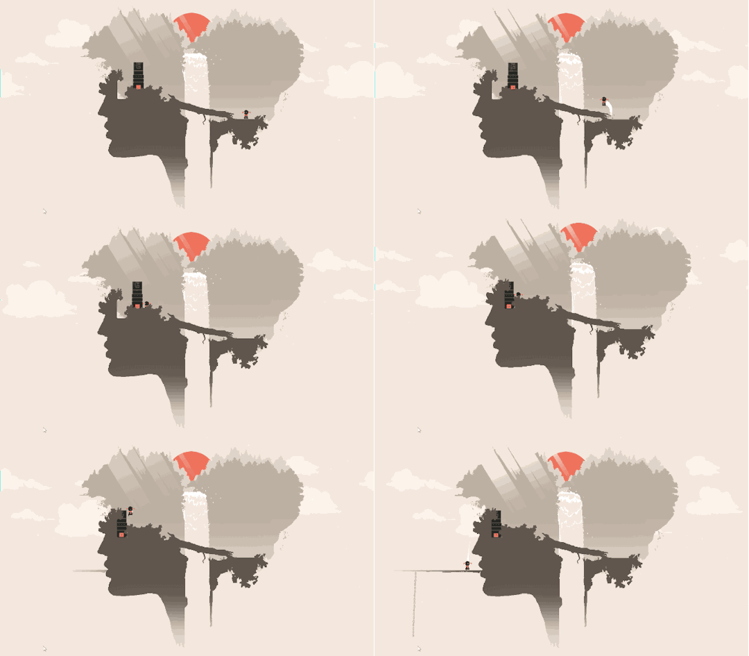
First up I see the main character platforming through what looks like a human head.

Little people inside the head of another is a move similar to Disney’s Inside Out. It isn’t clear at this point if I’m playing as an emotion or some other figure. Maybe things will become clearer as the game moves along

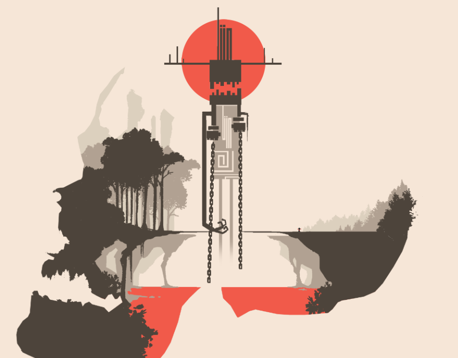
Next up, the red sun permanently hangs in the sky. Is this the rising sun, an omen of a bright future? Or is the sun setting, closing the final chapter of my character’s life?

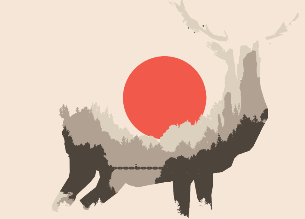
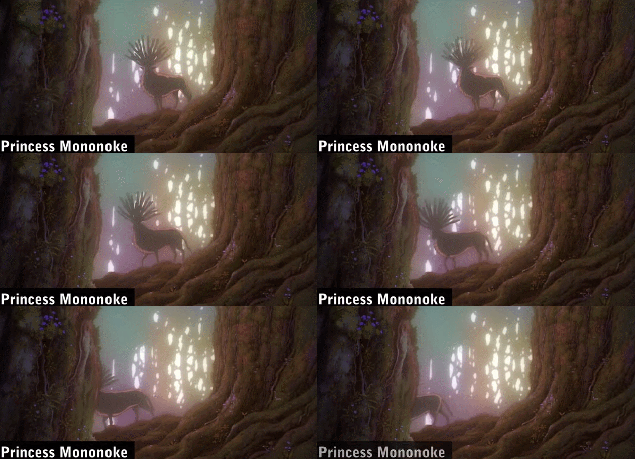
This time, the player character is travels inside the hollows of a giant deer. When it comes to life and death, the only deer I know who is up to the task is Princess Mononoke’s Forest Spirit, a powerful god who has the power to grant life and death. I wonder which awaits me?

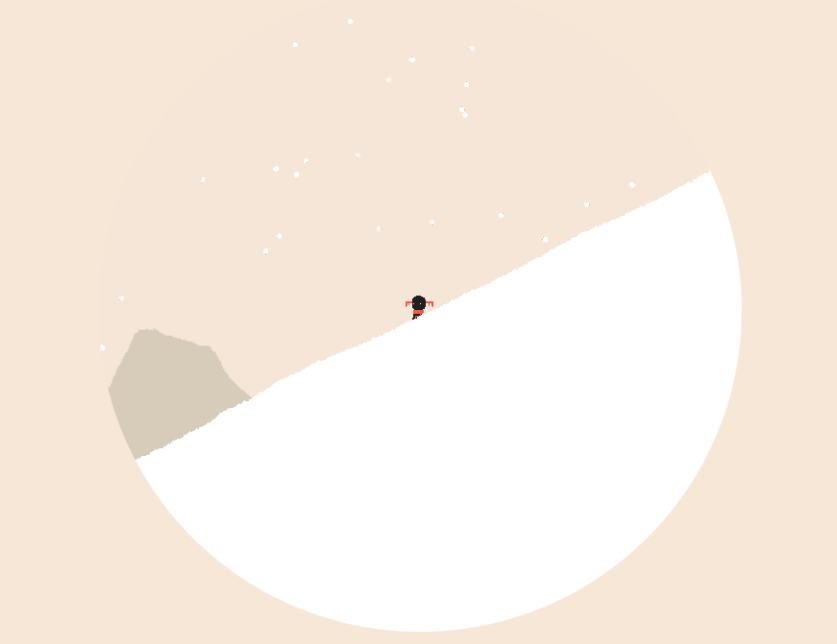
Last is a slow contemplative walk up a snowy mountain. I may not know how I got here, but the winter scene (like Journey’s ending) makes me feel like like the game is coming to an end. What did the Forest Spirit grant? Life or death?

Game Category1 Category2 Name Description Link
Dolly Enemy Elements side-spike Spikes that appear to only hurt players with their point also hurt the player when they walk into the side.
Dolly Feedback Screen Shake Features multiple kinds of screen shake including a handycam style and a rotation style.
Dolly Mechanics Triple Jump One ground jump and 2 mid air jumps.
Dolly Mechanics Wall Jump The wall jump does not restore mid air jumps.
Dolly Mechanics Wall Slide Like Super Meat Boy’s Wall Slide mechanic.
Dolly Design (visual) The game world is contained within a circular shape in the middle of the rectangular game window. Image!

Richard says: Dolly is a very short platforming experience with an engaging visual aesthetic and poor gameplay. Progression requires platforming across bottomless pits, activating scene transitions via awkward, inconsistent trigger points, or pushing special stone pillars into place.  None of these gameplay ideas were developed enough for me to get any meaning from their sequential arrangement. The whole game is a collection of largely  disconnected ideas. But, as Marcus demonstrates, the only part of the game worth talking about is the potential meaning behind the game’s striking visuals. Still, its minimalist style leaves too many pieces to assemble with little promise of a meaningful conclusion.

Pac-Man Design: Variables of Difficulty

POV: DESIGN.  DIFFICULTY 4.  LEVEL 5 - 1 POV: DESIGN.  DIFFICULTY 4.  LEVEL 5 – 1

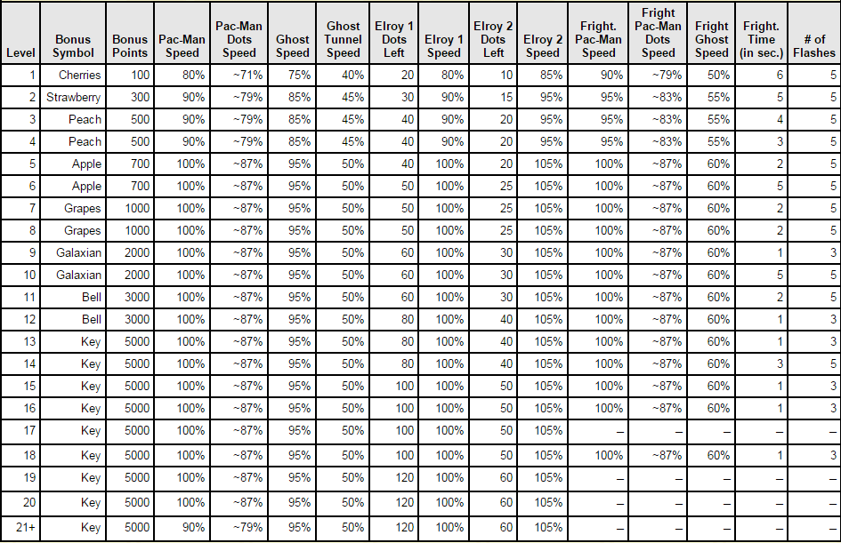
With video games it’s common for levels to increase in difficulty as the game progresses. I knew this  was the case for games as old as Pac-Man. But when I read through Jamey Pittman’s Pac-Man Dossier, I was surprised how many variables were tweaked to give each level its unique challenge.

Out of the 21 levels, only a few pairs of levels present an identical gameplay challenge. Otherwise, one of the game’s 13 gameplay variables is tweaked.

  • Pac-Man Speed
  • Pac-Man Dots Speed (Pac-Man slows down a bit when eating Dots)
  • Ghost Speed
  • Ghost Tunnel Speed (Ghosts slow down when traveling through the Warps on the sides)
  • Elroy 1 Dots Left (When there are this many Dots left, Blinkies/Red Ghosts increase in speed)
  • Elroy 1 Speed
  • Elroy 2 Dots Left (When there are this many Dots left, Blinkies/Red Ghosts increase in speed again)
  • Elroy 2 Speed
  • Fright Pac-Man Speed (after Pac-Man grabs a Power-Pellet)
  • Fright Pac-Man Dots Speed (speed eating Dots after Pac-Man grabs a Power-Pellet)
  • Fright Ghost Speed (the speed of blue vulnerable Ghosts)
  • Fright Time (in sec.) (the time Ghosts spend in the blue vulnerable state)
  • # of Flashes (the visual indication that Fright Time for Ghosts is about to expire)

Tweaking these variables across the 21 levels in Pac-Man gives players more comprehensive exposure to the design space. Players can better learn Pac-Man’s gameplay by progressing through the game and refining their strategies as the challenges get harder.

When Pac-Man eats an Energizer Power-Pellet his speed changes. In the early levels his speed increases to help players chase vulnerable Ghosts. On the other hand, during this “fright” time Pac-Man’s speed is lowered while he eats Dots. Between levels 4 and 5, the difference of Fright Pac-Man’s dot-eating speed is 4%, a change so subtle that players may not perceive it consciously, but I’m confident that players can feel the difference.

All of the variables listed above control gameplay elements that have clear feedback. Pac-Man and Ghost speed can be discerned by simply observing their sprites for a few seconds of motion. The number of times frightened Ghosts flash before becoming deadly is either 3 or 5; It would be more difficult to determine exactly when Ghosts turn deadly if the number of flashes ranged from 1-5. 1-2 flashes doesn’t give enough warning. 6 flashes is too long. Keeping it 3 and 5 gives players who anticipate a 3 flash change to react accordingly by the 5th flash.

Many variables are tuned to be easier for players to keep track of mentally. Ghosts flash an odd number of times before becoming deadly, which helps musically-inclined players who are used to musical phrases ending on an even beat. Fright times are whole numbers measured in seconds,  which makes counting easier. Blinky, the red Ghost, speeds up two times in a level based on the number of Dots left in the maze. The speed values for Blinky are all divisible by 10. Pac-Man’s normal movement speed is also divisible by 10. Pac-Man’s speed matches Blinky’s, a design choice that allows Blinky to chase Pac-Man effectively and makes the tiny speed boost granted when Pac-man rounds corners more obvious. However, when there are very few Dots left in the maze and Blinky moves at his fastest, his speed is consistently 5% faster than Pac-Man’s (except on the final level of difficulty where it’s 15% faster). This consistency among all the other changing variables in Pac-Man’s difficulty design goes a long way in making the interactions easier to learn yet variable. No matter how Pac-Man’s speed changes between levels, players can rely on the ratio of speed between Pac-Man and the most aggressive Ghost, Blinky, to be the same for 20 out of 21 levels.

The most interesting piece of feedback design is the classic “waca waca” sound effect that plays when Pac-man consumes a Dot: Pac-Man’s slight speed change when rounding corners while eating Dots can be can be seen as well as heard! Listen here.

Difficulty I Choose You

POV: JOURNALIST.  DIFFICULTY 3.  LEVEL 1 - 1 POV: JOURNALIST.  DIFFICULTY 3.  LEVEL 1 – 1

Game difficulty is hard to discuss especially for games like Pokemon. In this video Speedster presents a top 10 list of the hardest story battles in the Pokemon RPG series. Speedster’s video interests me not because of what he had to say about the difficulty design of Pokemon, but because he struggles to frame the discussion of difficulty. He opens with this:

“why are some battles just really hard?”

“I know that most battles in RPGs in general are really easy if you just grind levels and quite hard if you don’t grind levels.”

Speedster attempts to pin down the variance in the player’s Pokemon and items by stipulating that the notional player uses properly-leveled Pokemon for each battle. I assume “properly leveled” means that the player’s Pokemon levels closely matches the opposing Pokemon’s levels.

Speedster struggles to describe the conditions that make many of the battles in his top 10 difficult. Sometimes the opposing Pokemon have stronger moves. Sometimes the challenge is due to a Pokemon type disadvantage because of the availability of catchable Pokemon. Sometimes the lack of Speedster’s offensive strength increased the effect of random moves like METRONOME, SMOKE SCREEN, or DOUBLE TEAM from the opposing team. Basically, when he couldn’t KO the opposing Pokemon fast enough, his opponent had time to set up a some nasty situations.

“I only won with luck”

Throughout these descriptions Speedster doesn’t articulate how challenging the battles are in a consistent, objective, or measurable way. Instead he gauges difficulty generally by describing opposing Pokemon strength, the number of times he retried the battle, how frustrated he was, or if he had to leave the gym to grind a few more levels.

“I never had to.. reset and try again or go off and grind without losing. Easily the hardest champion for me.”

“I have never gone through this gym without at least a few of my Pokemon fainting”

The Pokemon battle system design space is massive and allows for an incredible diversity of strategies (read more here). For games like Pokemon, I’ve found that difficulty spikes occur not because the challenges gets much harder in a linear way; it’s not because the designers all of a sudden make the difficulty curve steeper by simply adjust one variable like enemy level. Rather it’s because the challenges start to require players to explore specific parts of the design space and use specific counter strategies. These challenges push the player to take advantage of elements of the complexity and depth of the game that they had been previously ignoring. For these battles, general strategies used previously will not be effective.

“[The Norman Gym battle in Pokemon Ruby/Sapphire] is a huge spike in difficulty curve”

Speedster didn’t describe using any boosting items, like X Speed or X Defense. Maybe he’s used to competitive battling where items are banned, so he chooses not to use such items in the single-player story battles. But trading for Pokemon and using items in battle is a legitimate part of the single-player game. This is a clear case of a player making challenges harder for himself by not exploring all the options available to him. I don’t blame Speedster. I do the same thing when I play Pokemon. Not only do such choices make the difficulty design of the game harder to grasp, but it makes talking about the difficulty of these challenges even harder.

One Night Wereworlf Chang Edition

POV: PLAYER.  DIFFICULTY 3.  LEVEL 1 - 1 POV: PLAYER.  DIFFICULTY 3.  LEVEL 1 – 1

Everywhere I go, I always seem to find a design-oriented conversation. This time, I was hanging out with friends in a hotel room at an anime convention. Every year for the last 10+ years, we meet up to play some video games and some board games. This year we played One Night Ultimate Werewolf.

Going into that session, Marcus and I knew next to nothing about this style of game. As is common with board games, the person who brings the game to the group takes up the role of explaining the rules. Meet the guy who brought Werewolf, Chang, the shirtless guy with the green hair. Without much introduction, Chang sucked us into a detailed discussion of his customized deck for the game.

The point of this article is to highlight some of the design-oriented points made in this real-life conversation. Before we hear from Chang, I’ll summarize how One Night Ultimate Werewolf works:

  • The game is played with 3-10 people all sitting around in a circle.
  • There’s a deck of roles (character cards) selected for the game.
  • Each player draws a character card and looks at their role while keeping it a secret from everyone else. Roles are different types of villagers and werewolves defined by their special abilities.
  • NIGHT PHASE: Everyone closes their eyes and the moderator gives a set of instructions for everyone to follow in turn. Instructions involve having a player open their eyes, do an action, and then close their eyes again. Our moderator was a customisable cell phone narrator. (Very fancy!).
  • DAY PHASE: Everyone opens their eyes. It’s up to everyone to then figure out the roles of the other players. Keep in mind that no one can look at their role card at this time and that the roles have probably been switched around or manipulated in some way.
  • VOTE PHASE: It’s villagers vs werewolves. At the end of a set discussion time, each player votes trying to “kill” a member of the other team (villagers / werewolves). Majority vote decides who “dies.” If that player is a villager, werewolves win and visa versa.

One Night Were Wolf Chang Edition

For One Night Ultimate Wereworlf, Chang is both a player and a game designer. He is very clear about why he dislikes playing with certain cards and articulates his idea of a well-balanced deck. Most often we discuss balance in terms of preventing game elements from being too powerful or too weak. In Chang’s case, he considers the difficulty of his deck for new players and the balance of skill, which he expresses as warding against too many “chaotic” elements. Notice in the video how others in the room like character cards that Chang dislikes. Often Chang chose not to include a card into his deck because of the deck’s overall balance not because he’s against the particular card.

The following are comments and notes extracted from our conversation with Chang.

“My goal for smaller games and [when playing with ] people who are new, [is to remove] cards that have too much chaos or cards that don’t introduce fun into the game (sit out roles or taking people out of the game. E.G. villager, revealer).“ ~Chang

  • In One Night Ultimate Werewolf, you need to figure out what role you are and figure out what everyone else is. You can only do it based on what other people say and the werewolves don’t want you to know that they’re werewolves. This game is about lying. That’s the difficult part and the most fun part. It’s like a group puzzle.
  • When you play regular Mafia you already know your own role, but with One Night Ultimate Werewolf, you may think you’re one role in the night phase, but in the day phase you might not be that role anymore.
  • Removing players from the game is a problem with Mafia. You can take out a player very early and that person doesn’t get to play more until the whole game is over which can take anywhere from 10-30 minutes.  
  • Chang likes the Alpha Wolf card because it adds or removes a wolf card and this isn’t too chaotic.
  • According to Chang, One Night needs at least 5 people to be consistently fun. 10-player games are still fun but some people get left out of the discussion part because there are too many voices.


  • The Villager role doesn’t have a special ability Having this role in the game means Werewolves can claim that they’re a villager and thus don’t have to make up a dangerous lie about using a special ability they didn’t actually use.
  • Whoever the Bodyguard points to during the VOTE PHASE is protected from being killed. Chang thinks it would be more interesting if the Bodyguard role could only protect Werewolves as a Werewolf-Bodyguard. Villagers by default have more power than Werewolves because the more people discuss the easier it is for werewolves to expose themselves. If the Werewolf-Bodyguard existed, that player can listen in on the discussion,  and then upset the Villager’s voting efforts by protecting a werewolf caught in a lie.
  • Chang introduces the Paranormal Investigator into his deck when playing with an experienced group of players because the role has more complicated rules than most roles.
  • In Chang’s idea of a well-balanced game there should never be a role that is a “0%” where there is no reasonable way to find out who has the role or what actions were taken during the Night phase. Likewise no role should be 100% where it’s too easy to find out who has the role and that role does the same action in the same way every time. This means Chang doesn’t play with the Revealer card, a role that reveals another player’s role for the DAY PHASE.
  • Village Idiot creates complete chaos by switching around all the role cards (excluding his own card) in a clockwise or counter-clockwise fashion at the end of the NIGHT PHASE. This role can nullify strategic choices made by other players by scrambling the order of things. The role always goes last and thus has a ton of (chaotic) power.
  • During the NIGHT PHASE the Drunk switches two players’ roles without looking at them. During the DAY PHASE it’s very hard for the group to gather enough information to follow the trail and figure out what the Drunk did. The Drunk doesn’t make informed decisions in the NIGHT PHASE and does not gather much information to share with the group in the DAY PHASE. The Drunk is essentially a dice role.
  • “The deck I created is more structured and balanced, creating uncertainty without making it too confusing.” ~Chang. I like how Chang doesn’t completely reject all elements of “chaos” from his games, but, like randomness (which essentially the function of the Drunk), a touch goes a long way.

Reblog: Play What You Like’s Guide to SRPGs

POV: JOURNALIST.  DIFFICULTY 3.  LEVEL 1 - 1 POV: JOURNALIST.  DIFFICULTY 3.  LEVEL 1 – 1

Mike says: I’ve been digging around the internet for design analysis on SRPGs (TRPGs as they’re more widely known in the west) since I started my series on Final Fantasy Tactics. Play What You Like is one of the few particularly useful sources of opinions focused on the genre. The author, Gregory Faccone, catalogs and posts a relatively brief critique on each SRPG that he plays.

Though I think that many of his reviews include important information about the games in question, and I would definitely play the SRPGs he recommends strongly, his approach to analysis leaves me wanting. His judgment-heavy posts seldom back up their claims with solid evidence. He clearly has certain expectations and assumptions about the genre that are not specified anywhere, yet his expectations play a critical role in his opinion–and so many of his opinions are presented with no further analysis or explanation and in a disorganized fashion. I think he has the knowledge to do fantastic analysis, but from the five posts on the site that I’ve read he seems to be unwilling to provide the structure and detail necessary to properly articulate and substantiate a critique that would satisfy me.

Richard says: “Conquest did a fine job including a great many [Pokemon] in a deeper way than typical Pokémon games.” a bold claim indeed. I agree with you, Mike. The breadth of topics covered in the Pokemon Conquest analysis is pretty great. He mentions everything from mechanics, level elements, modes and features, to feedback issues like the 3D environments occluding the player’s view of Pokemon. The game design reasoning behind his claims is often missing. I learned enough about this game from the analysis to push me over the fence. Now to look for a copy to purchase.

A Platforming Thread Through E3 part 3

POV: DESIGN.  DIFFICULTY 2.  LEVEL 3 - 1 POV: DESIGN.  DIFFICULTY 2.  LEVEL 3 – 1

The woolly world of Yoshi reminded us of the yarn aesthetic of Unravel, and in part 1 and part 2 of this article series we examined the yarn-like mechanics and design of these two games based on their E3 trailers. Yarny, the player character in Unravel, has a diagonal grappling yarn shot that reminds us of Chibi-Robo! Zip Lash.

Game Category1 Category2 Name Description Link
Chibi-Robo! Zip Lash Mechanics Ricochet Zip Lash The Zip Lash can ricochet off of objects. Video!
Chibi-Robo! Zip Lash Mechanics Zip Lash Seems to be able to aim and throw the Zip Lash in 2 directions. Forward and diagonally up forward.
Chibi-Robo! Zip Lash Mechanics pull Zip Lash The Zip Lash can grabble object and pull Chibi Robo along ending in a short jump. Video!
Chibi-Robo! Zip Lash Feedback When aiming the Zip Lash, a red laser line shows the path the throw will take. After a certain distance or maybe after a bounce, the line fades forcing playres to use knowledge based aiming instead of visual based skill. Video!
Chibi-Robo! Zip Lash Mechanics Dynamic, hover Preparing to throw and throwing the Zip Lash makes Chibi Robo hover in mid air. Video!
Chibi-Robo! Zip Lash Level Elements Multi-Coin Block Just like Mario, there’s a block that must be hit repeatedly to earn multiple coins. Video!
Chibi-Robo! Zip Lash Power-Up / Upgrade / Economy Burning Robo Special red outlets allow Chibi-Robo to catch on fire. Video!
Chibi-Robo! Zip Lash Level Elements Fire Walls Walls that can only be progress through using Burning Robo Video!

Richard: Check out the diagonal ZIP LASH mechanic. It looks like players can only ZIP LASH straight forward and diagonally upwards. If this is the case, that’s really interesting asymmetry. Mega Man is great because he can only shoot straight with his default weapon the M.Buster. This means he has to jump to aim at things in the air or on raised platforms. Having to move in unique ways and coordinate that movement with shooting makes for more engaging gameplay challenges. It’s the same way with SHMUPs that only let players shoot vertically (e.g. Ikaruga) and games like Super Mario Bros. where Mario can only shoot fireballs forward and downward. Or perhaps the best analogy is Bionic Commando Rearmed.

Marcus: Bionic Commando is a great example. Not just because it contains a very similar mechanic but because it explores the design space of using a grappling hook in an action and puzzle oriented way. Comparing the asymmetric design of these two games is tricky. But the Challenge Mode (i.e. puzzle mode) in Bionic Commando is an isolated and focused challenge absent of enemies, weapons, bosses, etc. This mode focuses on problem solving and traversal through grappling. Looking at the Zip Lash trailer, there doesn’t seem to be much in the way of battling so the puzzle comparison seems apt.

Mike: You can break this asymmetry down even further and look at the typical fighting game genre style of normal attacks. The player has to coordinate their movement along the stage, using forward and backward movement and jumping, with timing attacks that lock their character in place for varying numbers of frames. Some special attacks allow the player to move while attacking in specific ways, like Chun Li’s spinning kick and even Ryu’s fireball which he can walk behind as it slowly makes its way across the stage. This kind of trade-off and interconnection between movement and attack is so common in deep games it’s easy to miss it!

Richard: Good point, Mike. Even though the moves in fighting games are generally very quick, being forced to move or attack is the kind of asymmetry I love. I call this kind of asymmetric design “stop-and-pop” when we’re talking about shooters.

Richard: Looks like the ZIP LASH grappling spots are clearly marked as orange wall mounted level elements. Chibi-Robo! Zip Lash is doing it Zelda Hookshot style. Unravel’s anchors are, at least to my eyes, more organically integrated into the visual design. They’re easier to overlook, which is probably why the developers added that extra bit of glowing light to the anchor points.

Marcus: The anchors in Unravel function more like swinging in Bionic Commando rather than being pulled along the ZIP LASH. While I can see some of the Bionic Commando Challenge Room puzzles offering similar challenges to Unravel, the way the ZIP LASH ricochet along walls and blocks is more like the way an egg behaves in Yoshi’s Woolly World. Similar environmental puzzles could be used in both. 

Richard: Also, the ZIP LASH grabs coins and other pickups as it travels just like Yoshi’s thrown eggs and yarn balls!

Richard: The visual feedback design for the ZIP LASH is doing something pretty neat. In this game, the ZIP LASH extends in length as players progress through the level. This allows for the level design to create locks and keys pretty easily with space e.g. large gaps to cross. When preparing to ZIP LASH, Chibi-Robo swings the cord around. Notice how the red aimer turns into an ellipses near the end of its range. Also notice how a round red target mark appears when an object is in range. Looks like you’ll always know when you’ll hit an object in range, but after a bounce or two, the trajectory isn’t drawn out for you.

MIke: That’s an interesting learning aid. For most of the simple interactions in the game it lays out exactly what will happen, but for more advanced interactions involving ricochets and long distance ZIP LASHING it requires players to test their spatial judgment, experiment, and be able to forecast the ZIP LASH’s behavior.

Dual Progression Part 2: Jobs in Final Fantasy Tactics

POV: PLAYER.  DIFFICULTY 4.  LEVEL 4 - 1 POV: PLAYER.  DIFFICULTY 4.  LEVEL 4 – 1

In the last article in this series I talked about experience points and character levels. Now we dive into the other half of the character advancement systems of Final Fantasy Tactics: Job Points and Job Levels.

Job Points, henceforward JP, are gained when XP is gained. There’s a separate pool of JP for each Job. The character adds to this pool when it gains JP as that Job. The player can spend JP from a Job’s pool to unlock abilities associated with that Job.

The formula for Job Points gained from a successful action is 8 + (Job Level * 2) + [Level / 4]. (Level / 4 is in square brackets because the result is truncated to its integer component, e.g. [6 / 4] = 1.) All characters on the battlefield with a Job unlocked earn ¼ of the JP earned by any other allied character in that Job during the fight.

At level 1, a character starts with access to only two jobs: Squire and Chemist. To be able to use other Jobs, the character needs to gain Job Levels in the jobs they have access to by accumulating JP. Job Levels are based on total JP gained, not JP available to spend.

The table below gives an idea of how quickly job points are gained if the player is fighting opponents at their level and focuses on leveling one job.


Job Level Total JP JP Needed to Level Character Level** JP per Action Attacks until Job Level up
1 100* 100 1 10 10
2 200 100 2 12 13
3 350 150 3 14 15
4 550 200 4 17 15
5 800 250 5 19 19
6 1150 350 6 21 20
7 1550 400 8 24 23
8 2100 550 10 26


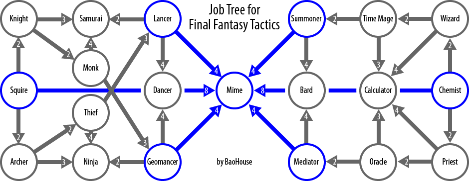
Job Levels unlock more advanced Jobs (at which point the player can put that character into that Job and start gaining JP for it) and quicken the pace of JP gain. There’s a relatively complex web of Job Levels required to unlock the most advanced Jobs, as you can see in the image below.

(From The Final Fantasy Wiki) (From The Final Fantasy Wiki)

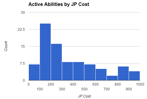
The player spends Job Points to unlock abilities. Most abilities cost between 100 and 400 JP, with others costing as little as 25 or as much at 1,000. In a typical battle a character will earn somewhere between 100 and 250 JP, which means that they’ll usually be able to unlock some ability each battle in the early stages of leveling up a Job. Later on it’ll be a few battles between ability unlocks.

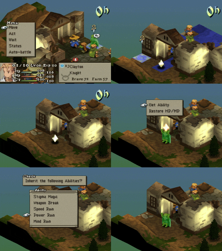
An interesting twist is that sometimes the player doesn’t need to pay JP to unlock abilities–there’s another way to acquire abilities! If any character is not resurrected within three turns of its death, it is replaced with a treasure box or a crystal. When a character moves on to a crystal, the player (or AI) gets the choice of regaining some HP and MP, or “inheriting” some randomly-picked abilities from the crystallized character. Inheriting abilities only works if the character picking up the crystal has unlocked the job associated with the skills in the crystal.

(My Knight saves over 1,000 JP by inheriting a defeated Knight’s crystal.) (My Knight saves over 1,000 JP by inheriting a defeated Knight’s crystal.)

Though the Job system gives the player a lot of interesting options for building an efficient party that can annihilate enemies in any number of creative ways, the way that JP feeds into party-building as a reward system doesn’t work as well as it could. My primary complaint about the tuning of JP is that the player can easily go a battle or two without unlocking any interesting new abilities. One of the most fun things in my experience with the game is when I unlock and start using that awesome new ability I’d been planning to get and building towards. With somewhat variable and sometimes slow ability unlock pacing, that cycle of setting my eyes on a new ability I want and then actually being able to use it in combat can be unpleasantly stifled. At the other extreme, when the player can get crystals of the Jobs that they want, it can lead to a landslide of progression. This kind of uneven reward pacing may keep the player marginally more engaged than a steady drip, but the lulls are made worse in my experience by those times when it seems I’m unlocking far more abilities than I will want to use.

Now that we covered the systems behind character progression, we have sufficient knowledge to make a broader critique of the dynamics that emerge. Next in this series, I’ll be examining an aspect of playing Final Fantasy Tactics that prevents me from falling in love with the gameplay, and, I argue, prevents the gameplay from reaching its full potential: grinding.

A Platforming Thread Through E3 part 2

POV: DESIGNER.  DIFFICULTY 3.  LEVEL 2 - 1 POV: DESIGNER.  DIFFICULTY 3.  LEVEL 2 – 1

Game Category1 Category2 Name Description Link
Unravel Mechanics Yarn man unravels as the player travels through the level.
Unravel Mechanics Swing Tether swings with yarn from your own body. Video!
Unravel Level Elements Anchor Find anchor points in the level to create new swinging opportunities for progression. Video
Unravel Level Elements Kite, Anchor Has an anchor point players can use to fly themselves away.
Unravel Level Design Stealth Use the shovels and objects in the mid ground to hide and avoid dangerous elements in the background. Video!
Unravel Mechanics Pull Use yarn to pull a light source through a dark snow storm Video!
Unravel Level Elements Fish, Anchor Use the hook in a fish as an anchor to power your raft.
Unravel Feedback glow anchor anchor points glow very faintly with a while particle effect.

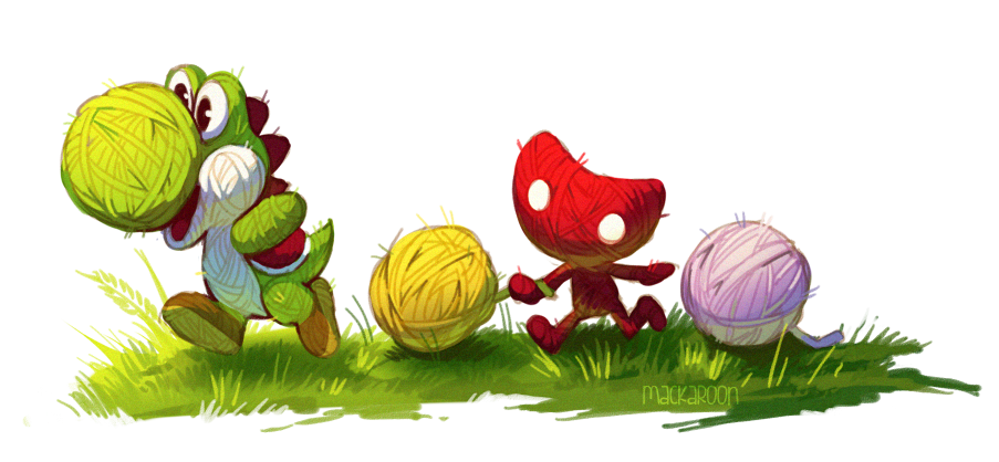
Richard: I initially thought that the Yarn theme in Yoshi’s Woolly World was completely visual, but as I’m looking at gameplay footage more closely, I can see more and more Yarn-like mechanics and systems. Contrast Yoshi with Yarny from the upcoming PS4 game, Unravel.

image by Cheepers   @mackadoodledoo  image by Cheepers   @mackadoodledoo

It’s not every E3 that we see two games with a yarn aesthetic! Unravel looks like more of a puzzle game or a set piece-driven exploration game than it does a platformer. The level design seems more linear and the camera view doesn’t look like it lets players see a large part of the level.

Marcus: The camera does look zoomed-in a bit. However, in the gameplay scenes, the ratio of Yarny to screen-size is about the same as Mario’s ratio in his wide screen platformers. I guess it is a matter of perspective: the slightly zoomed-in camera conveys how different the world looks when you’re small. The real take away is that the camera always appears to be a singular forward-focus camera. The camera in the horizontal side-scrolling scenes always positions Yarny in the center or the left quarter of the screen. Even when moving left the camera doesn’t adjust to give players a better view of where Yarny is facing (0m44s). Like the original Super Mario Bros., the camera is telling you to keep moving right, which hampers a potential exploration aspect.

Richard: The yarn theme is the aspect of Unravel that excites me the most. It has the potential to be mechanical (solving puzzles) and thematic (tying a story together) and a neat system for conveying player limits and other important information (feedback).

From the Unravel website:

  • “Yarny is a tiny new character made from a single thread of yarn that slowly unravels as he embarks on a …journey.”
  • “Using Yarny’s thread, interact with the environment… the tools may be simple but they have the ability to accomplish complex puzzles.”
  • “Unlock a heart-felt story re-connecting the memories of a long lost family…Yarny is the bond that ties everything together.”

The tricky part is that all of this potential is best realized with nonlinear gameplay. My first thought was that the puzzles would need to feature multiple solutions for the theme of tying things together to be well-supported by the gameplay. Then I realized that the puzzles don’t have to be nonlinear if the multiple attempts at solving a puzzle consumes yarn, which would limit the player’s ability to explore or use other mechanics. It’d be neat if yarn was a resource to conserve, spend, and consider.

Marcus: Not just multiple attempts, but an elegant solution to a puzzle could use less string than a brute force method. It’s the opposite of The Longest Path puzzle in Professor Layton and the Curious Village

Each street intersection in the Layton puzzle could be a hook to attach your yarn to and swing across in Unravel. Taking the optimal path by hooking the correct series of hooks would take up less yarn and thus could afford you more string to work with later.  

Richard: I found a secret! Right where the rock crumbles, there appears to be a cove with a small red, yarn-like collectable. I assume this is an early level in the game so the secret placement is relatively simple. Still, secrets are optional challenges that give gameplay a degree of nonlinearity. I wonder if grabbing this secret will leave a trail of Yarny yarn to indicates the player went off the main path.

On a side note the visuals are very impressive. The snow scene in particular reminds me of the Polar Express art. Also, the way Yarny throws out lines of yarn reminds me of Chibi-Robo! Zip Lash, a 3DS game from Nintendo that was also featured at this years E3.

Stay tuned as we continue this thread.

Hold My Vlambeer

POV: DESIGNER.  DIFFICULTY 2.  LEVEL 5 - 1 POV: DESIGNER.  DIFFICULTY 2.  LEVEL 5 – 1

Mike: This Vlambeer series has shown us how we can develop a critical metric from conception to application. It required us to go chin-deep in the details of over a dozen games. What has this effort taught you about the process of digging into the details of games?

Richard: One thing that I like about the Vlambeer Scale of Quality is that it’s a series of 31 questions, most of which are easy to answer. You don’t have to be a game designer to recognize if a game has screen shake or faster enemies. These are the kind of details that are relevant to players. Does the game have camera lerp, on the other hand, is a question that the average gamer might have to research before answering. Marcus, what were some of the trickiest Vlambeer Scale questions to answer?

Marcus: Creating a distinction between very similar questions was the trickiest thing in creating the scale. There are essentially two entries named “more enemies”. Listening to the original talk closely, I finally settled on making one entry a question about the density of enemies and the other about level progression (do more enemies show up later to provide additional challenge).

Richard: Ah. Good point. I think I had to think carefully about the 3 questions of permanence (#12, 21, 30). It’s pretty helpful that you added helper text for each question. Sometimes when working with the Vlambeer Scale I got the feeling that I was struggling to find a fitting example for the category. I had to make a judgement call of how many enemies qualified for “more enemies.” The whole experience of scoring a game is a great mental exercise that got me thinking in very specific ways about very specific parts of games.
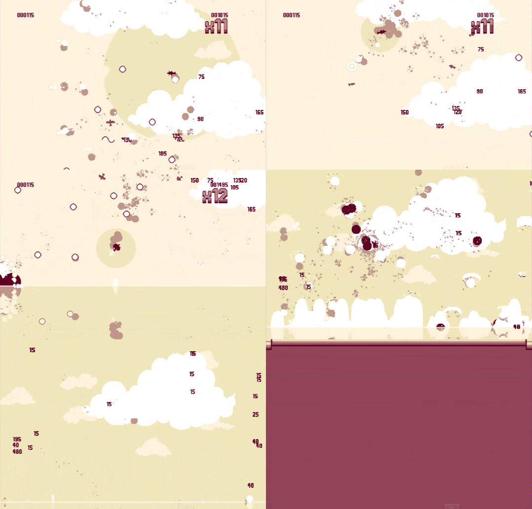
Hold my Vlambeer while I transport this nuke.  Hold my Vlambeer while I transport this nuke.

Marcus: At first I was worried about making some of the questions more abstract so that games without guns for example could have a chance of scoring points on the more gun-specific questions. My thinking was “I know this game has good game feel. It can’t score so low!” But then I realized the distinction between game feel and Vlambeer game feel.

Richard: Yup. The scale is a system of measuring the Vlambeericality of games. We have to score a game fairly first, and then compare the results to what we think the score should be. When we started this series, we got feedback from some who were confident that the scale was useless. They argued that the scale isn’t universal and that it doesn’t apply to all kinds of games. They didn’t understand that the limitation of the scale is the reason why it’s good. It’s neat to consider that there’s some universal theory of game design that can be applied to all games, but that’s not what we’re going for with the Vlambeer Scale: it’s an organized way of seeing how other games measure up to one company’s unique style.

Marcus: That’s right. Game feel is such a nebulous term anyway. It’s mostly used as a offhanded way to talk about a game after there is nothing left to say. To actually start out with game feel as a way to say something about a game before anything else is a small triumph I think. Doing so means we can have a design conversation and zoom in to the details immediately.
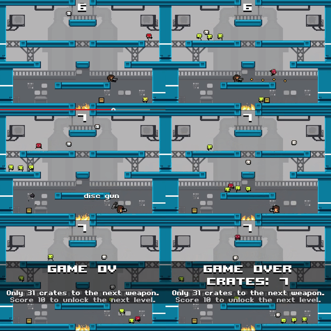
Hold my Vlambeer while I jump over this fire pit. Hold my Vlambeer while I jump over this fire pit.

Mike: It’s important to note that the value of a measure isn’t so much about how closely it hews to some ideal objective metric of quality or inherent “goodness” of games. The process of carefully analyzing a game through a regimented approach is, in itself, extremely useful and a skill worth practicing. Analyzing game design is subject to so many subtle and not-so-subtle biases–having a set approach, even if it’s somewhat arbitrary, can help against temptations to play to the home crowd and cheerlead for a game just because it’s a classic or because you happen to like it.

It’s easy to cheerlead when you’re trying to assess something as deeply subjective and personalized as a player’s perception of game feel. The Vlambeer Scale helps us cut through some of that, even if it isn’t perfectly fair to games that, say, don’t happen to involve guns and bullets.

Richard:  Game feel is a strange topic. The elements of game feel can be extremely obvious (screen shake) or incredibly subtle (milliseconds of sleep on enemy death). It’s both style and substance: an artistic technique and a collection of seemingly-arbitrary tips. We often talk about it with concrete details, yet it’s one of those “you know it when you see it” kind of topics. Because it has a large style component, many tacitly concede that achieving good game feel is at least partially luck-based or an art that cannot be taught. For all these reasons, the art of game feel is a perfect analogy to the art of game design.

“With diligence and luck, you’ve got a game that feels great.” ~ Steve Swink:

“[understanding the fundamentals] is going to be completely different for every type of game. And I’m not sure that be Shigeru Miyamoto is particularly useful advice.” ~Mark Brown.  
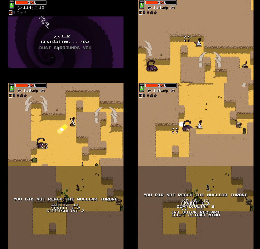
Hold my Vlambeer while I take out this basic enemy with my golden gun.  Hold my Vlambeer while I take out this basic enemy with my golden gun.

Marcus: The Vlambeer Scale of Quality : Game feel :: _________ : Game design?

Richard: Super Mario Maker : Game design? I think that answer works. Nintendo has always made my favorite platformers. But the Nintendo-Mario style is just one way to achieve greatness. It would be unproductive to compare every new platformer against the “Super Mario Bros.3 Scale”. Comparing games is a good way to highlight their differences, but eventually as critics and fans and designers, we have to be able to see how games can do things differently. So Super Mario Maker for the Nintendo Wii U may be a great way to engage in the design style of Super Mario Bros., but it isn’t meant to be an instruction book for all other types of games. For example, how does the design of Super Mario Bros. help you think about the design of strategy games, Mike?  

I know that the term game feel is most commonly applied to 2D action games, but do you think the Vlambeer Scale is useful for a game like Final Fantasy Tactics (FFT)?
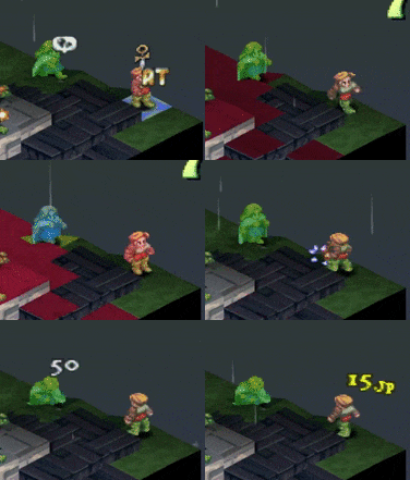
Mike: It’s tempting to say that  the Vlambeer Scale is not useful at all in analyzing FFT since a turn-based tactical game is about as far as you can get from an action game. But I think the Vlambeer scale is definitely useful here. The game doesn’t need to specifically be giving the player feedback on how they’re jumping and moving and shooting in real time in order for it to have a Vlambeerian feedback system. Good game feel in a turn-based game can be the difference between a mechanical, bland-feeling experience and an exciting experience. FFT has screen shake and knockback on critical hits, animations for being hit by attacks, elaborate and exaggerated animations for powerful attacks, and dynamic camera movement to accentuate important moments. The game doesn’t score highly on the scale (for instance, there are guns but bullets don’t show up on screen at all!) but it uses many of the tips and tricks embodied by the scale to make the player connect more viscerally to what’s happening to their characters on the battlefield. For that, I’m grateful. It certainly contributes to my enjoyment of the game, as much as I’d like to claim that I can detach myself from these purely superficial details and focus on pure strategy!

Richard: FFT has critical knockback! How interesting! I’m sure we can have a whole conversation about turning off animation in games like Fire Emblem and Advance Wars, but let’s wrap up this Vlambeer game feel topic.

Even if you think that game feel is just a buzzword, the process that we modeled in this series is important. By taking the scale seriously and doing the detailed work, I know how useful the Vlambeer Scale of Quality really is. And this isn’t as simple as a “yes, the scale is great” or a “no, it’s useless.” Getting more out of games as a player, being a more diverse designer, and writing more effective critique all require me to have more cups than just “good” versus “bad.” Ideally, I’d have a cup for every kind of style, and player, and designer, and effect that games can achieve. That’s the tricky part. Understanding game design isn’t about cramming everything into 2 good/bad cups or even a 100 cups. It’s about being open and ready to create more cups as needed.

Mike: Although it’s called game feel, we can more than just feel it: we can know it’s there without actually playing the game ourselves, and it’s all because we carefully broke down a talk by a game feel master into a metric, then carefully applied it. At first I was a skeptic of the usefulness of the Vlambeer Scale, but I’ve been converted after reading what the Super Terrell Brothers have had to say. I hope we can use this style of analysis to build other metrics and turn yet more feel into knowledge.

Richard: Right! Design Oriented is about moving in a better direction, to a place where we can have better conversations about games and game design. Engaging with game design is more analogous to sightseeing than participating in a court proceeding. We’re primarily interested in exploring ideas and execution. Likewise, I like the Vlambeer cup metaphor because it reinforces the idea that with game design and the style developers express through their design, we take, sip, drink, and eventually put down the cocktails of creators. And if you try to take too many drinks at once, merging them into one giant punch bowl, you’ll miss out on the individual flavor combinations… and probably end up drunk.

Final Fantasy Tactics 1.3: First Steps

POV: PLAYER.  DIFFICULTY 4.  LEVEL 1 - 1 POV: PLAYER.  DIFFICULTY 4.  LEVEL 1 – 1

Final Fantasy Tactics 1.3 is a fan mod that attempts to balance the generic Jobs and tune the game to be a challenge even to knowledgeable and skilled players. It’s not for the faint of heart. FFT1.3 seems to address some of my complaints about the original FFT and stands to really test my knowledge of the game.

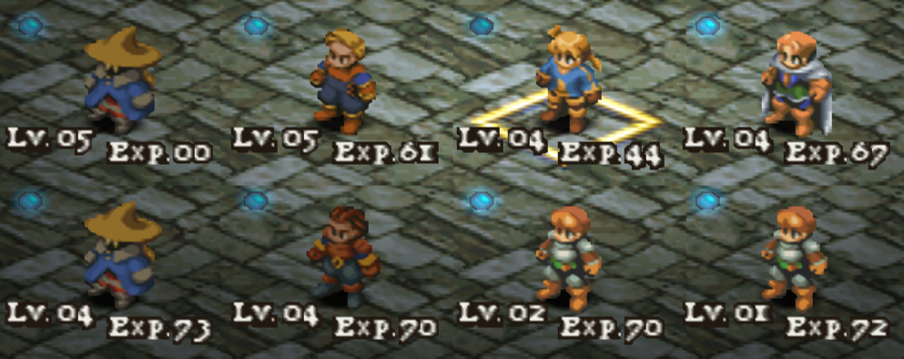
One of the first big notes I took after the first three missions is that the characters I choose for each mission really matter, both in terms of mission success in the short-term and getting  key characters enough XP and JP in the medium-term. From the first mission I had to pick who I wanted to make great, then stick with them. And in battles, I needed to be very conscientious with regard to making sure my characters were getting the JP that they need to keep up the progression pace. Just fighting to survive and win wasn’t good enough–I had to find something useful for each character to do each turn, even if it was just putting a relatively useless buff on an ally, so that my characters could catch up with Algus and Delita, two ally story characters controlled by the AI in the first few missions.

My first attempt through the first three missions (Gariland, Mandalia Plains, Sweegy Woods) I did not do a good-enough job of leveling up my characters, so I was stuck without any Wizards for the fourth mission, Dorter Slums. I needed my starting party to consist of some combination of Wizards, Priests, Marksmen, and Knights–not a bunch of red-cheeked Squires and Chemists. Delita and Algus were both level 4 or 5 by the time I hit Dorter, which meant the enemies were going to be at least level 5 and have real Jobs. I couldn’t bring rookies to this battle and hope to survive. The Marksmen and Wizards you face here have enough ranged firepower to overwhelm the healing efforts of a couple of Chemists–much unlike Mandalia Plains and Sweegy Woods which I had no trouble winning by playing defensively with a 2 Chemist 2 Squire team, focusing damage while healing whenever possible.

When I noticed that I was unprepared for Dorter, I tried to train up characters by fighting random encounters in Mandalia Plains. Wow, that was a mistake! The random encounters in 1.3 are quite tough–no place to bring a rookie to get him a few easy levels even this early in the game. The fact that Delita and Algus were level 5 meant that even the highest-level characters I could deploy were outleveled by the opposition by two whole levels. Though no damage or hit-rate calculations use character level directly, the enemies the game generates for random encounters use the player’s party’s highest level to guide how many abilities the enemies have have. As such, what should be challenging but fair battles for a level 5 party were murder on my party of level 3 characters. After trying a few random encounters and meeting brutal failure, I reassessed my entire progression strategy. I found out the hard way that the first few ability unlocks and job unlocks are so important that when the enemy had them and I didn’t, it was game over.

On my second try through the first three missions I did much better. I ensured I’d accumulate enough JP by setting up a trap in Mandalia Plains to pin an enemy Squire in place so that I could have my characters heal Delita and Algus repeatedly and farm some XP and JP. I was careful to avoid leveling past Delita and Algus, though, because in 1.3 enemy gear and levels scale with the highest level character in your party for all battles. If you outlevel the gear that you can buy in shops, you’re stuck with junk while the enemy has level-appropriate equipment. This means more damage and HP for enemies that are already at an advantage in numbers and positioning.

With a more advanced team I managed to complete Dorter, the first major hurdle in 1.3, on my first try. It felt great!

I’ve had lots of fun in these first few hours of play! This fan mod has forced me to engage with the game on a much deeper level than I ever had before, and for that I’m very thankful. I’ll be tackling the next couple of missions over the coming week. Expect another report soon.