Characterization Through Mechanics: Pokemon Battles

POV: DESIGN.  DIFFICULTY 3.  LEVEL 1 - 1 POV: DESIGN.  DIFFICULTY 3.  LEVEL 1 – 1

Characterization through mechanics essentially involves writing stories where the events and characters abide by a set of rules that are clearly defined and consistently applied. Clarity and consistency are important for any well-told story, but for characterization through mechanics in particular, we can take these rules and calculate the inner workings of characters and actions and even predict what will happen in new scenarios. I can’t think of a better case to examine for characterization through mechanics than the Pokemon TV show!

In the early seasons back in 1998, the show introduced me both to the world and mechanics of Pokemon. I used the lessons learned from the show, the Gameboy game, and the card game to deepen my appreciation of Pokemon. Now the show’s battles ignore the rules established by the games and the earlier seasons of the series. I have seen few battles with such an egregious disregard of mechanics as Scraggy vs Simisage and few battles uphold the RPG video game mechanics as closely as Sawk vs. Seismitoad (watch it here).

“Alright, Sawk. KARATE CHOP! … It’s fast! What’s up with that speed.”

Richard: Now the Pokemon trainers in the show often tell their Pokemon to “dodge” incoming attacks. Dodge is not a move in the Pokemon video games. KARATE CHOP is a move from the games and one that Sawk learns. Marcus, what’s the data for KARATE CHOP?

Marcus: It’s a move that you won’t see in any serious Pokemon video game competitive meta. It’s basically the Fire2 of the Final Fantasy series. It’s not bad, but why would you use Fire2 when you could use Fire3, or in Pokemon terms, why would you use KARATE CHOP when you can use CLOSE COMBAT. Since Ash and his crew are in a state of arrested development there is no telling what leg of their Pokemon journey they’re on. If they are mid-adventure, KARATE CHOP would be a sensible move to have and use.

Richard: In the video game, Karate Chop has 100% accuracy. So unless Sawk rubbed his eyes with some sand or Seismitoad covered itself with bright powder, it’s clear that the show is taking a bit of creative liberty to build drama in the scene. What is accurate to the games is that Seismitoad’s ability, swift swim, is no joke. In the rain swift swim doubles the speed of the Pokemon. So in the rain, swift swim Seismitoad can outspeed even some of the game’s fastest Pokemon.

Marcus: With the help of our handy dandy Poke-calculator we can take a look at the extema and compare. The slowest Seismitoad could outspeed the fastest Sawk in the rain. So no matter what speed values these Pokemon happen to have, any speed Seismitoad can outspeed any speed Sawk. The episode and the game line up again.

Richard: Sawk takes a DRAIN PUNCH to the face because he is unable to use the universal Pokemon show move “dodge it.” He doesn’t look too hurt because DRAIN PUNCH is a fighting type move and therefore Seismitoad doesn’t get a damage bonus because it’s a water-ground type. Also the power of DRAIN PUNCH is just 75 which is generally pretty weak. The best part about this attack is that the attacker heals back half the damage it dishes out. In Seismitoad’s case, it hasn’t been hit yet, so it had nothing to heal.

Poor Seismitoad. The MUD SHOT attack it uses has an accuracy of 95%. There was only a slim chance Sawk could dodge the shots, and the show reflects this lucky maneuvering well. You can see the surprised expression on Sawk’s face too! Seismitoad’s trainer isn’t a very good battler. The drain punch move was a questionable choice, but MUD SHOT has even less power at 55. What’s great about MUDSHOT is, if it hits, the target Pokemon’s speed is reduced. But Seismitoad is already faster than Sawk! Why would he need to use a risky and weak move to continue to be faster!?

Marcus: The LOW SWEEP the Sawk then lands next makes our calculations interesting. LOW SWEEP lowers the target’s SPEED stat by 33%. That speed drop allows Sawk to then outspeed Seismitoad. So what range of SPEED values would allow this to happen? The aforementioned fastest Sawk vs the slowest Seismitoad would fit this scenario easily. Sawk’s 295 SPEED vs Seismitoad’s modified 180. If you’re looking for a little more nuance in the stats, with some simple calculations we run calculations on anything but the slowest Seismitoad possible. In this scenario, Seismitoad can have a SPEED rage of 137-222!  Or a modified range of 180-295. What spread! Like I said before, doubling the speed stat is no joke. I guess our trainer was so confident in his speed in the rain that he didn’t bother to invest in Seismitoad’s speed at all.

Richard: I’m sure Edmund, the trainer in gray, is a wanna-be fighting Pokemon trainer. After his Seismitoad gets hit by the LOW SWEEP, he follows up with a BRICK BREAK, another relatively weak fighting type attack at 75 power. In general BRICK BREAK is a neat move because it has the power to break through the defensive psychic barrier moves REFLECT and LIGHT SCREEN. If you haven’t noticed, Sawk is not a psychic type and there ain’t no screens in this battle. In the Pokemon games, each Pokemon can only learn 4 moves. Seismitoad has revealed 3 out of the four. If Seismitoad’s last move isn’t a water attack, then its trainer completely fails.

In the next scene, the show really starts to take creative liberty with time. The pokemon video games are turn-based with all players making their moves simultaneously (not knowing the opponent’s moves). After getting hit by LOW SWEEP, Seismitoad “cheats” and takes a quick turn to land a BRICK BREAK. I don’t even know how to interpret the scene where both Pokemon continually strike each other with glowing hands. What attacks are they using? How many turns are they taking? Oh well, it sure looks cool.

Marcus: Assuming Seismitoad has max defense and Sawk has max attack the damage dealt thus far to Seismitoad is:

  • LOW SWEEP: 26.6-31.5%
  • Random Punches: ??? (let’s ignore these)
  • Attack boosted (+33% damage) CLOSE COMBAT: 73 – 85.9%
  • The range of total damage 99.6. – 117.4%

So the estimated range in damage the random punches 99.6 – 117.4% making the KO by Sawk possible according to the video game simulation.

Richard: This battle stays pretty true to the Pokemon game mechanics. Sure Seismitoad dodged a move, but we can consider “dodge it” to be the equivalent of the video game move PROTECT, which prevents all damage done to a Pokemon for a turn. Even though Seismitoad stole a turn with the MUD SHOT + BRICK BREAK sequence, Sawk stole it right back with the BULK UP + ClOSE COMBAT finisher. Yes, the Pokemon video games don’t allow players to steal turns like this, but plenty of RPG battles systems do. Radiant Historia, Bravely Default, and even Final Fantasy 10 allow players to see or manipulate their turn order in various ways.

We ran this battle scenario in Pokemon Showdown, an online battle simulator that emulates the mechanics of the Pokemon video games with perfect accuracy. It turns out that MUD SHOT miss was important for Sawk to win. If he got hit, Sawk would have taken damage and had his speed lowered for a double set back.

Dear Javed: A Response to DEAR SEGA // Sonic Re-design

Javed is an animator by trade, and it shows! The video’s presentation is clean and lively. Certainly the work of a professional.

I believe if you’re going to criticise the creative content of others, bring a creative solution to the table with you.

This is the opening statement to Javed’s critique “DEAR SEGA // Sonic Re-design”. It’s a statement that I disagree with. It’s hard enough to talk about games and articulate clear points about specific design elements, there’s no need to make it harder by throwing in your own ideas. It’s overreaching to suggest that all critics should attempt to step outside of their direct experience with a game and expertise with critical analysis, then pretend to be a designer. Doing so complicates the critique process and runs the risk of under-analyzing the source, over-scoping, and distracting the audience from the critical conversation by focusing too much on your ideas, which are immaterial to your critique of the game. Javed suffers in just this way: he over-scopes by addressing the entire Sonic series, fails to analyze any part of any one game sufficiently, and offers fairly generic design suggestions.

“Before we go further I think it’s important that we look your sales and ratings and take a look at how your platforming rival Mario is tracking as well. “

Games criticism and analysis has little to do with sales and ratings. A critic should be able to play a game and say something meaningful about the game or their experience. I can’t help but think that the reason Sonic doesn’t sell well these days is because the games aren’t very good. And so all talk of marketing, demographics, and how the “true fans” are now 30-year-olds with jobs and money is completely beside the point. Games criticism isn’t about sales at the end each fiscal year; it’s about the games at our fingertips.

After throwing all these numbers and graphs at us, the most Javed extracts from the data is “Mario is doing something right here.”

“When Sonic jumps he doesn’t become a ball straight away like the original games . A second action like the x button triggers a charge attack, and here he is powerful against enemies. Down and x smashes sonic into the ground. Left and right and x gives sonic a kind of air dash. While in his basic jump mode he’s vulnerable and this adds great tension into the gameplay. “

Javed describes how he would change Sonic’s mechanics and says this approach is different from the most recent Sonic games. His approach isn’t so different–many Sonic games already feature the mechanics Javed proposed. I can’t tell if he knows that these Sonic mechanics exist, or if he thinks they weren’t good enough as mechanics, or if he thinks the level design wasn’t good enough to highlight these design elements. The more recent games like Sonic Unleashed, Sonic Generations, and Sonic The Lost World feature gameplay that’s a refined mix of classic Sonic 2D platforming gameplay, 2D Sonic Rush gameplay, and the on-rails, runner-style of Sonic and the Secret Rings. Many of these games feature some kind of air dash, homing attack, and ground slam.

“[Sega hasn’t] arrived yet at a platform where Sonic’s speed can thrive in a 3D environment”

The big question is why hasn’t Sonic worked in 3D. Javed supports his claim about Sonic in 3D by describing the various surface-level differences between Sonic games without diving into specific examples, or giving reasons rooted in principles of game design. Almost every statement is missing the specific examples that would give his analysis weight. His discussion of Sonic Generation, again, uses sales and ratings data to make a claim about game design. There’s no mention of the camera design, level design, enemy design, or mechanics design. Though I know 2D platformers are easier to design and easier for players to control, the specific reasons must be articulated.

“I believe the best way to use Sonic’s speed …  is a momentum-based system where the player determines how fast or slow they wish to proceed.”

When is this not the case for a Sonic game? I know there are a few auto-runners out there where players can’t directly control Sonic’s speed. But for all the others, players have lots of control over their movement.

Javed does better when he talks about puzzle design and puzzle ideas for his version of Sonic. In his attempt to elegantly solve the problem of multiple gameplay types and the need for Sonic to have lives and restart levels, Javed proposes a power-up backpack and ring currency system. I like it a lot though the application is a bit janky. Javed’s idea essentially takes a power-up and makes it portable, like the hold items in many Mario games, but then turns the activation of the power-up into a more dynamic mechanic.

I find it weird to introduce a “summon block” mechanic into a platformer because, based on some of the examples given, it needlessly adds “summon” as a main verb along side MOVE, RUN, or JUMP. It doesn’t fit with Sonic’s platformer roots and Javed’s principle of Sonic games being all about moving and managing inertia.


The entire analysis lacks the kind of detail that would lend it substance, and then Javed lowers the level of critique further by resorting to incredibly short-sighted faux game design rules of thumb such as “respect the intellect of the player.” These phrase-crutches often treat players and developers as if they are in a kind of personal struggle. Thus when a game disappoints them, some gamers talk as if they were directly insulted, when by no means is a game’s quality some kind of intentional direct attack on the player’s intellect, time, or wallet. There are many reasons why games fail to be great–making games is unbelievably hard. The failure to deliver is not a personal slight aimed at every player, it’s the end of a long journey that mostly consists of well-meaning people making understandable mistakes.

Dear Javed, the talent and energy you’ve displayed is impressive. Let’s have a chat about Sonic’s game design sometime to see if we can aim the conversation in a more Design Oriented direction.

Reblog: How I’d Redesign Piano Sheet Music

POV: DESIGN.  DIFFICULTY 2.  LEVEL 1 - 1 POV: DESIGN.  DIFFICULTY 2.  LEVEL 1 – 1

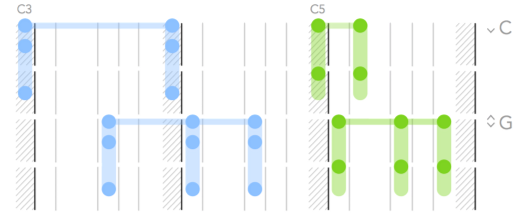
In his article How I’d Redesign Piano Sheet Music, Alex Couch suggests a new way to notate music which is oriented towards notating simpler popular pieces of music and getting newer players playing songs they know in as pain-free a way as possible.

Mike Says: I love that Alex consciously limits his audience as a way of freeing him up from what could be onerous constraints that would make the notation harder to read, like allowing the notation to accommodate precise timings. This is a critical design technique for user interfaces–focus on what the user is actually going to be doing and make that workflow as clear as possible instead of clouding the experience with all the knobs and buttons and text needed to manipulate and describe the much larger set of advanced features that only a power user would know how to use.

His choice to present the information in a downward-flowing format draws directly from the physical layout of the piano. It’s a great way of making the notation analogous to the real world, thus making it intuitive. I’m reminded that intuitive designs do not appeal to some foundational objective common-to-all-humans quality most of the time–intuitiveness in design is a matter of knowing the expectations and past experiences of your users and trying to maintain consistency with those experiences as much as you can.


Marcus says: I have long made my frustration with reading sheet music known to anyone within earshot of my piano practice. As any one of my piano teachers over the years would tell me: sit up straight while playing. It’s advice I’m forced to ignore. The only way I can read the tiny notes laid across their skinny bars is to lean forward and squint my eyes. I’m always dreaming of another way to read sheet music so I jumped at the chance to use Alex’s new notation. One short Sunday afternoon practice session later and………I’m still coming to grips with it. It should be no surprise, reading any type of language, no matter how simple, takes time. The notation does a number on my noodle but if anything I’m starting to see the strengths of the notation shine through. Giving a greater priority to the spacing of the notes creates a visual on the page that is more like how I have to visualize the space my hands must carve out when I’m playing a piece. I’m going to keep working at reading this new notation. Maybe it’s the solution to my sight reading woes.


Richard says: Marcus, you think you’re frustrated with piano sheet music, remember when I blogged about it on Critical-Gaming? Mike started making this comment, but I’ll finish it. Take note of the excellent structure of Alex’s article. He articulates what his project aims to do, what it doesn’t aim to do, and the various features of his Piano Tablature system. He even discusses the pros and cons of his system. Great stuff Alex. The only thing left to do now is actually sit down and work with Alex’s new system. Alex is in luck. All the writers at Design Oriented are musicians. Mike, Marcus, and I play piano as well. I’m inspired to not only try it out but to start a new article series linking music and game design. I’ve got Guitar Hero, Rhythm Heaven, and Sentris on the brain, and I want to talk about notation (UI/UX), level design, and mechanics. Stay tuned.

Chris says: I’ve never had much difficulty reading sheet music, so perhaps it’s no surprise that Alex’s redesign isn’t really something I can see myself experimenting with. It takes time to learn any system of representation, but I actually find it less distracting to use systems that are more abstract – like language and sheet music – than those that rely on a large dose of literal representation – like Alex’s system. The beauty of abstract designs is that you don’t have to think too much about how the representation and the represented object are the same in order to understand what’s going on; instead you just have to think about the represented object itself.


Reblog: Relative Numbers

Teale introduces his concept of relative numbers which are “any number where there aren’t specific absolute values that determine outcomes.” Auction mechanics and victory point race-style rules are common examples.

Mike says: Seems like a really basic concept. Comparing numeric between game elements is foundational to game design. It’s more common than “absolute” numbers. Consider this: the X and Y positions of various things in the 2D space modeled by a game are relative numbers–so that means the core mechanic of movement in 2D action games, platformers, and strategy games is all about relative numbers.

I’m not a fan of the name of the concept. “Relative” to me conjures “+1” or “half”, not the mere fact that two numbers are related to one another by some third rule.

The Design Was Disregarded

Original Article: What Games Must Learn From Children’s BooksA designer studies her favorite works of play and picture to explain what’s missing from many modern video games by Anna Anthropy
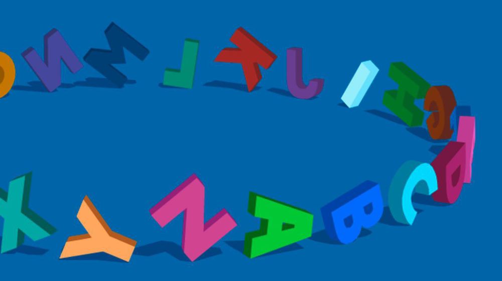
“It’s this placement of the text accompanying each illustration that makes the book playful. Because you have to turn the page in order to read the caption, you can’t help looking at each picture and trying to guess which letter-appropriate act of violence is being depicted. I showed the book to my partner and they started guessing without even being prompted.”

Anna Anthropy opens her analysis well by identifying the subject, describing it on a surface level, and then highlighting particular details about the book The Z Was Zapped that are key to “inviting” play. By separating the explanatory descriptive text from each accompanying picture, the book gives readers a chance to observe, ponder, and guess at the correct verb to describe the scene on every other page. Unfortunately, Anna’s concrete, detail-oriented, properly-scoped analysis based on her own personal experience is only applied to The Z Was Zapped in the few paragraphs of the article.

That’s really very typical of games these days— games are obsessed with control. A digital version of The Z Was Zapped wouldn’t let you turn the page until you’d entered the correct word. When you got it wrong, it would blarrrt at you and make you do it over again. Maybe there’d be an “in-app purchase” that would let you see the total number of letters in the word.”

Over-scoping is Anna’s first issue. “Games these days”  is way too vague and broad. I don’t know if Anna is referencing browser indie games like Draknek’s collection, the wide variety of Nintendo games, Minecraft and the many games it inspired, or just the popular style of mobile app that game critics seem to universally dislike. If “games these days” actually means “the games that I’ve come across recently” then a few specific examples are needed.

The tone in the description of the theoretical digital version of The Z Was Zapped is negative: “obsessed”, “blarrrt”, and “make you do it over again.” I don’t yet have a decent idea of what Anna is upset about.

What I like about The Z Was Zapped is that, as a humble picture book, it doesn’t provide any explicit rules, nor does it make any effort to enforce a guessing game.”

The core of Anna’s critique is comparing a favorite children’s books to tropes of game design. The quote above, however, fails to draw a useful comparison between game design and book design. These books are not games without rule enforcement, they are simply following the form of their medium–a medium which does not involve rule enforcement or game-like interactivity. At this point in the article, I’m looking for a statement about a similar element between games and books and how that element works in two different ways.

“The trick of The Z is Zapped, and most good children’s books, is to invite play, not to try and enforce or legislate it.

Okay, but what do I mean when I use “play” as a noun?…In Play Matters, he makes statements like “Play is…an activity in tension between creation and destruction.” … Above all else, play is transformative.

Here Anna has establisheds a key point. The rest of the article should define, outline, or frame what she means by “play” “invite” “enforce” and “legislate.” She starts well by presenting definitions of play and capping it off with her own view of the concept. Unfortunately, Anna’s version doesn’t define “play”; rather she describes it as being “transformative.” At this point I lost hope for a structured side-by-side comparison between games and children’s books because the very core terms of Anna’s argument are ill-defined. It’s not that a quality argument is impossible without the structure of well- defined terms. It’s that, in my experience, such a structure hones the mind before the writing process happens.


The media does not provide the play itself… This is the fundamental thing most game designers get wrong. …we’re becoming obsessed with rules. Game designers have become pedant legislators, trying to make sure players are playing our games the right way. We’ve become obsessed with controlling play.

I believe Anna is trying to explain why she feels that games with many rules and complexities are restrictive to the experience of play. By saying the media “does not provide the play” she’s trying to articulate the idea that the most important and valuable parts of a play experience are what the people bring including their quirks, questions, and life experiences. And if people are the key cog in the game-play machine, it doesn’t do gaming and play justice to force players to learn too many rules.

Anna is addressing a few common realities about playing games; namely that increased complexity and rules generally put a greater stress on the player. Put simply, players have to learn more before they really “get” the game and apply their unique personality to the experience. The freedom players feel inside of a rule based system is correlated to their understanding of it.

Anna fails to illustrate the spectrum of obsessive-rule-legislation and pinpoint where she thinks play happens. She mentions that designers use rules to “make sure” players are playing games the “right way.,” but there’s also a right and wrong way to experience The Z Was Zapped. If you read the book backwards or decide to engage with it by ripping out pages without looking at them, I’m pretty sure your experience won’t be meaningful in the same way as someone who reads front to back while engaging with its implicit guessing game. Looking at design through the lens of “right vs. wrong” isn’t an effective approach because it fails to address the vast range of experience designed for a wide range of players.

The difficult part of comparing unlike things that aren’t polar opposites is that the difference will generally be a matter of degree. It’s not that Anna thinks games shouldn’t have rules., Iit’s that the rules shouldn’t be so complex that the player cannot make creative or playful choices or engage with the game in some other mentally stimulating way. I think this is something we all can agree on.

Play, creativity, and understanding are tightly interwoven experiences. We play to explore, experiment, learn, and express. We create to express, explore, and mix up what we’ve learned. We understand based on our own experiences, often using experimentation, play, and creation to fill in gaps.

The tricky part is that everyone is different. Everyone has different learning styles and has a different comfort level at which they can engage with complex information. If you are untrained musically, a Piano fugue of three voices (listen here to Bach: WTC1 No. 21 in B flat major BWV 866) may quickly overwhelm you. This doesn’t mean the composer is trying to force their more complex work on you regardless if you can “feel” the music or not. And this doesn’t mean creators shouldn’t make complex works or that they’re overly obsessive and controlling. Rather, the complexity of art is an attempt to reflect the complexity of life and the uniqueness of individuals.

The beauty of complexity is that, for most works of art including most games and books and movies, we have the ability to learn over time and level up our ability to comprehend and enjoy complexity. For those who haven’t leveled up yet or refuse to, engaging with works that are more complex than they can handle typically results a relatively meaningless, flat experiences that feel like just going through the motions or “lubrication.” Anna wrongfully blames designers for “controlling play through rules” rather than acknowledging the fact that “overly-designed” games offer a unique kind of playfulness and self expression for some players.

The rest of the article is a series of disjointed comments.

“The formalist approach to design reveres the game as a kind of mathematical artifact, pure in form and precise in function: A neat matrix of abstract systems in which comfortingly quantifiable values bounce off one another in rational ways. Only in numbers are there truth, formalism tell us. All else lies.”

A jab at formalism, and a misguided one at that. To paint formalism with such a broad brush in such a cold manner is unnecessary. Formalists aren’t robots. They’re people: People who have different values and see the world differently. Being a formalist doesn’t necessarily mean  obsessing about function and rationalism while excluding everything else as “lies.” It seems that Anna uses her limited capacity to engage meaningfully with complex rule-based systems as an excuse to draw a line in the sand.

As a marginalized person in a field where I am constantly reminded of my difference, …I can’t think of anything more alienating to me than an e-sport in which depersonalized squares shunt balls at each other.

One thing that I like about competitive multiplayer video games is that they are worlds unto themselves; worlds that act like windows that allow players to see and interact with each other on a level that is impossible to experience otherwise. I like how a player’s gameplay choices and actions speak volumes about themselves. It’s neat how hundreds of players can all play the same character in a fighting game or shooter and yet they’re entirely distinguishable by their actions. Playing games can often side-step our ability to judge based on race, sex, or body type.

“Games do not exist in a vacuum, as much as we might like to find beauty in the perfection of pure design. It has become clear to me that the lumpy, messy thing we try to smooth out in our iterative design is often our humanity.”

Anna’s use of the phrases “pure design” and “humanity” is vague and misleading. I assume “pure design” is what she thinks formalist are focused on: a world of rules, rationality, and math. This is a false dichotomy. As designers, humanity is in everything we do whether we decide to focus on individual mathematical relationships or isolate a specific kind of play that exists on an intensely personal level.

Though the Be Witching development examples Anna describes are interesting, they do not support the idea that less complex rules create better games and better play for all games. When analyzing game design I find it most beneficial to look at the type of game, consider the audience, and define the type of desired play experience. Without this context, I cannot understand Anna’s example. Anna “over-designing” her own game because she was too focused on her own “cleverness” is less a lesson about game design and more a glimpse at how she interprets her own process of refining her game for her audience.

Like all designers, Anna designs and revises based on her own sensibilities. It’s great that she can create the kind of play she values most. It’s ironic and sad that she speaks so disparagingly and narrowmindedly about a type of design, experiences, and play that she can’t personally relate to.

Dual Progress pt 3: Finding the Slack

POV: DESIGN.  DIFFICULTY 3.  LEVEL 3 - 1 POV: DESIGN.  DIFFICULTY 3.  LEVEL 3 – 1

To examine the intersection between character progression and the battle system of Final Fantasy Tactics, we must first ask and answer a basic question about feedback: What do XP and JP reward the player for doing? They’re a reward for using characters to ACT.

Successful actions have a variety of effects in Final Fantasy Tactics: they can do damage–which is most common–but they can also restore health, increase or decrease attack stats, or inflict status effects like sleep that expire in a fixed number of clock ticks but do no lasting harm. Thus XP and JP are awarded for actions that ostensibly move a battle towards its conclusion, but also actions that can reset some elements of game state (like healing HP or restoring MP), or lessen the impact of actions that would move a battle towards its conclusion (like lowering Physical or Magical Attack).

This aspect of the Final Fantasy Tactics rewards system allows for some serious slack. The player can engage in a variety of stalling strategies, using abilities that heal or buff allies and cripple enemies, that result in their characters getting more XP and JP than they otherwise would from play that is wholly motivated by fulfilling the win-condition. These stalling strategies become extremely low-risk as fewer enemies are left in the battle. By employing this brand of low-risk, infinitely-repeatable reward-focused strategy, the player willfully compromises any quality gameplay arising from the risk-reward-balanced interplay between characters’ abilities that sits at the very core of the battle system’s design.

The design facts that lead to emergent low-risk reward-focused strategies are

  1. Rewards are granted per individual action.
  2. An action that grants XP and JP doesn’t necessarily move the battle toward its conclusion.
  3. A battle becomes much easier as the player eliminates more enemies–at some point the battle will become easy enough that the player can safely start optimizing for long-term character progression instead of having to optimize to win the battle.
  4. Battles can be manipulated such that the player directly controls when the battle ends and the player can indefinitely prevent it from ending.

Take a look at this video of a player exploiting the slack in gameplay that I’m describing.

Mustafa Anssar corners the last remaining enemy after killing all others. Then he uses the Monk’s Chakra ability to ensure all character have their health and mana topped-off, while using the very weak Gil Toss Thief ability to deal damage to the only remaining enemy. A Priest rounds out the team and provides some additional area-of-effect healing. Combining the Gil Toss, Chakras, and healing, all characters get in on the act and harmlessly can gain XP and JP until the player gets bored, at which people he can stop healing the enemy and kill it in a few hits.   can limitlessly loop useless actions that end up making no lasting difference in game state except for the XP and JP gained by everyone involved.

But why is this a problem? RPGs typically allow the player to engage in some similar low-risk activity to increase stats and thus make subsequent battles easier. Why should Final Fantasy Tactics be any different? I’ll be examining these questions in upcoming articles.

A Vlambeer Round for Everyone

POV: DESIGN.  DIFFICULTY 3.  LEVEL 7 - 1 POV: DESIGN.  DIFFICULTY 3.  LEVEL 7 – 1

Part 1 – Part 2 – Part 3 – Part 4 – Part 5 – Part 6

Our series on the Vlambeer Scale of quality has certainly taught us a lot about game design. Here at Design Oriented our goal is to have better conversations about games not just between us, but with you as well. So while we think it’s great that you’ve followed along so far, it’s time for your participation. It’s a lot easier and more fun that you might think.

Amazing art by Paul Lombard Amazing art by Paul Lombard

Step 1: Pick a game. Got a favorite? If you are a developer for a game don’t be afraid to apply the scale to your own work.

Step 2: Find a video of the game. Find a section of the video that’s a good representative slice of the gameplay experience. You may have to rely on knowledge of the game that is not in the video footage. That’s perfectly acceptable.

Step 3: Fill out this Vlambeer Scale questionnaire we designed. The results will be searchable and open to the public.

Step 4: Share the news with us, friends, or fellow designers, developers, and critics. Twitter is good: #VlambeerScore.

BONUS: What would you add to the  31 tricks already on the Vlambeer Scale?