It’s E3 week! Here at Design Oriented we’re skipping the speculation and the hype. We’re focused on bringing you the details from E3 that are design-oriented. Keep an eye on our twitter feed and keep coming back here for features that zoom in on games from the show.
POV: DESIGNER. DIFFICULTY 2. LEVEL 1 – 1
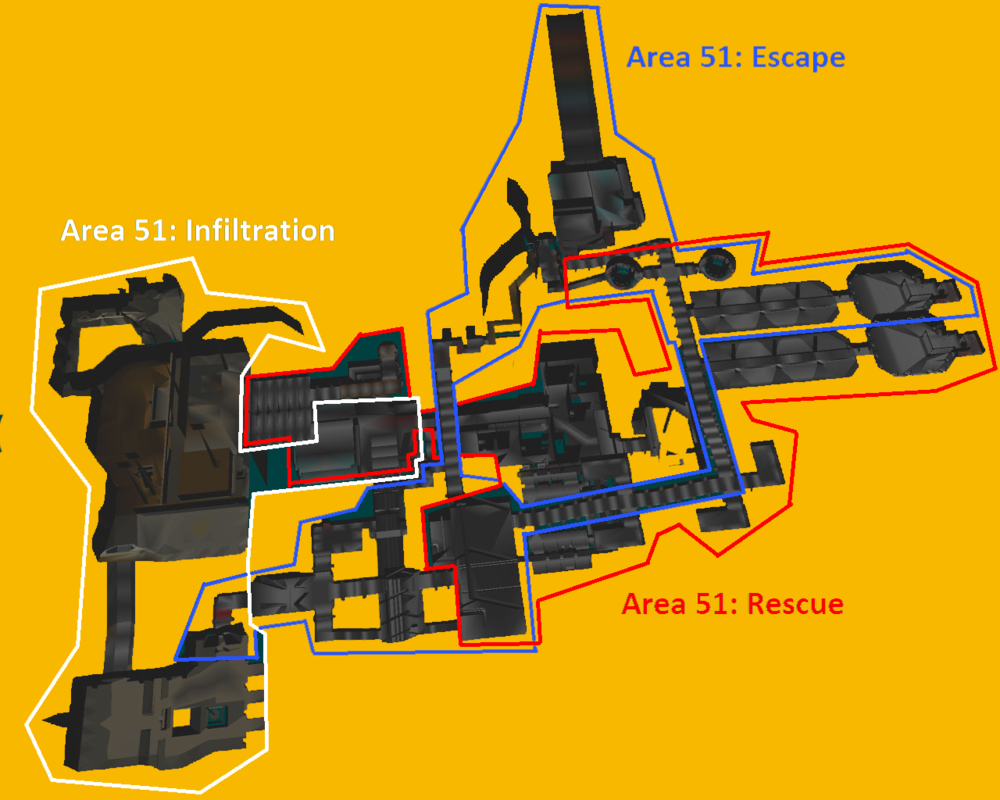
Making an E3 trailer or demo is a complicated. A few short minutes is all companies have to thrill, intrigue, and possibly make good on their promises. Naughty Dog promised there would be more ways to move through the levels of Uncharted 4 and this live stage demo chase scene makes good on that promise.
It starts with a sweeping vista and the destination far off in the distance.
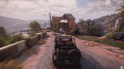
How do Drake and Sully get to the tower below? Sully chimes in “We just keep heading down hill”. While a cinematic ride down roads and back alleys seems like a linear experience, the E3 demo hinted at something more. At every turn when Drake was cut off by the pursuing van, there were always at least two other paths the he could take to evade his foe.
The whole experience is subtly a dynamic set piece. As NeoGaf’s mrklaw notes, the whole scene is a clever use of winding roads that fork and then meet up again later. The interwoven paths funnel Drake and the pursuit van towards each other and down the hill towards the destination no matter which of the many paths they take.
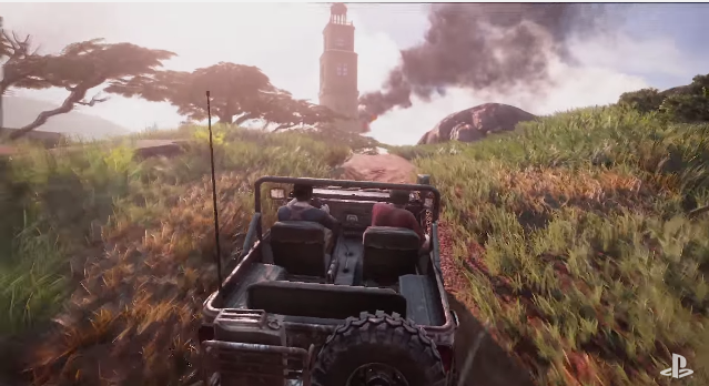
Richard says: I think the biggest difference between this Uncharted 4 chase scene and this one from Uncharted 3 is that there are few to no dead ends. When young Drake takes the wrong jump in Uncharted 3, it’s game over. I couldn’t see any areas where the player car in Uncharted 4 would get stuck at a dead end.
The Uncharted 4 set piece flows pretty nicely. The scene also keeps up the pace by eliminating loading screens. Gameplay-wise, the decisions look just as simple as other Uncharted chase set pieces: Steer left, steer right, and you’ll make it. Contrast Uncharted 4 with this scene from The Adventures of Tintin, and you’ll see what I mean. Tintin features driving, shooting, grabbing, jumping, and punching.
[Perfect Dark Retrospective] is a post by Mark R. Johnson that addresses critical claims about Perfect Dark. He takes a detailed look at several levels in Perfect Dark and concludes by considering the validity of the critics’ claims. Topics include level design, difficulty design, tutorial design, and modern FPS trends.
Richard says: Let’s go Perfect Dark! Still my favorite single-player FPS campaign. Mark R Johnson does a great job setting up the conversation with quotes from reviewers. Mark picks a few of the most interesting levels in the game due to their differences between difficulty and their use, and re-use, of space. His descriptions are accurate, though I imagine the screenshots are hard to follow if you’re not familiar with Perfect Dark.
Mark analyzes Perfect Dark levels for “completeness” to counter the claims made by many reviewers that the game is filled with dead ends. Mark illustrates how interconnected the areas, missions, and optional sub-missions are across the level and across the three different difficulty modes. Perfect Dark, after all, is a rare FPS that adds objectives, alters objectives, and changes the path of a level to create distinct experiences.
Mark addresses Perfect Dark’s unique “complete” level design to counter part of the critic’s claims, and then agrees with them regarding the game’s feedback issues. The environment design of the game makes it fairly easy for players to get lost at times. Coupled with the non-linear level design (players can take many paths and accomplish mission objectives in different orders) getting lost is more likely and more frustrating than in linear games. Mark explains the problems of Perfect Dark’s level design, and ends by arguing that “contemporary FPS games” have gone too far in the other design direction to remedy this problem by designing levels where the path to take is more obvious and the level design is more linear.
Perfect Dark is a complex game to analyze in terms of how it teaches, guides, and challenges players. Mark has only scratched the surface by highlighting the coherent details with Perfect Dark’s level design.
Mike Says: It’s interesting how players, even those who have been playing games for more than a decade, have come to rely on the linearity of modern shooter level design on a subconscious level; how it’s far from certain–in fact it is becoming less common by the day–that a player will pick up on the more advanced or subtle level design concepts that could clarify the seemingly arbitrary locked door here or samey-looking room there. A game like Perfect Dark ends up suffering not because of some inherent objective weakness in its level design, but because the kind of headspace required to enjoy it as it was enjoyed shortly after release just isn’t practiced and available to players like it used to be, either because those players never had to practice it, or because they’ve long since been retrained by the zeitgeist of shooter level design.
In response to my article On “Perfect Imbalance”, Travis Clark wrote in with his insightful perspective on balance and memorization in Chess.
POV: PLAYER. DIFFICULTY 4. LEVEL 1 – 2
As for the state of balance in Chess, Travis makes a great point about the subtle nature of the imbalances present in what appears to be a symmetrical system:
“It is almost symmetrical, and visually tricks people into to thinking so with the optical-illusion of black and white squares and the pieces in front of you line up with pieces in-front of your opponent. Fold the board in half along its supposed line of symmetry and you will find every black square folds on top of a white square. The board itself isn’t meant to be symmetrical. Its a very small difference but bishops are assigned to move along a specific color square so the board itself creates some very slight but uneven gameplay. Now take a close look at the pieces. Things look a little different if you are playing black versus playing white. If you are playing as white your king is on the fourth square from the right. If you are playing black, you must look from black’s perspective, your king is on the fifth square from the right. The situation for the queens are similar. I believe it is this way because it is aesthetically pleasing. However, every opening strategy is hinged on this very slightly imbalanced set-up.” ~Travis
In the original article, I had considered making a comment on the fact that Chess is not a symmetrical game, primarily because of White’s first-turn advantage, but Travis brings up a good further point about how the aesthetically-pleasing apparently-symmetrical setup is hiding some one-square positioning differences that rest at the core of the strategy-space of the game. He later also mentioned the importance of first-turn advantage as well:
“The most drastic way chess is imbalanced is the fact that white always goes first. You may wonder how much of a difference white’s privilege actually makes. …Because of the small differences in starting positions and the advantage white has in time there is a Chess theory which states that if two perfect computers were to play each-other, with all the Chess databases known to man for reference material the best outcome black could hope for would be a draw in every game.” ~Travis
Travis pointed out a memorization-free style of learning chess that worked well for him:
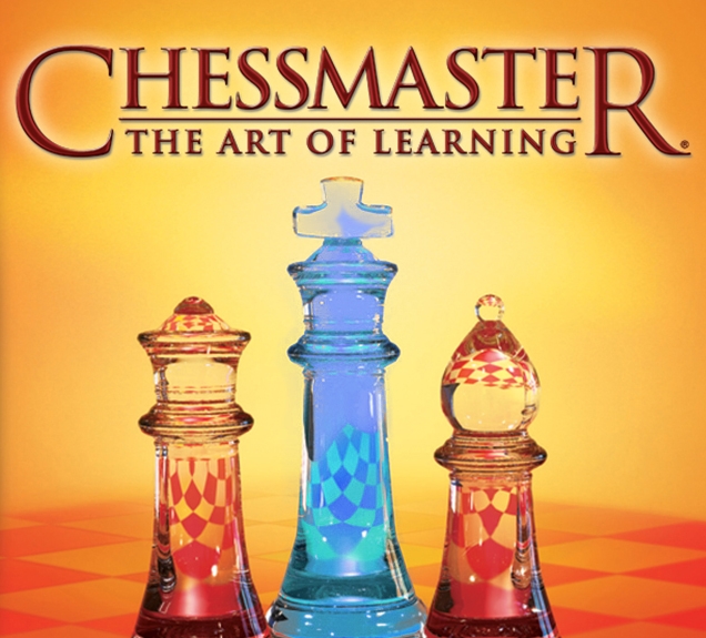
“Josh Waitzkin is one of my chess heroes. He wrote an excellent book called The Art of Learning that I highly recommend, and in partnership with Chessmaster(Ubisoft) created a fantastic chess course. The reason why I was drawn in to chess so deeply and find it fascinating are his annotated games. His style of play and teaching didn’t revolve around the learning of specific patterns or memorizing databases. In place of the rote portion he would explain the theory of why certain opening patterns developed and what the Grandmaster’s that used them were trying to accomplish what they gave up and got in return and how it suited their style of play. I never once had been one to memorize openings. Using his training I could look at a completely unfamiliar opening, that my opponent may have memorized, and look at its goal and strengths and weaknesses and choose a move based on that.” ~Travis
And he went on to talk about the mind-games that can be involved in Chess:
“But the heart of chess is this competitive spirit. Connecting with someone through competition is the key. Memorization is a piece of the puzzle but I argue that it is a much smaller piece than the current image of chess projects. Raw calculation is indeed a factor along with pattern recognition, logic, strategy, poise and other mental talents; however, I believe the biggest portion is the psychology of competition. You have to be in tune with what you opponent is thinking and find a move that counters, disrupts, or solidifies your opponent’s thought process while fitting the current position on the board. The correct move isn’t always the mathematical best move, rather it is the move that will beat the opponent in right in-front of you in that moment with their current state of mind. As annotated by Josh, this psychological warfare happens on the grandmaster level, the beginner level and everything in-between. That is why I argue that it is the heart of this slightly imbalanced non-symmetrical game.” ~Travis
It’s a great point, and one that I think is too often thrown by the wayside when we try to talk about design in the abstract. People are playing these games, and seldom can they near the mathematical precision of a computer, in terms of memory and applying algorithms and valuation strategies effectively and consistently. Even though Chess is a perfectly deterministic game involving no hidden information that would affect objectively optimal play, a degree of psychologically-hidden information exists because of the limitations of the human mind’s ability to apprehend the many branches of the decisions tree. Even at the highest levels, says Travis, players benefit from exploiting the limitations of the wetware of their opponent while trying to avoid being exploited themselves. Memorization might be an “ideal” solution to chess, but as the metagame stands now, there’s plenty of room for human limitations to be exploited by using the mind and emotions of the opponent as a weapon.
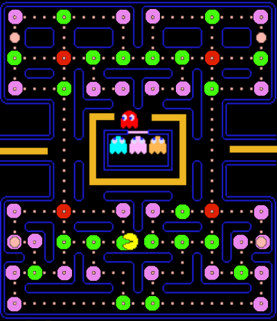
A handy way to analyze Pac-Man’s maze design is to count the number of hallways, 3-way turns, and 4-way turns and then to consider their relation to each other. Turns are important to Pac-Man because every turn is the exact point in which the most meaningful decisions are made for Pac-Man and the Ghosts. In the same way players express agency with their turning and pathing choices, the Ghosts show their AI personality through the turns they take and the direction they move.
The whole gameplay experience of Pac-Man is a loop of deciding to turn or not. Figuring out the pros and cons of one turn versus another stresses knowledge about the game’s rules (complexities) and understanding of the current state of the maze, enemies, and items. Hallways (straightaways or paths with only 1-way turns) provide a nice contrast to 3-way and 4-way turns as the decision making while in a hallway is simpler (keep going forward or turn back). But keep in mind the potential to become trapped by Ghosts is higher in a hallway as there is only one entrance and one exit.
The Pac-Man Arcade maze has the following features:
4
4-way turns
22
3-way turns
26
1-way turns
15
longest hallway(measured in dots)
240
Dots
4
Power-Pellets
The relationships between the numbers described above give the original Pac-Man level its maze feel and well-tuned gameplay. Notice how most turns are 1-way and 3 way. The abundance 1-way turns makes it so that the player’s fingers are rarely idle. Though moving through a 1-way turn doesn’t involve much decision-making, it does require timing. If players don’t give a MOVE input at a 1-way turn, Pac-Man will just sit there and waste time.
The abundance of 3-way turns means players will frequently make a relatively simple choice; turn into path A, B, or turn back around for path C. Because players are typically being chased by at least one Ghost and the goal is to move forward through all the dot lined paths of the maze, a 3-way turn is mostly about choosing path A or B. While it’s easy to pick the option to avoid running into a nearby Ghost, planning ahead even a few seconds into the future is increasingly complicated. Accurately predicting Ghost movement requires understanding the AI mode timer, current level of difficulty, each Ghost’s AI personality, and a few other special rules discussed in part two of this analysis. In practice, the player chooses quickly, moves swiftly, and watches the results of their turning decisions unfold before their eyes.
Here are a few other details about the original Pac-Man maze:
Power Pellets are placed near the corners of the map, in hallways, away from warps, and surrounded by a combination of 4-way and 3-way turns. This placement ensures the most decision making when going for the power-pellet and the most escape options for Ghosts as they retreat in the frightened state.
There are empty areas of the map (leading into warps and around the Ghost House). This design keeps the warps optional while giving the bonus fruit an area to spawn that Pac-Man wouldn’t be incentivised to travel through otherwise.
When Ghosts switch to the scatter AI mode they move to their home corners on the map ignoring Pac-Man. This movement also means the Ghosts go on patrol in the areas around the power-pellets. So even when they’re not chasing Pac-Man, Ghosts naturally protect Pac-Man’s greatest weapon against them.
4
4-way turns
20
3-way turns
19
1-way turns
17
longest hallway
(measured in dots)
270
Dots
5
Power-Pellets
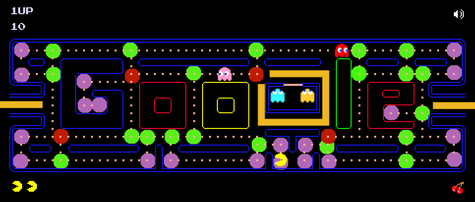
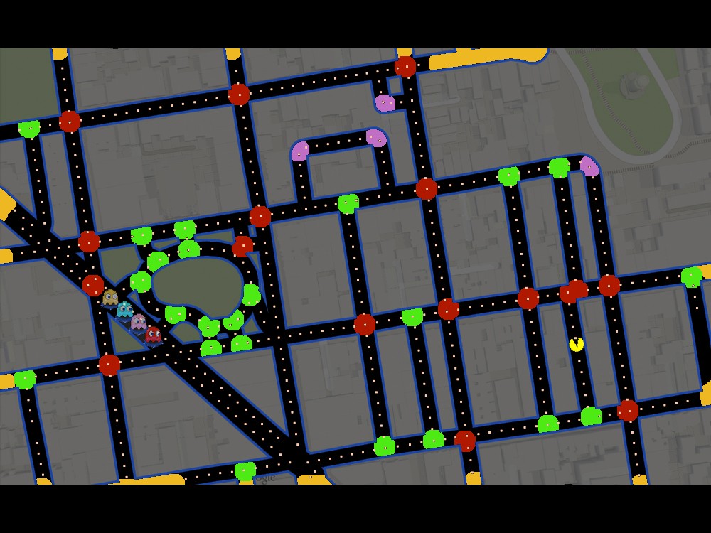
The Google Doodle Version of Pac-Man (play it here) does a pretty good job creating interesting gameplay.
The biggest problems I have with the Google Doodle maze design is the concentration of turns and the placement of the Ghost House. Creating a maze out of the Google logo involves a lot of horizontal hallways. The Roman alphabet tends to create horizontally-oriented blocks of shapes. Hallways are great as a reprieve from continuous Pac-Man turning, but not as roughly half the maze paths. Basing the maze design around the Google logo also is why the Ghost House is made out of the lowercase “g” instead of the yellow “o”. The Ghost House functions best in the center of the maze so that the ghosts have the shortest distance to travel to Pac-Man once they exit. When navigating the left side of the maze in the Google Doodle Pac-Man game, consumed Ghosts are less threatening as they take more time to travel to the Ghost House and back to Pac-Man. When this happens, the gameplay experience becomes dull.
Real-life roadways, however, are not designed to challenge our brains. In fact, most streets are designed to be as simple and as straightforward as possible. This is great for modern living. It’s terrible for Pac-Man maze level design. Straight hallways in Pac-Man are death traps because they allow for very little decision-making while inside. Real-life roads are generally spaced apart from each other, further reducing the concentration of corners and turns, limiting how often Pac-Man can juke ghosts to buy more time.
It doesn’t help that the warps are unintuitive due to the lack of symmetry between entrances and exits. Sometimes entering the same warp can spit Pac-Man out of different exits. The Power-Pellets are placed randomly it seems. Sometimes they’re in a hallway; sometimes at a 3-way turn.Since the abundance of hallways means players will have less ability to out-maneuver Ghosts, grabbing the Power-Pellet becomes either necessary for survival or a boring choice–there is no expedient way to maneuver around the Power-Pellet to save it for later. Ultimately, the Power-Pellet placement algorithm results in fewer Ghost chases and fewer exciting situations where Pac-Man barely turns the table on ghosts who are rapidly cornering him.
For these reasons, most of the Google Map Pac-Man levels I’ve played have given me little fun and much frustration compared to the original Pac-Man maze. Procedurally-generated level design is harder to execute well for games that have deep and complex gameplay. With mazes designed from road maps, the algorithms Google used to generate the Ghost House, Power-Pellets, and warps don’t produce levels that support interesting gameplay.
Have you seen those infomercials where they show some inferior product used by a poor soul who lives in a black and white world? The person who struggles to do a simple task due to the incompetent design of an inferior product? Perhaps water leaks on the sofa, food accidentally falls on the floor, or the cat just smells too bad to sit next to.
This black and white disaster infomercial scene is part of a formula that is effective at conveying an idea by creating an emotional through line from the frustrating experience of using the inferior product to the newfound joy of using whatever product that’s for sale. The music, the coloration, and the histrionic performance are designed to get you to feel great about the for-sale product. Whether this miracle product works or not, the point is these scenes are not designed to inform viewers of the pros and cons of each option. The sale is the bottom line and the less customers think and the more they feel, the better.
The same approach is being used commonly within games criticism videos, and it comes mainly in the form of youtube level design analysis. The analyst walks through a level of a game explaining what a first-time player thinks, feels, and how they play. This approach often notes how gameplay concepts are taught and supposes how a player with no prior knowledge of the game, the genre, or even video games might progress. I call this approach to critique theoretical player perspective (TPP)analysis.
Though there are many types of players out there with various levels of skill and experience, the one thing we have in common is that we all have a similar first time experience with a game. We all start without knowing exactly what we’re doing or exactly how everything works, and we take things one step at a time. Focusing on this first time experience is a great way to establish the starting point of the players skill acquisition trajectory. With this knowledge we can better understand why certain players give up or why some levels “click” for players.
The problem with the theoretical player perspective when applied to first time players is it tends to paint a picture of a player who is astute, quick to pick up even the most minute of details, thoughtful, reflective, and patient. This depiction is just as extreme as the black-and-white frustrated infomercial people but in the opposite way. I’m not assuming this theoretical player can’t exist; I’m saying it is hard to find all these these qualities within a single person. It’s even harder to find someone who exhibits these qualities when playing video games, which are largely consumed for entertainment, as doing so requires a high level of attention and self-discipline.
Most players’ actual first experience with a game is far more stressful, frustrating, and unfocused than analysts would have you believe. The explanations TPP analysts provide tend to be oversimplifications of how any player would learn. Sure, a player is likely to pick up on some of the correct details and connect some of the dots, but they’re not going to latch on to all the details, and certainly not so cleanly on their first time playing a game.
image and example from Sequelitis
The final problem with the theoretical player perspective analyses is that they tend to only focus on tutorials and how the player learns the basic rules of play including new enemy and level elements. I have yet to find a TPP analysis that comments on the hints, scaffolding, or tutorial design of higher levels of play. Initially, this may not seem like a big deal. After all, a critic doesn’t need to bethe best player or a highly-skilled player to examine the design details of a game and write a thoughtful analysis. However, I’m worried that the lack of coverage for the higher design of these games is a symptom of a bigger issue.
It’s one thing for a critic to not have time or energy to take their game to that “next level” whether that be attempting to speedrun, achieve 100% completion, reach a high score, or top the leaderboards. It’s another thing if a critic is completely blind to high-level play. My stance is that, like in school, learning piano or any other discipline, the goal isn’t to learn the basics and barely pass. Learning the basics and passing is just step one. There are many steps on the path to mastery, and once mastery is achieved you gain access to a whole new world of expression and understanding. As my former piano teacher explained, when you learn all the notes and all the rhythms and all the fingering for a song, you haven’t passed yet. In fact, you get a 0. Only after you’ve put in the work to smooth everything out and really practice the song until it’s so comfortable in you that you have control over every phrase and note and dynamic, then you get to a level where you deeply understand the song and you can truly make the music your own. Even in school, the grade on the paper wasn’t the point. Hopefully, the grade reflected your genuine dedication to learning and how much you made the material a part of who you are.
In my experience, most of what is interesting about games comes from what happens after one learns the basics. Though there may be no cap to how “high” high-level play gets, a critic’s journey upwards will show in the kind of insight they bring to their analysis. Digging deeper changes the player and critic in a profound way. There’s a whole world of interesting concepts and experiences in each game. Our goal here at Design Oriented is to dig deeper than others and bring you more than the typical beginner-level coverage of game design you can readily get elsewhere.

 POV: DESIGNER. DIFFICULTY 2. LEVEL 1 – 1
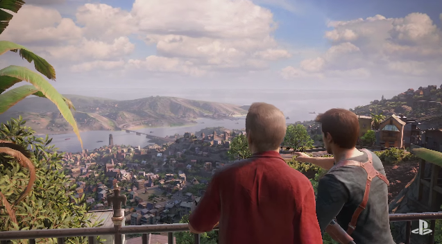
 POV: DESIGNER. DIFFICULTY 3. LEVEL 1 – 1