POV: DESIGN. DIFFICULTY 2. LEVEL 1 – 1
In his article How I’d Redesign Piano Sheet Music, Alex Couch suggests a new way to notate music which is oriented towards notating simpler popular pieces of music and getting newer players playing songs they know in as pain-free a way as possible.
Mike Says: I love that Alex consciously limits his audience as a way of freeing him up from what could be onerous constraints that would make the notation harder to read, like allowing the notation to accommodate precise timings. This is a critical design technique for user interfaces–focus on what the user is actually going to be doing and make that workflow as clear as possible instead of clouding the experience with all the knobs and buttons and text needed to manipulate and describe the much larger set of advanced features that only a power user would know how to use.
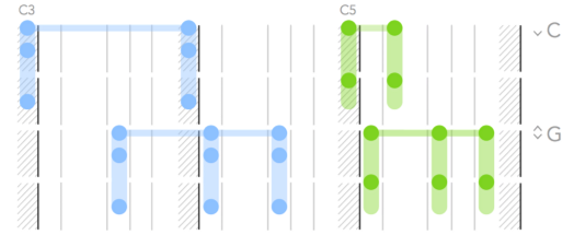
His choice to present the information in a downward-flowing format draws directly from the physical layout of the piano. It’s a great way of making the notation analogous to the real world, thus making it intuitive. I’m reminded that intuitive designs do not appeal to some foundational objective common-to-all-humans quality most of the time–intuitiveness in design is a matter of knowing the expectations and past experiences of your users and trying to maintain consistency with those experiences as much as you can.
Marcus says: I have long made my frustration with reading sheet music known to anyone within earshot of my piano practice. As any one of my piano teachers over the years would tell me: sit up straight while playing. It’s advice I’m forced to ignore. The only way I can read the tiny notes laid across their skinny bars is to lean forward and squint my eyes. I’m always dreaming of another way to read sheet music so I jumped at the chance to use Alex’s new notation. One short Sunday afternoon practice session later and………I’m still coming to grips with it. It should be no surprise, reading any type of language, no matter how simple, takes time. The notation does a number on my noodle but if anything I’m starting to see the strengths of the notation shine through. Giving a greater priority to the spacing of the notes creates a visual on the page that is more like how I have to visualize the space my hands must carve out when I’m playing a piece. I’m going to keep working at reading this new notation. Maybe it’s the solution to my sight reading woes.
Richard says: Marcus, you think you’re frustrated with piano sheet music, remember when I blogged about it on Critical-Gaming? Mike started making this comment, but I’ll finish it. Take note of the excellent structure of Alex’s article. He articulates what his project aims to do, what it doesn’t aim to do, and the various features of his Piano Tablature system. He even discusses the pros and cons of his system. Great stuff Alex. The only thing left to do now is actually sit down and work with Alex’s new system. Alex is in luck. All the writers at Design Oriented are musicians. Mike, Marcus, and I play piano as well. I’m inspired to not only try it out but to start a new article series linking music and game design. I’ve got Guitar Hero, Rhythm Heaven, and Sentris on the brain, and I want to talk about notation (UI/UX), level design, and mechanics. Stay tuned.
Chris says: I’ve never had much difficulty reading sheet music, so perhaps it’s no surprise that Alex’s redesign isn’t really something I can see myself experimenting with. It takes time to learn any system of representation, but I actually find it less distracting to use systems that are more abstract – like language and sheet music – than those that rely on a large dose of literal representation – like Alex’s system. The beauty of abstract designs is that you don’t have to think too much about how the representation and the represented object are the same in order to understand what’s going on; instead you just have to think about the represented object itself.